Dimensions: image: 598 x 803 mm support: 792 x 997 mm plate: 605 x 807 mm
Copyright: © John Latham Estate, courtesy Lisson Gallery, London | CC-BY-NC-ND 4.0 DEED, Photo: Tate
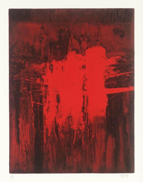
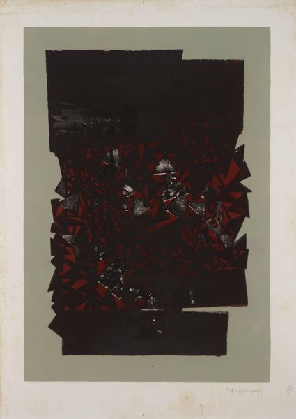
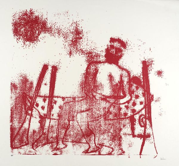
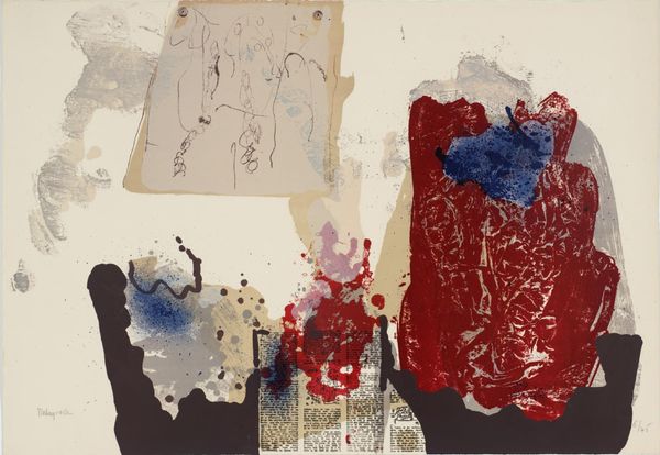
Curator: John Latham's "Tadpole-Taffrail" presents us with a screenprint, a burst of red layered with dictionary text and images. Editor: It feels almost like a repressed memory, all washed in red, but there’s something about the tadpole that hints at transformation. Curator: Latham, of course, was fascinated by systems of knowledge and their inherent limitations. The layering of the dictionary extract… Editor: Along with the tadpole and nautical references, it’s a visual deconstruction of language itself, isn't it? A questioning of how we define and categorize the world. Curator: Precisely. Latham’s work encourages us to question the very structures through which we understand reality. Editor: It leaves you pondering the very act of knowing, which I suppose is precisely the point.
Comments
tate 11 months ago
⋮
http://www.tate.org.uk/art/artworks/latham-tadpole-taffrail-p79062
Join the conversation
Join millions of artists and users on Artera today and experience the ultimate creative platform.
tate 11 months ago
⋮
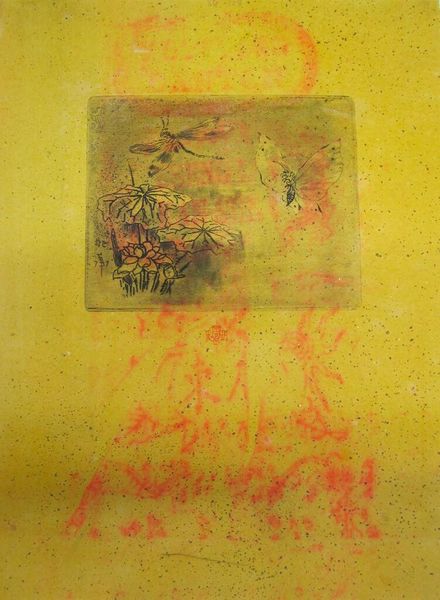
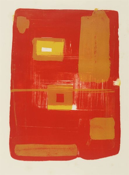
This is one of a suite of etchings, entitled 5 photo etchings, that Latham produced in collaboration with artHester Editions. The suite of prints refers to two series of works. The first four images – Tadpole-Taffrail, Boy-Girl (Tate P79063), Ben (P79064) and Presumed Level of Abstraction (P79065) – derive from Review of a Dictionary, a long-term project that Latham began in the mid-sixties. For this project, Latham photographed illustrated pages from a dictionary, and subjected the photographs to various experiments in the dark-room. Developer thrown on the exposed printing paper, or a match lit to over-expose a part of the print, resulted in blob-like forms appearing on the photographic surface, partly concealing and partly highlighting the original text. Latham used these altered prints as the basis of silkscreens and screenprints on a variety of media including canvas. He preferred mostly sombre, saturated colours but in some instances he utilised fluorescent printing inks which, in combination with the organic forms on the photographs, recall the psychedelic art and design of the decade. In contrast to this, the etchings in this suite have been printed with strong, dynamic colours: red, yellow and two blues, with additional silvery, grey and white tones where the burning and splashes of liquid occurred.
More like this