drawing, paper, ink
#
drawing
#
narrative-art
#
landscape
#
figuration
#
paper
#
ink
#
line
#
genre-painting
#
history-painting
#
miniature
Dimensions: height 403 mm, width 334 mm
Copyright: Rijks Museum: Open Domain
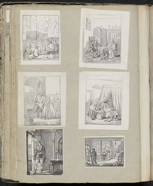
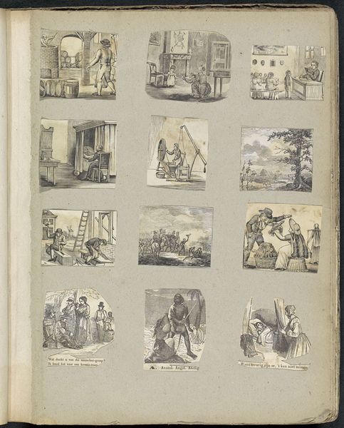
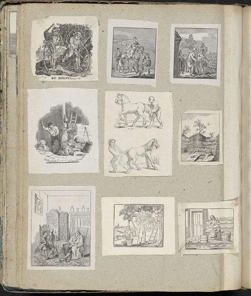
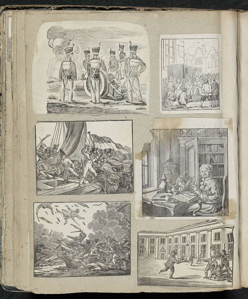
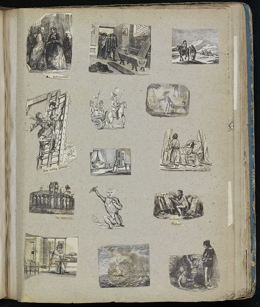
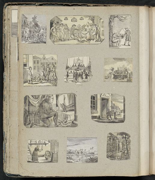
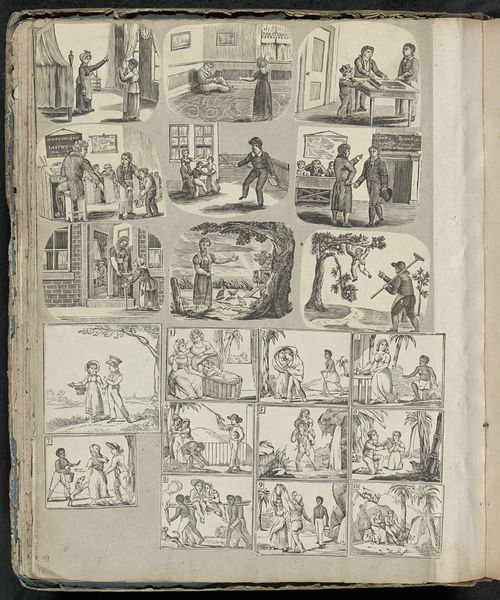
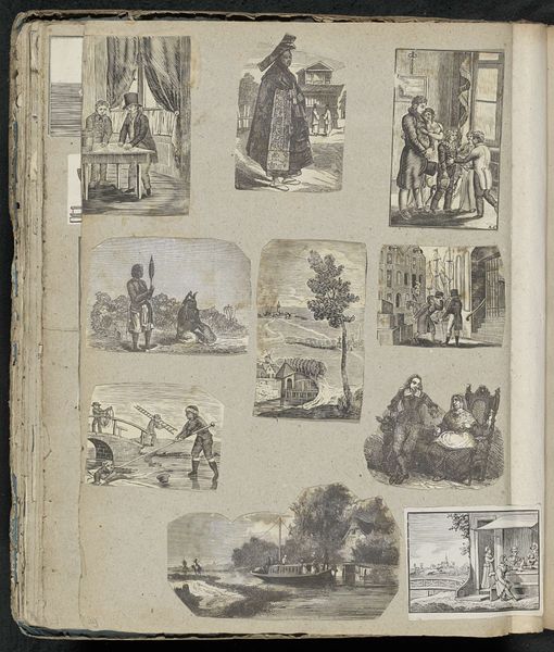
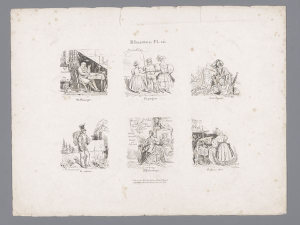
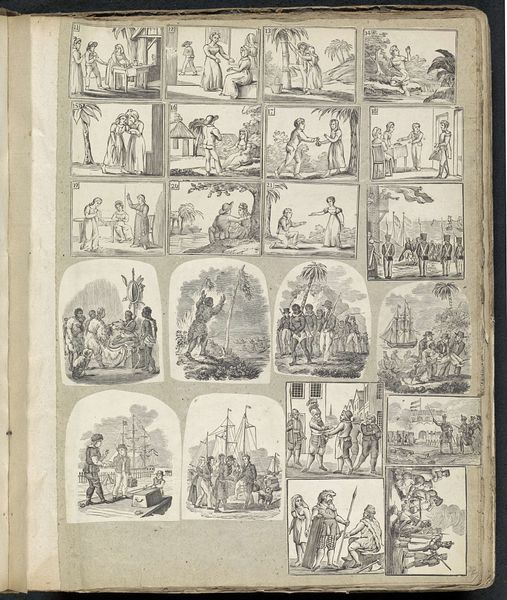
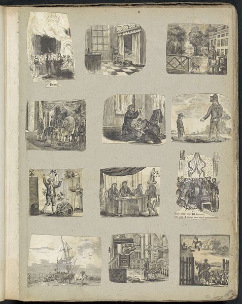
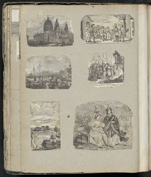
Editor: Here we have an album page by Alexander Cranendoncq, created sometime between 1814 and 1869. It’s a collection of small ink drawings on paper, all distinct narrative scenes. I find the overall effect quite intriguing because of how varied the images are, a collection of moments captured using delicate lines and composition to suggest activity within each scene. How do you interpret this collection formally, thinking about line, texture, or movement? Curator: The formal arrangement certainly draws the eye across the page. Note how each scene is framed by a defined rectangle, a clear decision that establishes each vignette as a discrete visual unit. What strikes me is the varying line quality used throughout; thin, almost ethereal lines suggesting distant landscapes, contrasted with denser, more deliberate lines used to depict figures. How does that variation impact your understanding of the scenes depicted? Editor: It makes me think each rectangular composition almost works as a framed photograph, despite obviously being rendered as a miniature illustration. I’d guess the more deliberate and detailed use of the lines signals greater importance within the illustration itself, for instance with focal characters or activity. Does this shift how we consider each frame? Curator: Precisely. Notice too how Cranendoncq utilizes shading and hatching – observe, for instance, the scene in the top left or bottom right where figures are created through varied uses of contrast. This highlights form and creates depth but simultaneously draws our attention to the medium itself. Ink on paper. He invites us to consider his craftsmanship. Editor: I never thought about the craftsmanship that way! It’s interesting how the varying styles impact each picture as well as the collection overall, with some areas clearly having far more detailing than others, despite each still having some very visible aspects in each square, and almost fighting for your eye as a whole picture of the page. Thanks for helping me notice the different qualities in each. Curator: Indeed. Considering this interplay of techniques opens avenues to further understanding the deliberate arrangement of forms on this singular album sheet. The unity rests within its diversity, presenting visual variations as aesthetic explorations.
Comments
No comments
Be the first to comment and join the conversation on the ultimate creative platform.
More like this