Dimensions: height 80 mm, width 112 mm
Copyright: Rijks Museum: Open Domain
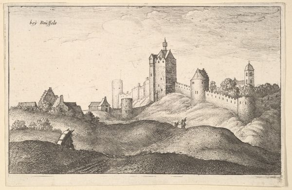
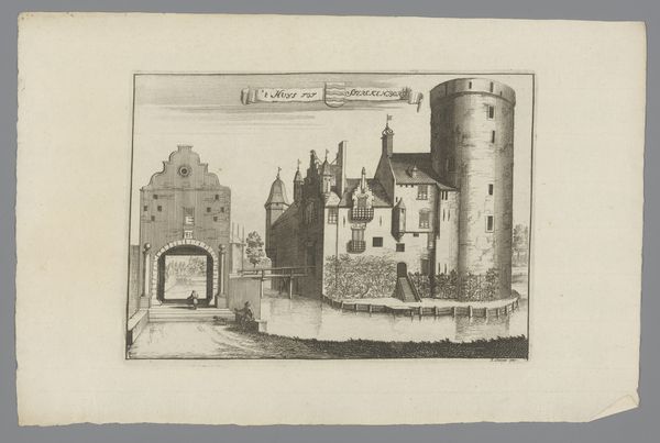
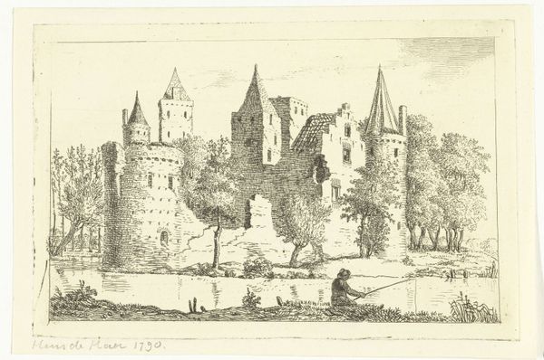
Editor: So, this is "Gezicht op Kasteel Batestein, 1607," by Abraham Rademaker, made sometime between 1725 and 1803. It's an engraving, currently housed in the Rijksmuseum. What strikes me is the strong horizontal line created by the castle walls, it dominates the composition. How do you interpret this work? Curator: Indeed. Immediately apparent is the formal deployment of line. Consider how the artist uses hatching and cross-hatching to define form and create tonal variation. Notice the precision in rendering the architectural details of the castle versus the looser, more gestural treatment of the landscape. How does this contrast affect your reading of the artwork? Editor: I think the sharp contrast accentuates the architecture even further and creates a hierarchy between nature and artifice. But what’s the effect of placing the castle slightly off-center? Curator: An astute observation. The asymmetrical composition introduces a dynamic tension. The artist avoids static symmetry, choosing instead to create visual interest and a sense of movement across the picture plane. It pulls the viewer’s eye to different points of interest within the image and enhances a unique viewing perspective. Editor: So, the seemingly simple choice of composition contributes to the overall effect of dynamism and reinforces the artwork’s narrative. It makes one truly observe. Curator: Precisely. Through formal analysis, we’ve seen how the interplay of line, texture, and composition reveals deeper artistic intentions, transforming a mere landscape into a structured visual experience. Editor: That makes so much sense! I feel like I have a much better understanding. Thanks for illuminating the construction of the artwork!
Comments
No comments
Be the first to comment and join the conversation on the ultimate creative platform.
More like this