drawing, pencil
#
drawing
#
amateur sketch
#
aged paper
#
toned paper
#
light pencil work
#
art-nouveau
#
homemade paper
#
ink paper printed
#
pencil sketch
#
old engraving style
#
hand drawn type
#
form
#
personal sketchbook
#
geometric
#
pencil
#
abstraction
Copyright: Rijks Museum: Open Domain
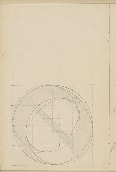
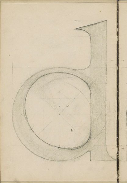
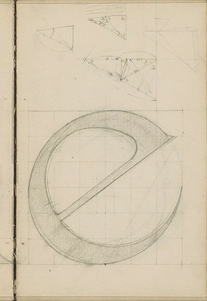
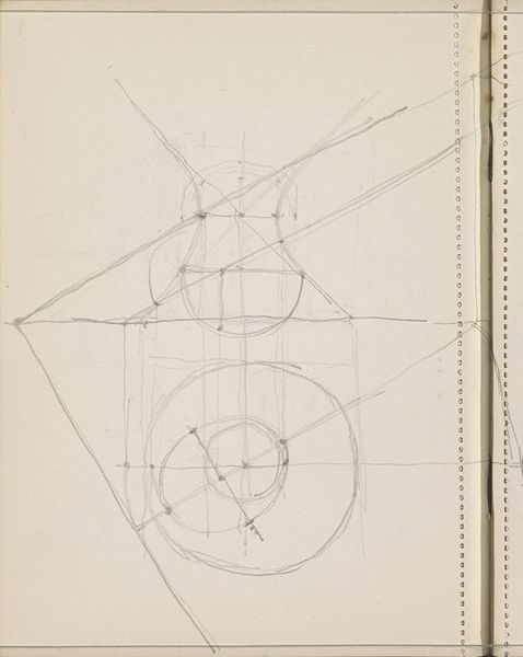
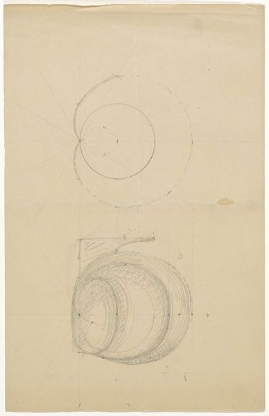
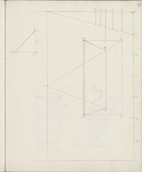
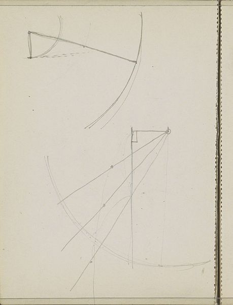
Curator: We’re looking at "Letter ‘D’," a pencil drawing from Antoon Derkinderen, created between 1889 and 1894. It depicts precisely what the title suggests. Editor: My immediate sense is that this feels like a behind-the-scenes glimpse. The sketch evokes the quiet labor involved in constructing meaning—almost a blueprint for an idea, raw and incomplete. Curator: Absolutely. Typographical forms, especially capital letters, carry significant cultural weight. Think about monumental inscriptions, declarations, propaganda; Derkinderen, through his process, isolates this symbolic power. We observe not just the 'D' itself but the underlying structure, the grid—a very deliberate framework upon which the letter takes shape. It calls to mind illuminated manuscripts where initials were artworks themselves. Editor: That grid is so evocative! For me, it conjures a sense of constraint but also potential. The unfinished state throws into sharp relief questions of authority and legibility: Whose rules determine the "correct" form? Does its imperfection subvert established notions? We see the workings, not the imposition of order. I wonder what was its initial design objective: perhaps it's not simply about pure design? Curator: It reminds me of architectural studies or the geometrical studies of Dürer in their careful attempts at systematization. Within that system, a whole aesthetic sensibility emerges, connecting form and function in art. Editor: And consider the historical context. Turn-of-the-century Europe, with rising nationalism and shifting social structures. The visual language, even down to typeface, became intensely politicized, functioning as both a shaper and reflector of identity. Curator: That’s insightful. The beauty emerges not in a perfect execution, but the layers and tentative construction—perhaps a symbol of progress? It makes visible that all images, however stable they may seem, have complicated origins. Editor: Right, the palimpsest effect is potent! By showcasing the letter’s making, Derkinderen provides a quiet yet insistent reminder of art and typography's ability to carry multiple histories and possibilities, whether recognized at first glance or not. Curator: Ultimately, viewing art is really about learning to read beyond the surface. "Letter ‘D’" encourages a type of careful seeing that pays attention to underlayers and to processes that normally get lost to our consumption-driven present. Editor: And I would argue it urges us to question established forms—literal and figurative—by revealing the provisional, constructed nature of even something as seemingly fixed as a letter of the alphabet.
Comments
No comments
Be the first to comment and join the conversation on the ultimate creative platform.
More like this