Copyright: Modern Artists: Artvee
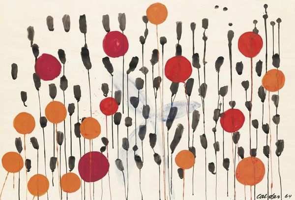
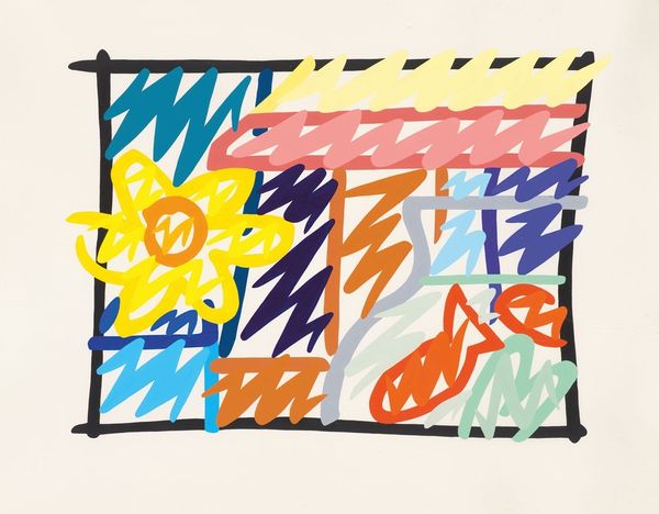
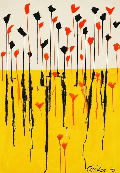
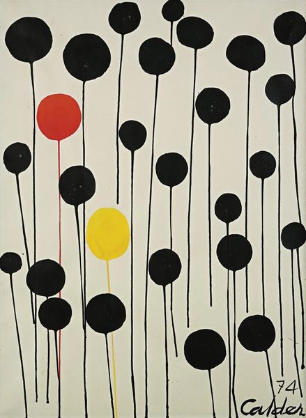
Editor: Here we have Alexander Calder's "Flower," created in 1971, a vibrant print in the Pop Art style. The initial impression is a field of graphic rain intersecting with bold organic shapes in bright yellow and red. What do you see in this piece, viewed through a Formalist lens? Curator: The interest for me lies in the interplay between line and form. Note the dynamic arrangement of linear elements which give the illusion of depth and movement, juxtaposed against the static shapes of the 'flower'. The palette of primary colors, although typical for the period, creates strong contrasts within the flat plane. Observe, too, the textures achieved, and the deliberate use of what may be areas where the artist allowed slight imperfections, contributing to an aesthetic of casualness. Editor: The ‘imperfections’ you mentioned seem crucial for softening the intensity, making it feel less rigid and more inviting, despite its geometrical style. I'm intrigued by how you isolate those aspects to appreciate the work. But is it all intention? Curator: Intent is an interesting area – what an artist truly ‘means’ to convey versus the structural implications of the piece itself are sometimes at odds. It's more rewarding to dissect the visual rhetoric. Note, for example, how the repetition of the slanting lines directs the eye towards the lower portion, framing the flower motif. Editor: So, even if it wasn't Calder's intention to guide my eye, it does so regardless. Focusing on structure gives us a different insight into its aesthetic, it moves away from questions about Calder’s biography and focuses on what the piece 'is' not necessarily where it 'came from’. Curator: Precisely! It allows one to appreciate the intricacies and relationships inherent within the artwork, irrespective of any exterior factors. We start by examining what is tangible.
Comments
No comments
Be the first to comment and join the conversation on the ultimate creative platform.
More like this