drawing, paper
#
script typeface
#
drawing
#
script typography
#
hand-lettering
#
old engraving style
#
hand drawn type
#
feminine typography
#
hand lettering
#
paper
#
hand-drawn typeface
#
thick font
#
handwritten font
#
calligraphy
Copyright: Rijks Museum: Open Domain
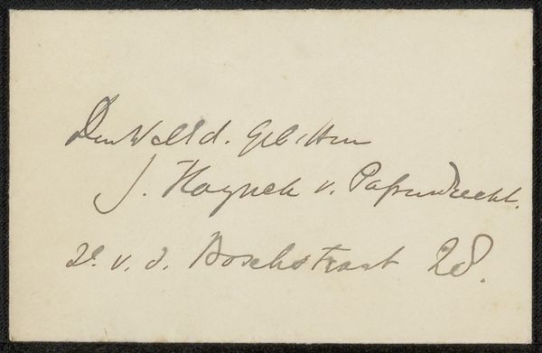
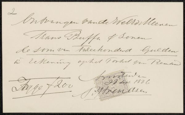
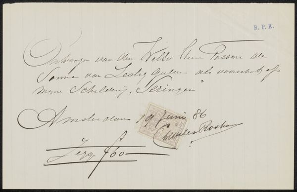
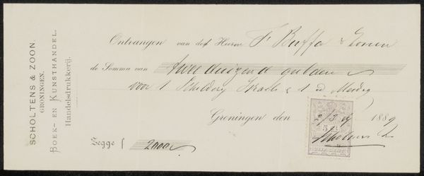
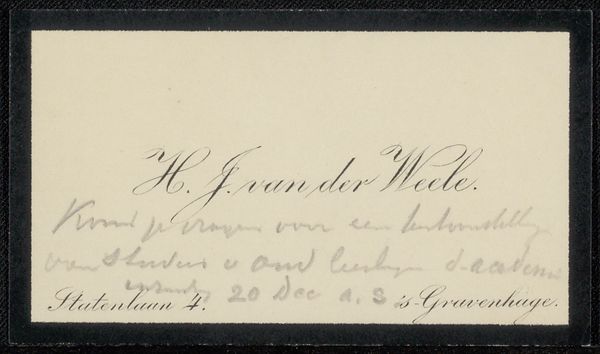
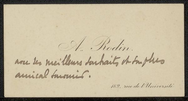
This calling card was made by Gustave Bourcard for Philip Zilcken. The paper is thin and light, an appropriate material for such a fleeting message. But consider the ink, the trace of the pen – these carry their own weight. Bourcard’s handwriting is elegant, practiced, reflective of the hours spent mastering penmanship. Note the careful curves and consistent pressure, revealing the discipline of calligraphic training. This wasn't just about conveying information; it was about presenting oneself as refined, educated, part of a social class with the leisure time for such pursuits. Calling cards like these were social currency, literally. The exchange of these cards represented a contract, a promise of future interaction. So, while seemingly simple, even disposable, this small card speaks volumes about a particular moment in social history, where grace and skill intersected with economic realities. It reminds us that even the most ephemeral objects are embedded with labor, class, and cultural significance.
Comments
No comments
Be the first to comment and join the conversation on the ultimate creative platform.
More like this