drawing, print, paper, ink, engraving, architecture
#
drawing
#
baroque
#
ink paper printed
# print
#
old engraving style
#
landscape
#
paper
#
ink
#
engraving
#
architecture
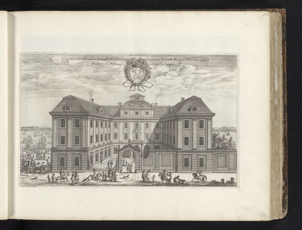
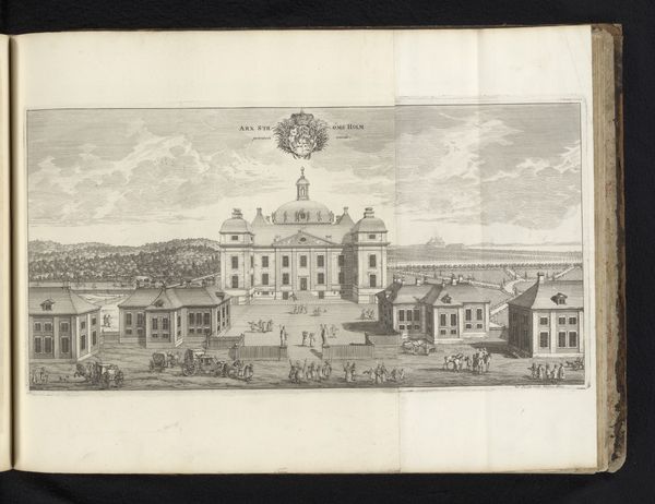
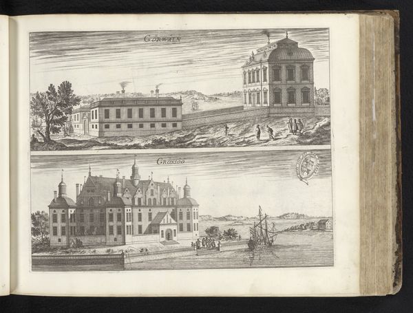
Dimensions: height 216 mm, width 338 mm
Copyright: Rijks Museum: Open Domain
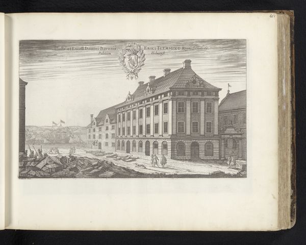
Editor: We’re looking at "Paleis van Schering Rosenhane in Stockholm," a 1670 engraving by Jean Marot. The detail is incredible, almost photographic! But what strikes me is the rather rigid symmetry. What do you see in this piece, Professor? Curator: The geometric rigor evident in the facade is undeniable. Notice the almost obsessive repetition of the windows and the balancing of the wings. But let's not disregard the engraving technique itself. Editor: The lines are so precise, almost architectural in their own right. How does the medium itself impact our reading of the artwork? Curator: Precisely. The very linearity, the stark contrast achieved with ink on paper, contributes to the sense of order and control so prized during the Baroque era. It also underscores the idealized representation of architecture. Ask yourself, what is included and, crucially, what is omitted from this view? Editor: Good question. There is a formality, a detachment... Perhaps a distancing from the reality of daily life within those walls. It’s a very constructed image, isn't it? Curator: Indeed. It's a statement, a projection of power and prestige achieved through the formal language of architecture and the precise execution of the engraving. Editor: I hadn’t considered the effect of the technique on the message so directly before. Curator: Art is not simply *what* is represented, but *how* it is represented. Remember that.
Comments
No comments
Be the first to comment and join the conversation on the ultimate creative platform.
More like this