About this artwork
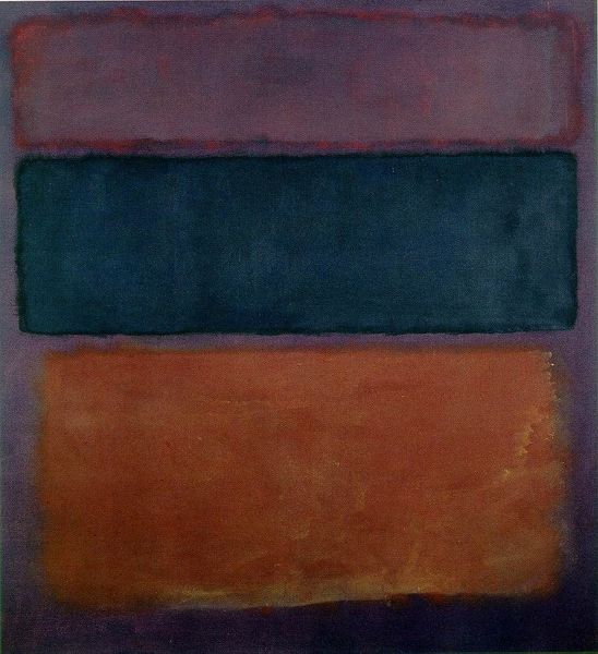
Mark Rothko made this painting of stacked colors, like violet, black, orange, and yellow, on a white and red ground. Looking at the layered rectangles, the edges are fuzzy and kind of dissolve into each other. It feels like Rothko wasn't so interested in hard lines, but more in how colors can vibrate and bleed. Check out where the violet meets the black; it's not a clean break, right? More like a hazy meeting. That’s the process, the doing, it’s like he’s showing us his thinking right there on the canvas. The paint looks thin, almost like a stain, which lets the colors glow from within. There's something very emotional about how these colors sit together. They create a mood, like a landscape of feelings. Rothko reminds me a bit of Agnes Martin, who also used simple forms to create expansive, meditative spaces. I think these are like fields or auras of colour. Ultimately, the feeling we get from art is always a conversation, an ongoing exchange of ideas.
Artwork details
- Copyright
- Mark Rothko,Fair Use
Comments
Share your thoughts
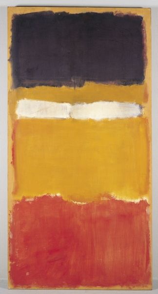
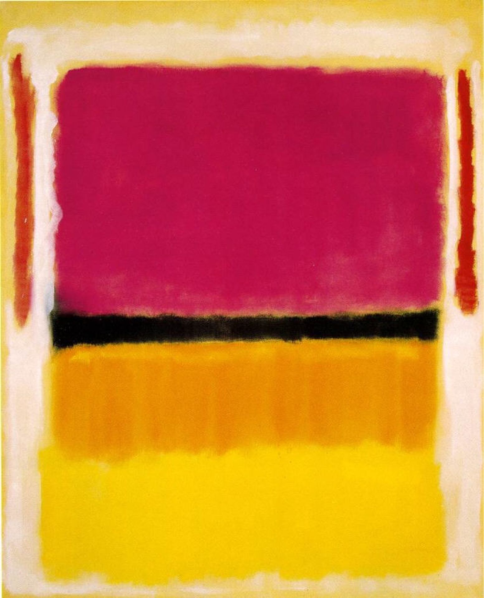
About this artwork
Mark Rothko made this painting of stacked colors, like violet, black, orange, and yellow, on a white and red ground. Looking at the layered rectangles, the edges are fuzzy and kind of dissolve into each other. It feels like Rothko wasn't so interested in hard lines, but more in how colors can vibrate and bleed. Check out where the violet meets the black; it's not a clean break, right? More like a hazy meeting. That’s the process, the doing, it’s like he’s showing us his thinking right there on the canvas. The paint looks thin, almost like a stain, which lets the colors glow from within. There's something very emotional about how these colors sit together. They create a mood, like a landscape of feelings. Rothko reminds me a bit of Agnes Martin, who also used simple forms to create expansive, meditative spaces. I think these are like fields or auras of colour. Ultimately, the feeling we get from art is always a conversation, an ongoing exchange of ideas.
Comments
Share your thoughts