photography
#
portrait
#
script typeface
#
sand serif
#
aged paper
#
homemade paper
#
script typography
#
hand drawn type
#
photography
#
hand-drawn typeface
#
thick font
#
handwritten font
#
publication design
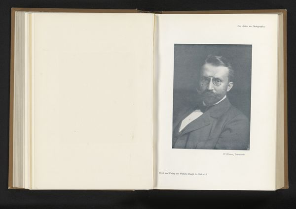
Dimensions: height 227 mm, width 171 mm
Copyright: Rijks Museum: Open Domain
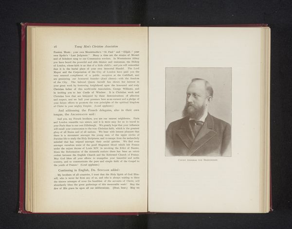
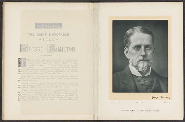
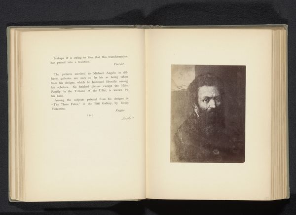
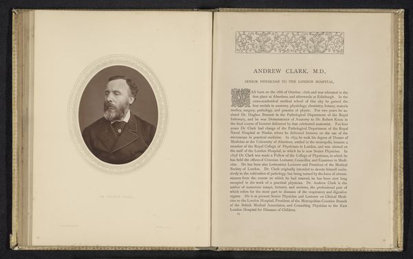
This portrait of His Grace the Duke of Norfolk, made by Elliott & Fry, presents us with a study in contrasts and conventions, typical of late 19th-century photography. The composition is bisected into two distinct halves: on the left, we have text, while on the right, the Duke's photographic portrait. The subdued tones and formal pose of the Duke—stern gaze, meticulous beard—speak to an era deeply invested in notions of dignity, class, and representation. The photograph has soft gradations, capturing the texture of his beard and the glint in his eyes with a delicate balance. The text on the opposing page underscores the sitter's noble lineage. In this structured layout, we see a visual encoding of power, where the Duke's image is meticulously constructed to convey authority. The semiotic interplay between the textual and visual elements invites us to decode the cultural values embedded within this formal portrait. Is it merely a record or a constructed image meant to perpetuate an idea?
Comments
No comments
Be the first to comment and join the conversation on the ultimate creative platform.
More like this