Copyright: CC0 1.0
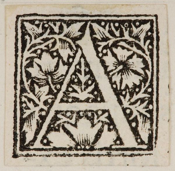
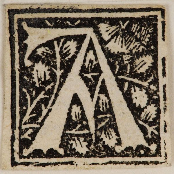
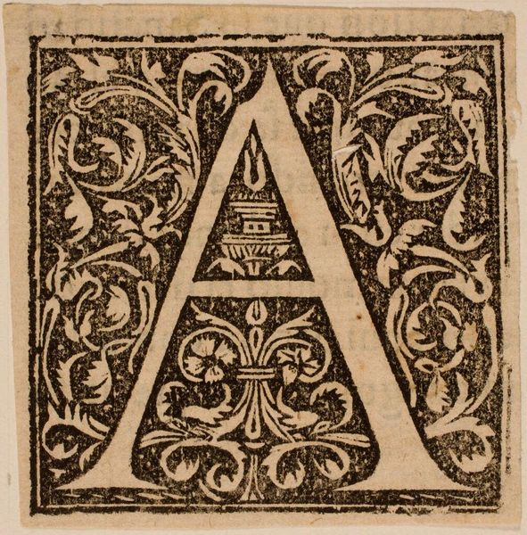
Editor: Here we have Initial A, artist unknown, here on loan from the Harvard Art Museums. It has an almost medieval feel, like something you'd see in an illuminated manuscript. What stylistic elements stand out to you? Curator: Observe how the stark contrast between the black ink and the untouched paper defines the form. The solid letter “A” is counterpoised by the detailed, almost frantic vegetal patterns occupying the negative space. Editor: Almost like the letter is fighting to break free? Curator: Precisely! The framing border further emphasizes this tension, creating a visual dynamism that transcends the simple representation of a letter. The semiotic weight of the 'A' is, therefore, enhanced by its composition. What do you make of the leaves and fruits? Editor: I see your point! Thanks. I'll never look at a letter the same way. Curator: My pleasure. Remember, form dictates function and meaning in art.
Comments
No comments
Be the first to comment and join the conversation on the ultimate creative platform.
More like this