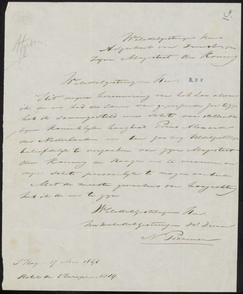
drawing, paper, ink
#
drawing
#
baroque
#
paper
#
ink
#
calligraphy
Copyright: Rijks Museum: Open Domain
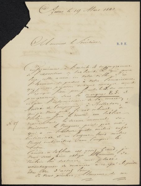
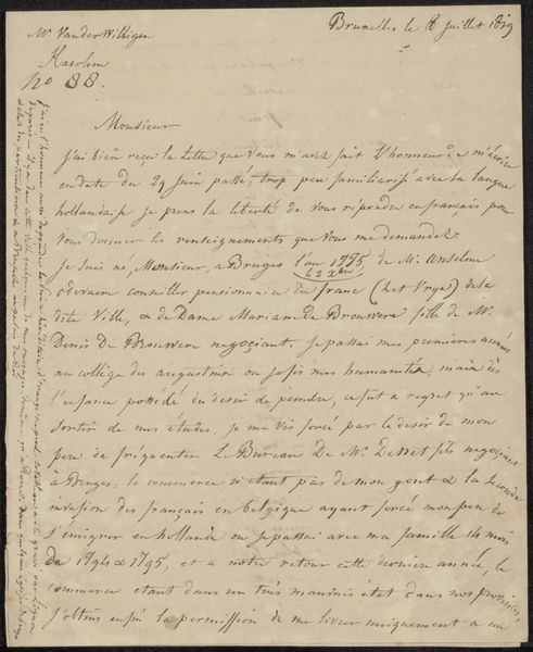
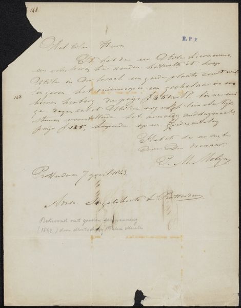
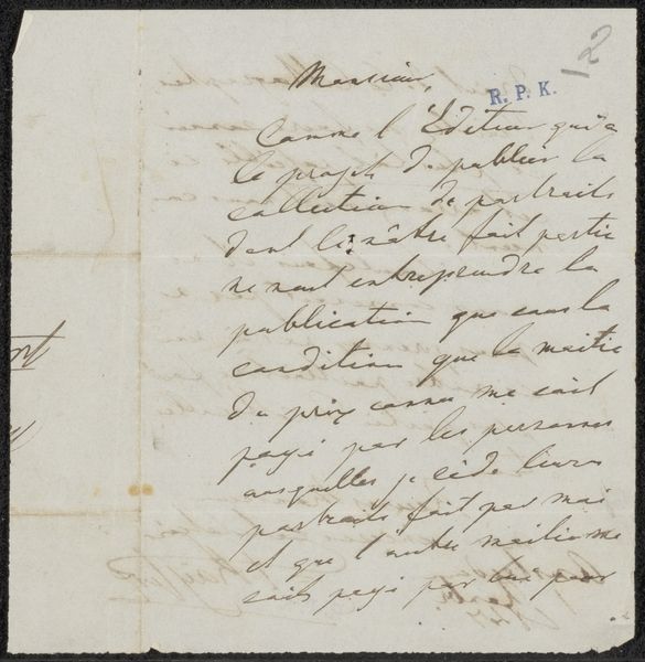
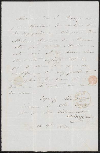
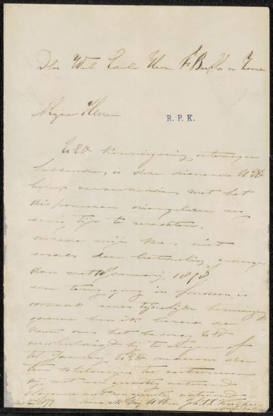
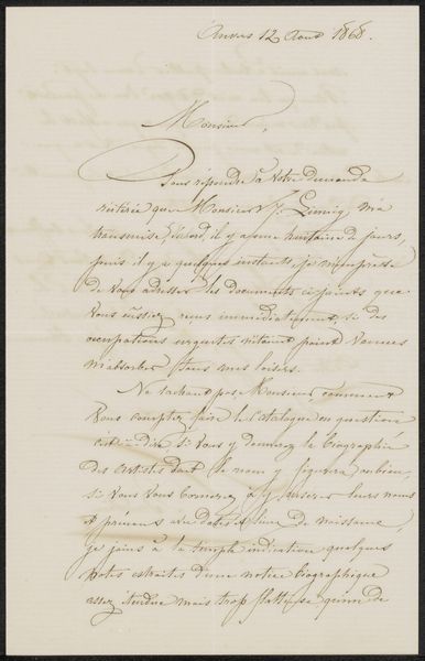
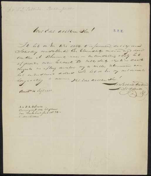
Editor: This is a drawing called "Brief aan anoniem" which translates to "Letter to Anonymous," believed to be from 1681, by Theodoor van der Schuer. It’s ink on paper, so you see all these elegant, looping calligraphic forms filling the space. What can you tell me about it? Curator: Consider how the calligraphy functions as a visual element in itself. The formal qualities of the script – the rhythm of the ascenders and descenders, the weight of the ink, the way the strokes vary from delicate hairlines to bold curves – contribute significantly to our perception of the artwork. Even without understanding the words, we can appreciate the inherent beauty of the forms and their arrangement on the page. The lines and strokes, their contrast against the paper, define the visual texture and the sense of depth. Note also how the flourishes in the script create an interesting negative space within the overall design. Does it evoke a specific mood or tone for you? Editor: It does feel quite formal and even a bit secretive, because of the unreadable, elaborate script and the anonymity of the recipient. The "R. P. K." and other sections of writing seem almost decorative. Curator: Exactly. Consider, how these letterforms and abstract shapes come together in composition. Note the strategic placement of text and open spaces. Also, the blurring of writing and abstraction challenges traditional boundaries, forcing the viewer to focus solely on intrinsic, sensory impressions. Editor: It’s almost like a purely abstract composition, but one made with such deliberate, practiced hand movements. Thanks. Curator: Precisely. The artist manipulates basic visual elements of shape and contrast for effect. Thinking about it from that structural perspective lets us really appreciate van der Schuer’s choices.
Comments
No comments
Be the first to comment and join the conversation on the ultimate creative platform.
More like this