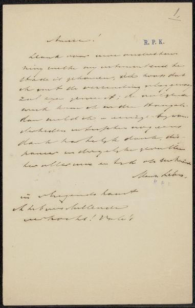
drawing, paper, ink, pen
#
drawing
#
pen sketch
#
paper
#
ink
#
romanticism
#
pen
Copyright: Rijks Museum: Open Domain
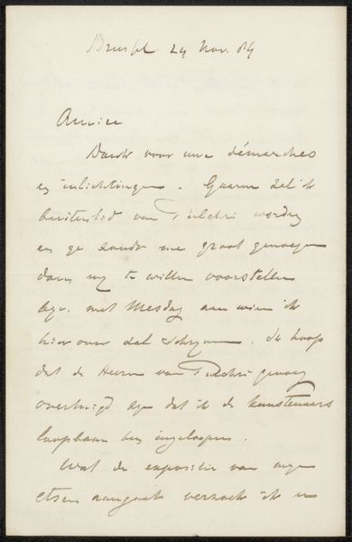
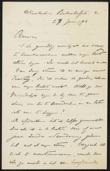
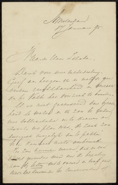
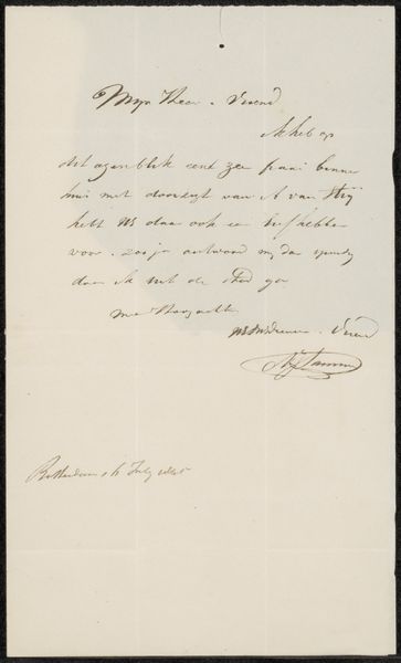
This is "Brief aan Jean Zacherie Mazel" made by Pieter Gerardus van Os in 1835. The artwork is composed of calligraphic lines of ink on paper. The writing, in Dutch, speaks of engagements and expectations, but let's look at it formally. The visual weight is distributed unevenly, with denser clusters of text towards the upper half, creating a sense of top-heaviness. This imbalance plays with our expectations. Typically, we anticipate symmetry or a balanced asymmetry. The script itself varies in pressure and thickness. This variation introduces a rhythm, almost like musical notation on a page. The stark contrast between the dark ink and the pale paper heightens the visual impact of the lines. This interplay of positive and negative space is fundamental. Each word, each stroke, defines not just itself but the space around it. Van Os gives us more than a letter; he presents a visual field where language and form intertwine. The letter defies conventional interpretation and becomes a study in the aesthetics of communication.
Comments
No comments
Be the first to comment and join the conversation on the ultimate creative platform.
More like this