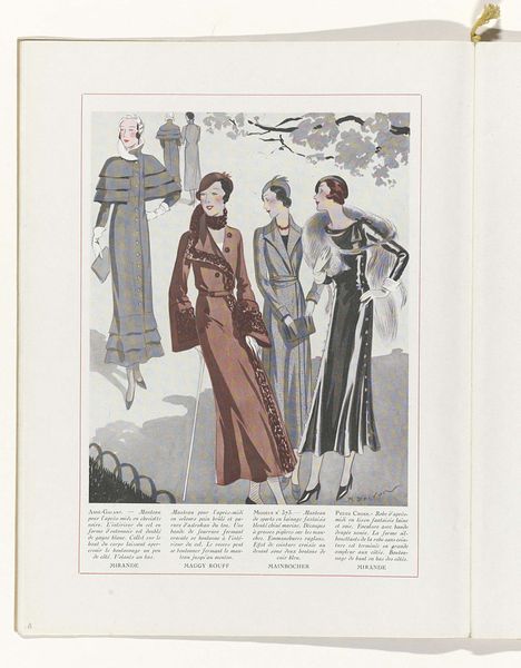
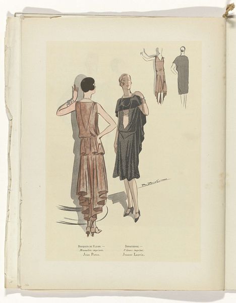
Femina, Mars 1928: 6: twee vrouwen in jurken van Mirande en Beer met twee details van jurken van Lucien Lelong en Redfern 1928
0:00
0:00
drawing, print, paper
#
art-deco
#
drawing
# print
#
fashion mockup
#
paper
#
historical fashion
#
visual diary
#
fashion sketch
Dimensions: height 352 mm, width 224 mm
Copyright: Rijks Museum: Open Domain
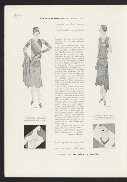
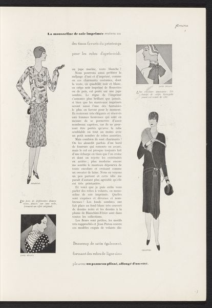
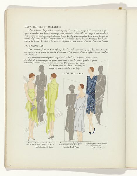
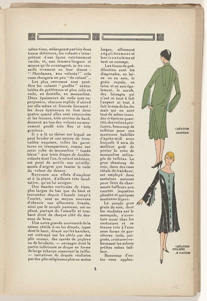
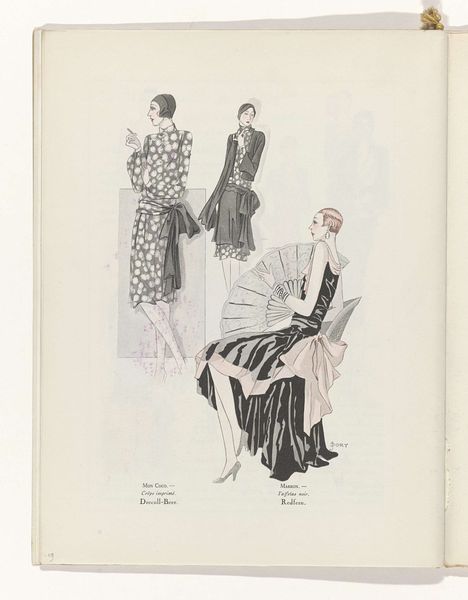
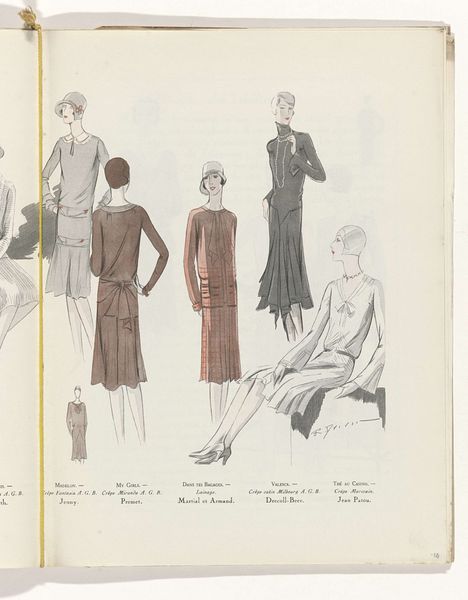
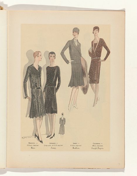
This magazine spread from March 1928 presents fashion as a graphic arrangement. The anonymous artist—or maybe team of artists—uses a straightforward approach to capture the essence of early twentieth-century style through a limited tonal range, focusing on shape and form. Look at how the details are rendered—the even distribution of black and white creates a flattened effect, so the figures almost emerge as stylish paper cut-outs. The dresses on the women on either side of the composition become blocks of pattern, inviting us to see fashion design as a process of arranging shapes, colors, and textures to create visual harmony. It reminds me of the way Matisse would cut out shapes when he was too old to stand at a canvas, arranging them until he got the composition just right. This approach echoes the work of fashion illustrators like Erté, who also distilled complex designs into elegant, simplified forms. These artists seem to be saying that ambiguity is not a problem to be solved, but a condition of art.
Comments
No comments
Be the first to comment and join the conversation on the ultimate creative platform.
More like this