About this artwork
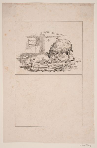
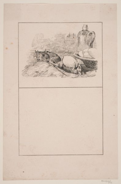
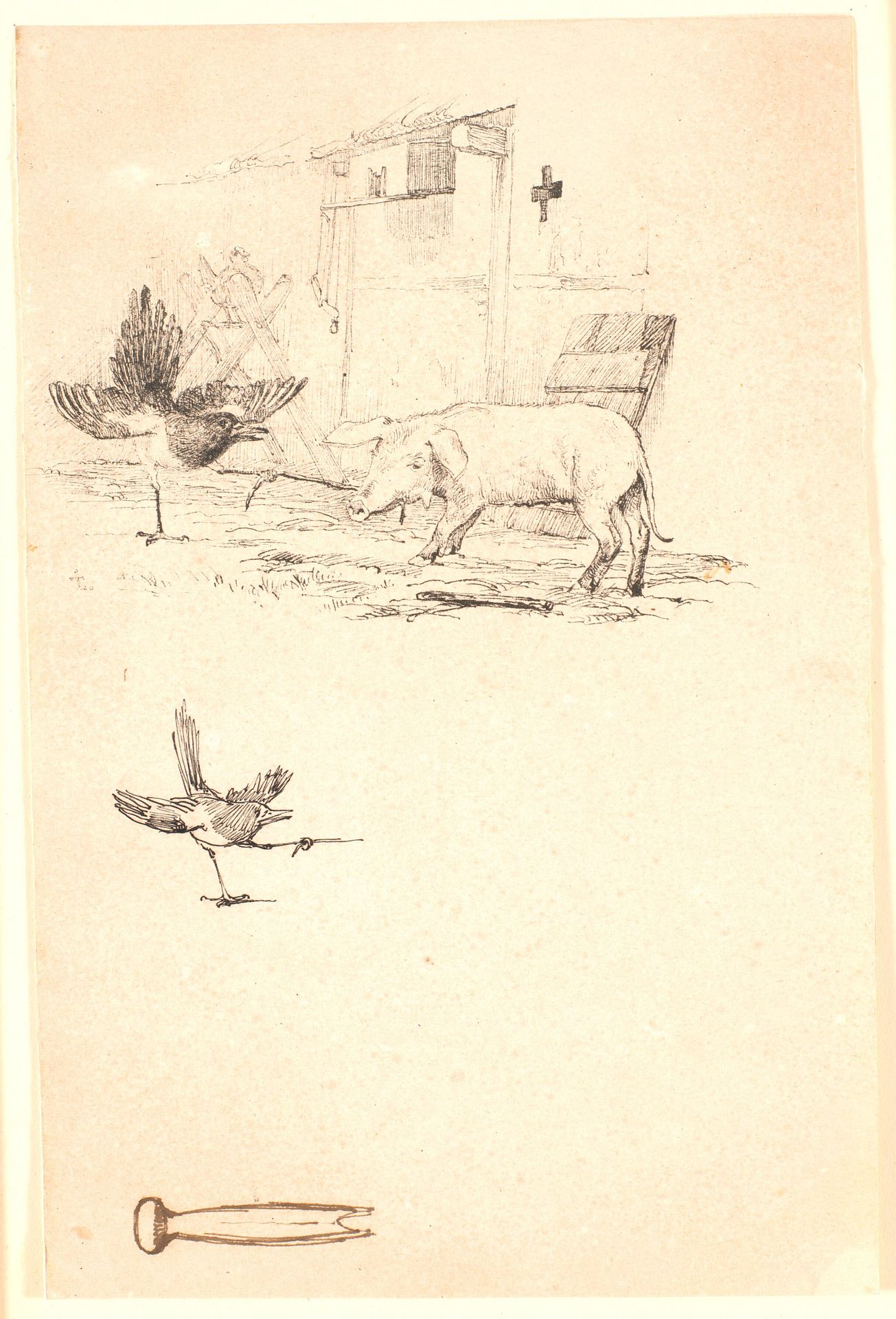
Editor: Here we have Johan Thomas Lundbye’s 1843 ink drawing, "The Stork and the Pig," part of an illustration for children’s fables. It seems rather sparse, but there's a dynamic contrast between the precise rendering of the animals and the sketchier architectural elements. What stands out to you about its composition? Curator: Indeed. Consider the linearity present. The controlled, almost scientific, rendering of the stork contrasts sharply with the softer, more volumetric depiction of the pig. Note how the cross-hatching defines the pig's form, whereas the stork's detail arises from concise lines. The bottom figure replicates the general shape of the upper stork; together they resemble abstract wings, or perhaps open and closing gestures, a curious relationship. Editor: That’s interesting; I hadn’t noticed the similarity in their shapes. And the tool-like shape near the bottom of the sketch–what is that? Curator: A pertinent question. It is positioned in stark isolation from the rest of the scene. What is most compelling here is that this isolate shape rhymes, in its elongated form, with the long and flat-planed face of the pig above. As if an echo of the drawing process made solid. Do you think that this compositional analysis affects how we consider the fable’s meaning? Editor: Absolutely. By emphasizing the formal relationships within the work, you de-emphasize any potential symbolic interpretation, making me focus instead on how Lundbye constructs form and space through line. Thanks for the insight! Curator: You are very welcome; close inspection can unveil many layers.
Storken og grisen. Nedenunder studie af skaden og et stykke værktøj. Illustration til Kaalunds "Fabler for Børn". Se kommentar fra arkkatalog.
1843
Artwork details
- Medium
- drawing, print, ink, pen
- Dimensions
- 108 mm (height) x 138 mm (width) (bladmaal)
- Location
- SMK - Statens Museum for Kunst
Tags
Comments
Share your thoughts
About this artwork
Editor: Here we have Johan Thomas Lundbye’s 1843 ink drawing, "The Stork and the Pig," part of an illustration for children’s fables. It seems rather sparse, but there's a dynamic contrast between the precise rendering of the animals and the sketchier architectural elements. What stands out to you about its composition? Curator: Indeed. Consider the linearity present. The controlled, almost scientific, rendering of the stork contrasts sharply with the softer, more volumetric depiction of the pig. Note how the cross-hatching defines the pig's form, whereas the stork's detail arises from concise lines. The bottom figure replicates the general shape of the upper stork; together they resemble abstract wings, or perhaps open and closing gestures, a curious relationship. Editor: That’s interesting; I hadn’t noticed the similarity in their shapes. And the tool-like shape near the bottom of the sketch–what is that? Curator: A pertinent question. It is positioned in stark isolation from the rest of the scene. What is most compelling here is that this isolate shape rhymes, in its elongated form, with the long and flat-planed face of the pig above. As if an echo of the drawing process made solid. Do you think that this compositional analysis affects how we consider the fable’s meaning? Editor: Absolutely. By emphasizing the formal relationships within the work, you de-emphasize any potential symbolic interpretation, making me focus instead on how Lundbye constructs form and space through line. Thanks for the insight! Curator: You are very welcome; close inspection can unveil many layers.
Comments
Share your thoughts