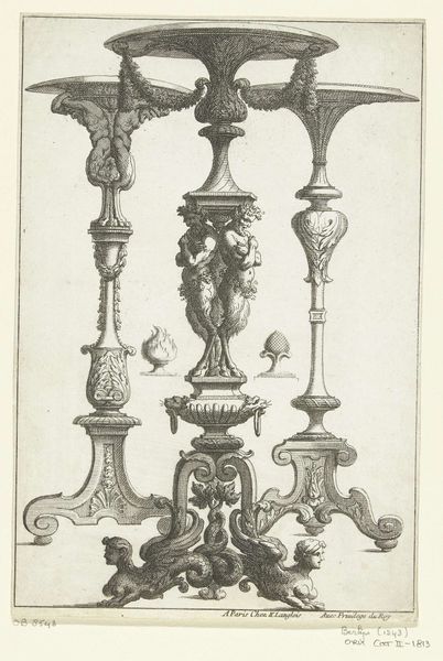
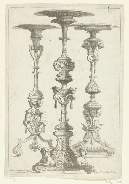
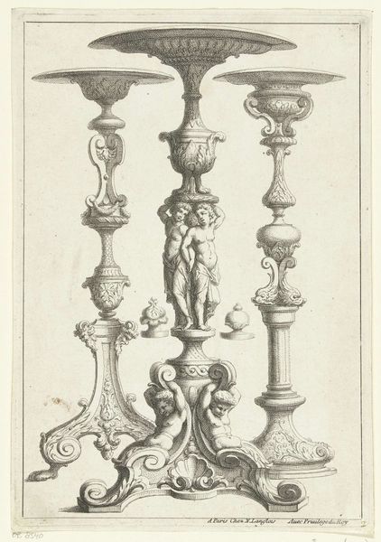
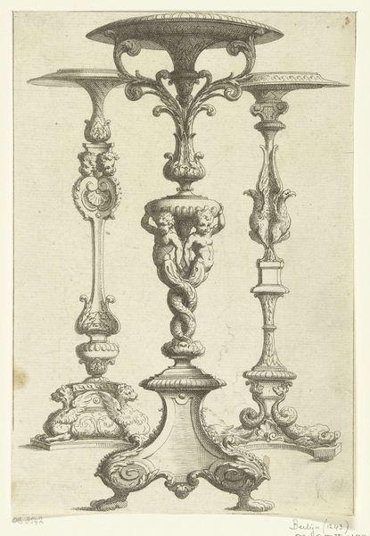
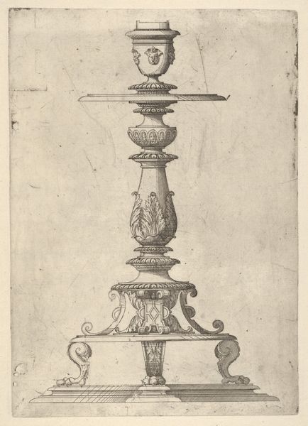
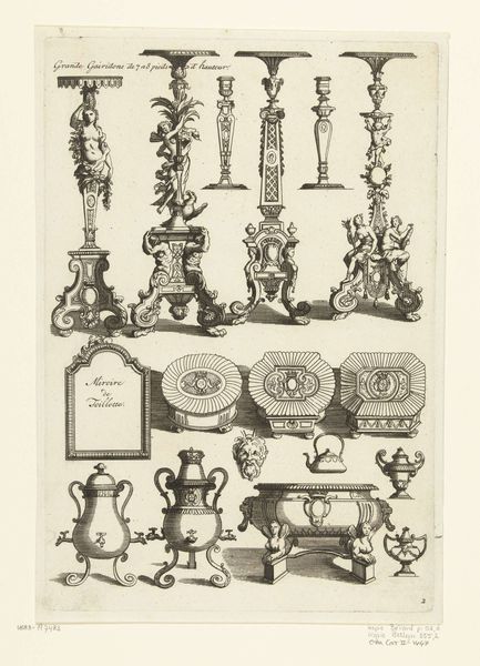
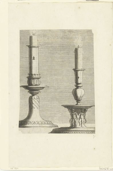
Nouveaux dessins de guéridons dont les pieds son propres pour des croix before 1692
0:00
0:00
alexisloir
Rijksmuseum
drawing, graphic-art, print, metal, engraving
#
drawing
#
graphic-art
#
baroque
# print
#
metal
#
old engraving style
#
etching
#
form
#
line
#
engraving
Dimensions: height 235 mm, width 159 mm
Copyright: Rijks Museum: Open Domain
Curator: This engraving, titled "Nouveaux dessins de guéridons dont les pieds sont propres pour des croix," presents several table designs. It comes to us from before 1692 and is attributed to Alexis Loir. Editor: My initial reaction is one of complexity, but a slightly rigid complexity. The composition, especially given that we’re seeing several designs together, strikes me as rather formal. The line work is meticulous but somehow doesn't quite breathe. Curator: Considering Loir's era, we're deeply embedded in the Baroque period, a time when ornamentation and elaborate design reflected social power and religious authority. This piece provides insight into the artistic designs available, perhaps acting as templates, offering designers guidance in crafting objects that speak to particular patrons, be it for church or noble house. Editor: Indeed. Structurally, observe how Loir uses repeating motifs and carefully modulated line weights to create a sense of depth, if even a bit reserved, in these elevations. The mirroring in each individual design, along with their varied heights and base ornamentations, does create an appealing rhythmic visual structure. Curator: Beyond the obvious functionality, the figures, like the putti and other decorative forms worked into the stands, offer clues to cultural values, beliefs around beauty and virtue. Also, take the literal title here. "Feet Proper for Crosses." What relationship did these table designs have with Christianity? Editor: That reference does jar slightly with their overtly decorative character, doesn't it? Still, notice the delicate rendering of the figures, they create a compelling contrast with the stricter architectural features in the middle part of each table design. It's precisely this visual counterpoint that yields its specific quality of "Baroque." Curator: Examining this work prompts critical reflections on consumption and class, asking what societal messages the visual language conveys to its consumers, or simply to its viewers like ourselves. Editor: For me, I’m interested in how such precise graphic techniques might abstract actual objects and transform the relationship of objects in an interior. Considering that this exists in the visual space as pure line… interesting to me how its message transcends and exists through it. Curator: Thinking about design in that period also forces us to look at intersections with colonization, because such display became increasingly intertwined with exploiting labor in the colonies, both human and material. Editor: A valid point, indeed. My perspective today has really centered around form, how such delicate design translates to greater conceptual narratives.
Comments
No comments
Be the first to comment and join the conversation on the ultimate creative platform.
More like this