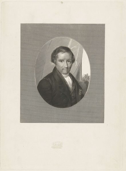
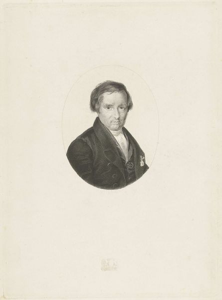
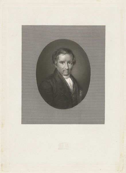
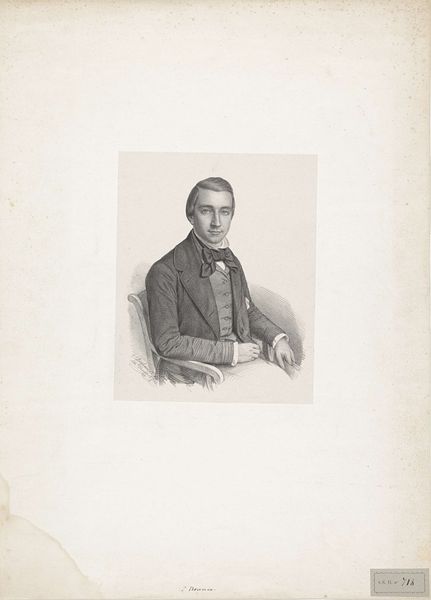
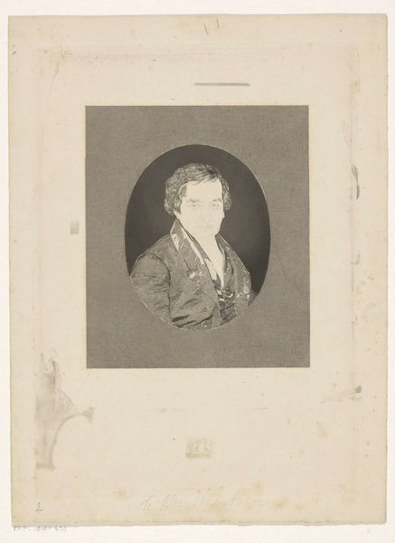
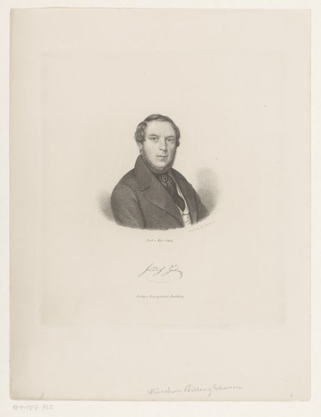
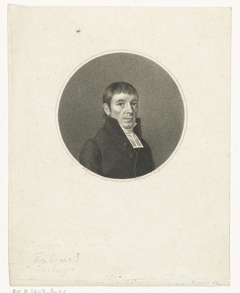
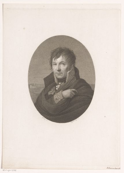
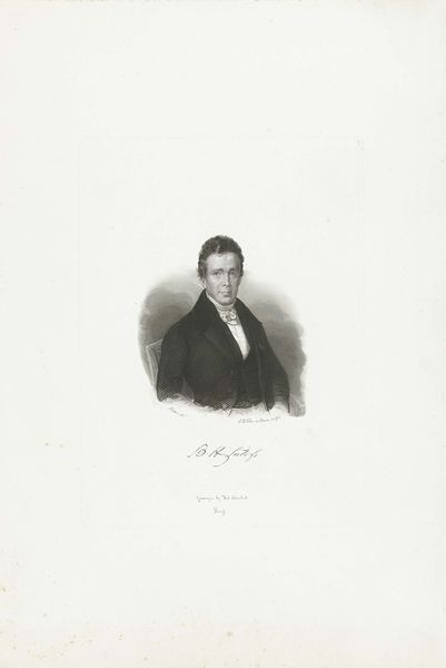
print, engraving
portrait
pencil drawing
romanticism
limited contrast and shading
engraving
Dimensions: height 300 mm, width 220 mm
Copyright: Rijks Museum: Open Domain
Editor: Here we have a print titled “Portret van Willem de Clercq,” created sometime between 1829 and 1845. The artist is Henricus Wilhelmus Couwenberg. It’s an engraving, and what strikes me immediately is its gentle tonality. How do you read this piece from a formalist perspective? Curator: I'm immediately drawn to the careful modulation of light and shadow. Observe how the artist employs delicate lines to define the contours of De Clercq’s face and the fall of fabric in his jacket. Note how the oval format emphasizes the subject. The gaze, coupled with the tight framing of the composition, commands your attention. The cross-hatching also guides our reading. What does it convey? Editor: I hadn’t considered that so closely, but now that you point it out, it seems to lend a certain softness while simultaneously defining form. Curator: Precisely. And it also introduces a visual rhythm that enlivens the surface. The relatively limited contrast creates a subdued yet intimate effect, pushing us toward introspection. How does that compare to the figures behind de Clercq, viewed through the window? Editor: The people outside seem less individual. Maybe more focused on society than this solitary man? I noticed those shapes but hadn't made much of them. Curator: The difference highlights the individuality celebrated in portraiture of this period, doesn't it? By observing its visual organization and its technical execution, we are invited to meditate on the work's deeper intent. Editor: Absolutely. Considering the interplay of light, form, and texture has unlocked a new way for me to approach prints. Curator: Agreed. Focusing on intrinsic elements provides a powerful analytical tool, opening dialogues and interpretations through visual evidence alone.
Comments
No comments
Be the first to comment and join the conversation on the ultimate creative platform.