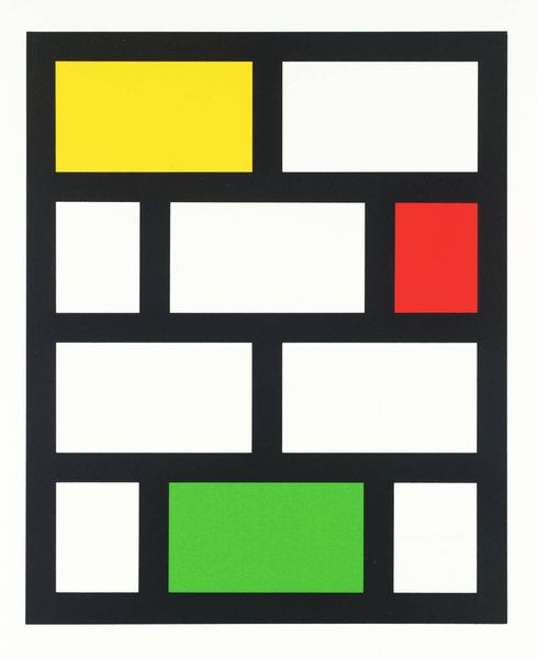
glass, installation-art
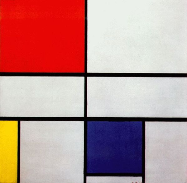
de-stijl
geometric pattern
glass
geometric
installation-art
abstraction
Dimensions: 57 x 38 cm
Copyright: Public domain
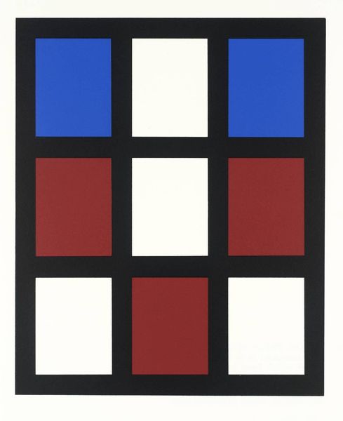
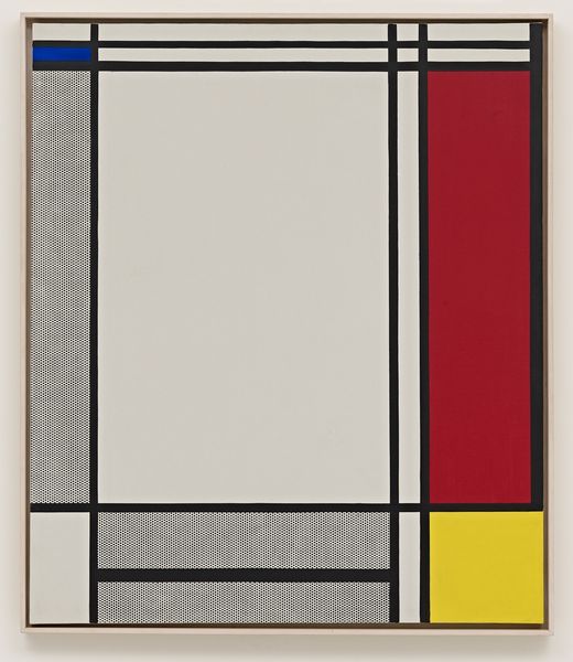
Curator: Right, let's talk about this stained glass window, or rather, this work in leaded glass by Theo van Doesburg. A beautiful example of de Stijl. What’s your first take on it? Editor: Honestly? It feels like a Mondrian painting got pixelated. All these pure, primary colors contained in that strict grid… It’s like looking at a minimalist city from above. I find it rather playful, despite its apparent rigidity. Curator: The window, indeed, embraces geometric abstraction characteristic of the De Stijl movement. Notice the strategic use of colour—red, blue, yellow, white. For Van Doesburg, these colours weren’t just aesthetic choices, but rather fundamental expressions. Editor: It definitely hits that same harmonic vibe as a Mondrian or Rietveld piece—simple elements dancing in organized tension, that De Stijl harmony, a complete aesthetic environment, if you will. Curator: Precisely. De Stijl sought to achieve a visual harmony through simplified geometric forms and primary colours. These are the elements for, what they believed would reflect a new utopian social order. You will agree it also appears radical for stained glass. Editor: Oh, it's a rebellion against traditional stained glass, without a doubt. No saints, no biblical scenes—just pure, abstract form. But does that mean it can’t communicate spiritually, then? The simplicity forces us to pause, to focus… there's a kind of meditative quality about it. It might actually be perfect for a meditative, mindful activity to encourage calm reflection. Curator: And the black lead lines? Aren't they interesting! Structurally and symbolically, they confine, sure, but they also define the light, allowing it to illuminate. A contrast that suggests structure versus chaos? Editor: Light as liberation... Nice. Looking at it more I keep circling back to those warm yellow/brown squares, how their position on the left really messes with the strict visuality and makes you aware you're experiencing glass - rather than pure structure. That warmth. Curator: Indeed. A lot of people may perceive that as imperfect. Editor: See, there is my way in - these very physical squares make it "imperfectly, perfectly" appealing and dare I say charming. Curator: So, looking back, this artwork's commitment to elemental shapes still challenges conventions to elicit pure, elevated beauty and thought, doesn't it? Editor: Absolutely. A city of colored light in perfect, yet subtly flawed balance, still creating something transcendent. A very neat trick, indeed.
Comments
No comments
Be the first to comment and join the conversation on the ultimate creative platform.