drawing, ink, pen
#
portrait
#
drawing
#
line-art
#
pen illustration
#
figuration
#
line art
#
ink line art
#
ink
#
symbolism
#
pen
Copyright: Public domain
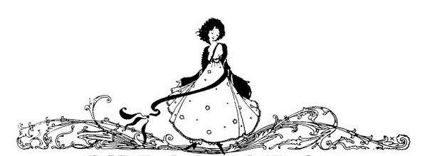
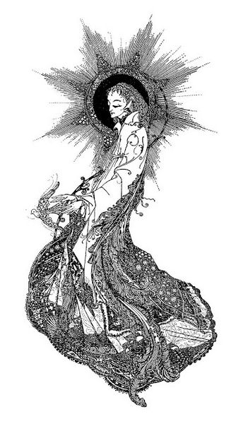
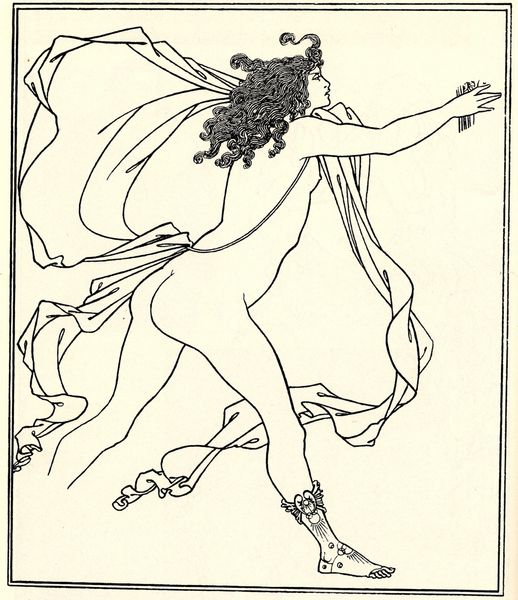
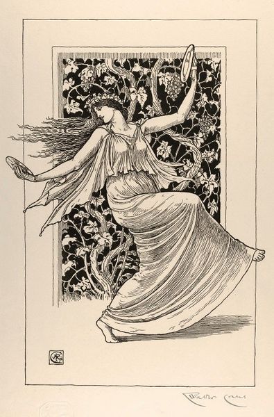
This illustration, "The Year's at the Spring," was created by Harry Clarke, sometime before 1931, using ink on paper, I'd imagine. What grabs me first is the way the super-fine, almost obsessive hatching of lines creates the gown's texture. It's so delicate, yet so precise, giving the whole image a kind of dreamy, ethereal quality. You can almost feel the weight of the ink as it builds up to define the folds and shadows. And then, look at the little flowers strung around like a garland. They seem to float, framing the figure and the landscape behind. The contrast between the detailed dress and the more loosely defined background is really interesting. It's like Clarke is inviting you to focus on the emotional experience of spring, the feeling of lightness and renewal, more than any literal representation. It reminds me a little of Beardsley, but with more overt sentimentality. It’s so evocative, yet wonderfully ambiguous.
Comments
No comments
Be the first to comment and join the conversation on the ultimate creative platform.
More like this