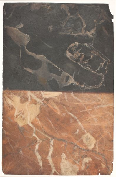
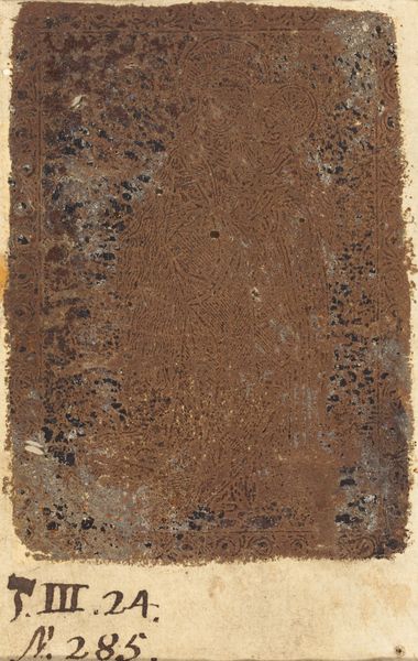
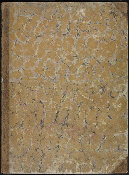
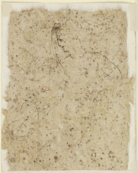
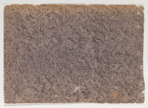
Udkast til to forskellige typer marmorering, en sortblå og en gyldenhvid. 1668 - 1669
0:00
0:00
drawing, mixed-media, watercolor
#
drawing
#
mixed-media
#
water colours
#
baroque
#
watercolor
#
abstraction
#
mixed medium
Dimensions: 322 mm (height) x 209 mm (width) (bladmaal)
Curator: Looking at Lambert van Haven's "Udkast til to forskellige typer marmorering, en sortblå og en gyldenhvid", created between 1668 and 1669, one can’t help but reflect on the socio-political landscape of the period. The Baroque era saw immense disparities in wealth and power, mirroring the artificial elegance and imposed structure so present in artistic styles and the lavish, marble interiors of the elite. Editor: My first impression is its stark division—the canvas split horizontally between a light, swirling texture above and a dark, marbled plane below. It's incredibly balanced. Curator: Precisely. But this balance can be interrogated further. What is Van Haven attempting to represent through these carefully arranged mixed media drawings? One might propose the dark marble, perhaps meant to represent a foundation or support system, contrasts sharply with the lightness above, evoking dialogues around materiality, luxury, and labor that structured the early modern world. Editor: It's fascinating how Van Haven manages to capture the essence of marble through watercolor and drawing. The upper half seems almost cloud-like in its form, yet those subtle veins imply the hard, unyielding nature of stone. The dark lower register could serve as the underpainting that visually balances the piece, and gives gravity to the entire work. Curator: This work may hint at power dynamics and the subjugation of nature through artifice, which might have resonated with the experience of artisans and craftspeople contributing to this very construction. And we cannot deny its impact on identity, especially that of marginalized communities often forced into providing resources for aristocratic families. Editor: Your point regarding these artisans and their perspectives prompts new ways to look at art. Even in this seemingly simple sketch, semiotics unveils layered complexity. Its value, as it stands, resides on his clever combination of these raw and contrasting textures, each suggesting a complex symbolic world that begs interpretation. Curator: In revisiting this composition, I consider how we can learn to reassess historical canons. It encourages thinking more about art in terms of intersectional analysis that include concerns like power structures that were present in our histories. Editor: Reflecting on this work, the beauty really lies in the inherent formal elements of this sketch. Its delicate contrasts and skillful representation—invite ongoing reflection and an almost inexhaustible range of perspectives.
Comments
No comments
Be the first to comment and join the conversation on the ultimate creative platform.
More like this