Copyright: CC0 1.0
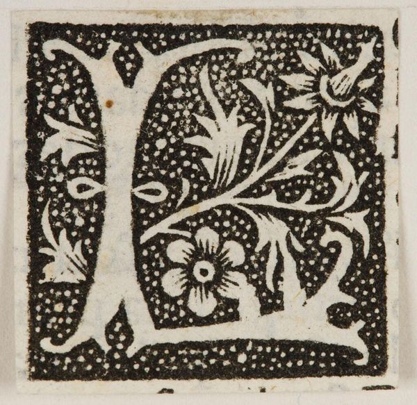
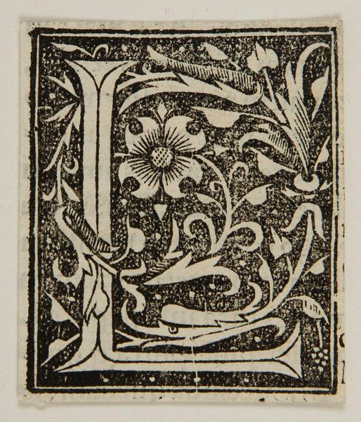
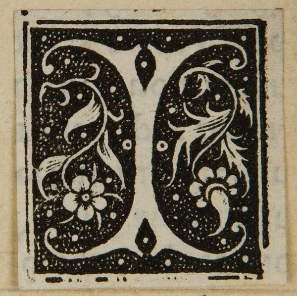
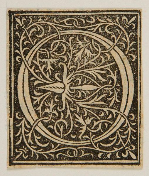
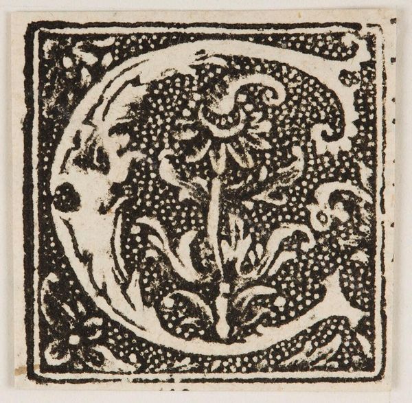
Curator: The "Letter I," held at the Harvard Art Museums, immediately strikes me with its stark black and white contrast. The floral motifs lend it a delicate, almost paradoxical feel. Editor: It's fascinating to consider how such a seemingly simple design can carry so much cultural weight. Think about the power of literacy, of language, and who historically had access to it. Curator: Absolutely, the initial "I" – often used to begin illuminated manuscripts—is steeped in tradition, privilege, and power structures. The floral elements, though decorative, could be a coded language, a subtle rebellion even. Editor: Or perhaps they represent nature, growth, the blossoming of knowledge itself. The high contrast, the texture created by the tiny dots, these choices add depth. Curator: I see it as a commentary on accessibility. Who gets to interpret, who gets to learn, and how does that shape our understanding of the world? Editor: It certainly invites further visual investigation and thinking! Curator: It is a reminder that even in the smallest details, history resonates.
Comments
No comments
Be the first to comment and join the conversation on the ultimate creative platform.
More like this