Dimensions: height 114 mm, width 159 mm
Copyright: Rijks Museum: Open Domain
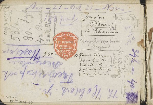
Willem Cornelis Rip made these notes, including addresses, on a small piece of paper, and it feels like catching a glimpse into his process. The pencil marks are light, fleeting, and kind of all over the place, like thoughts jotted down in a hurry. You can see the eraser smudges, the crossed-out words, the changes of direction – all the beautiful imperfections that reveal the hand of the artist. The texture is smooth, almost like tracing paper. The gray pencil is offset by a bright orange stamp. It feels intimate, personal, like stumbling upon a page torn from a private sketchbook. Look at how some words are emphasized with a heavier line, while others fade into the background. The word "Hattum" stands out with a looping quality. It's not just about information; it's about the rhythm and energy of writing. This reminds me of Cy Twombly, another artist who turned the act of writing into a kind of abstract poetry. It's like Rip is showing us that art isn't just about the finished product, it's about the messy, imperfect, and totally human process of getting there.
Comments
No comments
Be the first to comment and join the conversation on the ultimate creative platform.
More like this