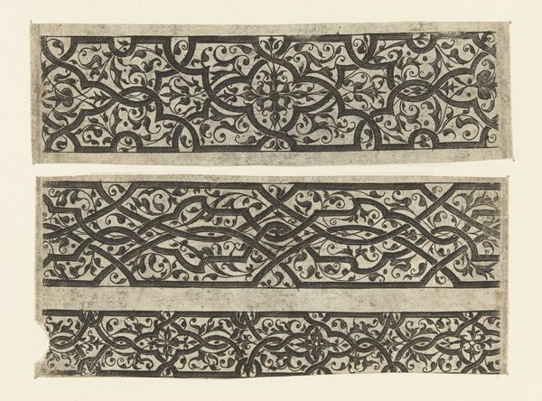
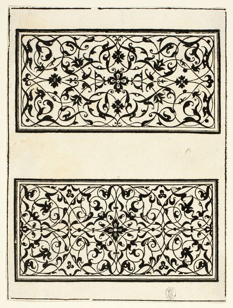
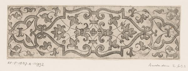
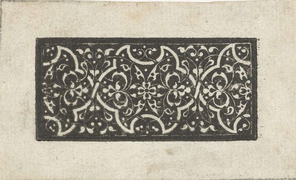
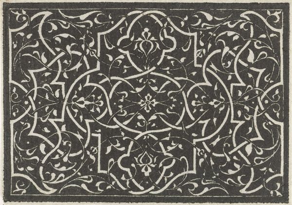
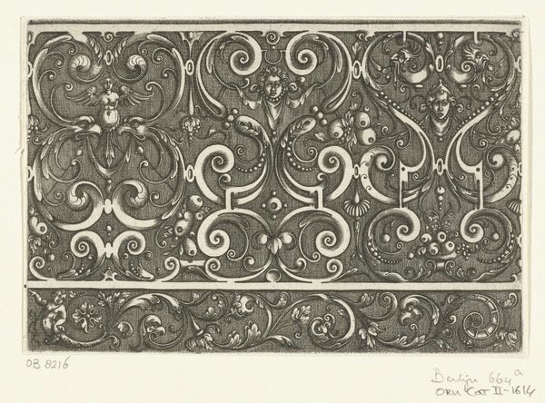
Twee brede friezen met zwarte moresken op een witte ondergrond 1528 - 1580
0:00
0:00
balthazarvandenbos
Rijksmuseum
print, engraving
# print
#
pattern
#
11_renaissance
#
linocut print
#
decorative-art
#
engraving
Dimensions: height 49 mm, width 114 mm, height 46 mm, width 114 mm
Copyright: Rijks Museum: Open Domain
Curator: Right now we're looking at a print called "Twee brede friezen met zwarte moresken op een witte ondergrond", which translates to "Two broad friezes with black moresques on a white background". It's attributed to Balthazar van den Bos and dates back to between 1528 and 1580. It is housed right here at the Rijksmuseum. Editor: My immediate reaction is of ornate repetition—a sort of hypnotically patterned world held neatly within these defined borders. They look like templates for decorating something grander. Curator: Exactly. These types of prints were crucial for disseminating design ideas during the Renaissance. Think of them as the Instagram of the 16th century for artisans and architects! Editor: I like that! So it’s not necessarily fine art in the sense we think of it now, but more like a manual or a catalog. Though, of course, there is artistry here, in the curves and the little floral flourishes tucked into every space. Did they literally cut these patterns from wood, or how was it made? Curator: This one’s an engraving, actually. Think of it, yes, a guide to creating decorative borders. Moresques, the style showcased here, draw heavily from Islamic art and architecture, often featuring interlaced foliage and geometric patterns. We often see these kind of embellishments cropping up on various surfaces from furniture to bookbindings, speaking to this era's intense cultural exchange. Editor: So, its appeal then stretches far beyond purely aesthetic, it gives us a glimpse of the circulation of forms and ideas at the time. It makes me think about the ease with which patterns now go viral compared to how special something like this would have felt then! I also feel these swirling, knot-like images create a strange combination of serenity and controlled chaos, right? Curator: Absolutely! The black and white contrast emphasizes both the intricacy of the details and creates a grounding feeling with all these sinuous lines. It’s interesting how the Renaissance adapted and reimagined these Moorish elements. There’s an appropriation to consider, naturally, but also a deep fascination. Editor: Agreed! The dialogue between cultures is captured within its details. Thank you. I feel so enriched now. I wonder where some of these motifs eventually landed? Curator: I guess our treasure hunt can start right now! Hopefully listeners will continue their quest somewhere else in the Rijksmuseum.
Comments
No comments
Be the first to comment and join the conversation on the ultimate creative platform.
More like this