drawing, graphic-art, paper
#
portrait
#
drawing
#
graphic-art
#
aged paper
#
script typography
#
hand-lettering
#
hand drawn type
#
hand lettering
#
paper
#
personal sketchbook
#
hand-drawn typeface
#
intimism
#
fading type
#
thick font
#
golden font
#
calligraphy
Copyright: Rijks Museum: Open Domain
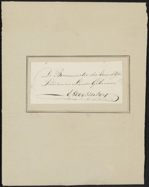
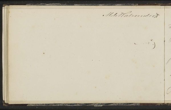
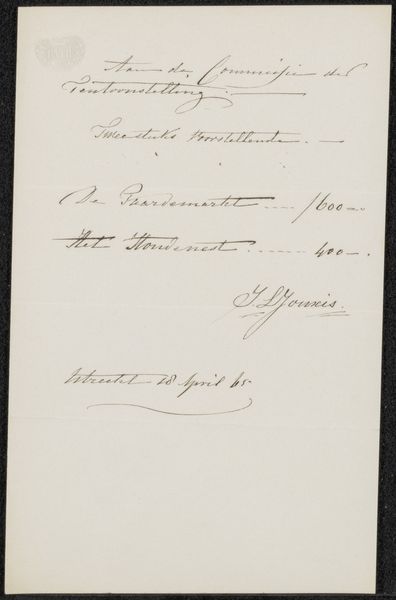
This visiting card was made by Marinus van der Maarel for Philip Zilcken. I love how the elegant script sprawls across the card’s surface, a deliberate act of formal display. It's got this kind of creamy, off-white ground, like old paper that’s been holding secrets for ages. The ink, a delicate, faded black, gives it a ghostly quality, a whisper from the past. The cursive almost dances, each letter carefully rendered with a flourish. Notice how the loops of the 'v' and 'd' in 'van der Maarel' loop and curve. It’s as if the artist is not just writing a name, but performing a kind of dance across the page, an echo of a formal greeting. It reminds me of Ed Ruscha's text based works, in that they both elevate simple text to a form of art. What seems like a simple gesture carries so much weight, a gentle nod across time, full of understated elegance.
Comments
No comments
Be the first to comment and join the conversation on the ultimate creative platform.
More like this