graphic-art, print, poster
#
graphic-art
# print
#
geometric
#
poster
#
modernism
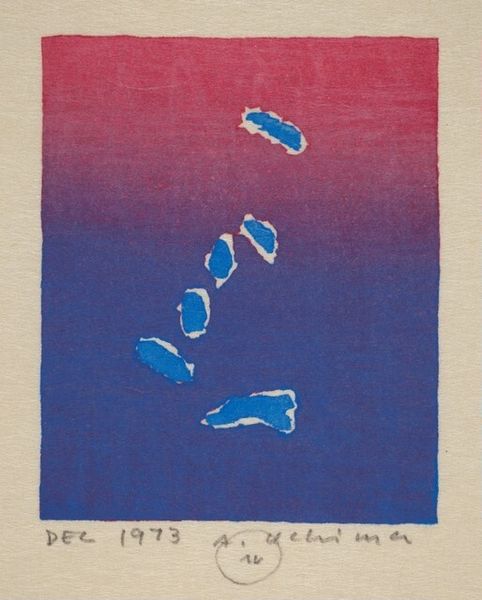
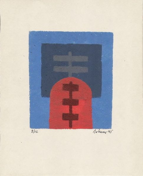
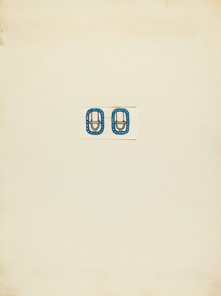
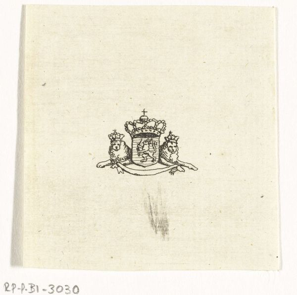
Dimensions: height 23 mm, width 43 mm
Copyright: Rijks Museum: Open Domain
Editor: Here we have “Two Red Cross Stamps of 15 cents,” designed in 1927 by Carel Adolph Lion Cachet. They are prints and posters, currently held at the Rijksmuseum. They strike me as being a bold statement with very geometric design, and also commemorative. What stands out to you about this work? Curator: I see a layering of symbols intended to communicate complex ideas swiftly and memorably. Note how the familiar red cross anchors the design; it is, after all, universally recognizable and represents aid and neutrality. Editor: Yes, absolutely. Curator: But look closer. The figures flanking the cross...they almost feel like guardians. Notice how the symmetry evokes a sense of balance, a reliability that is vital for an organization like the Red Cross to convey. Editor: Interesting. And the blue and red color palette reinforces that sense of trust. How does this fit into a broader tradition? Curator: Well, visual communication through stamps and posters, especially during times of conflict and social change, often used familiar emblems. They tapped into cultural memory, shaping public perception and national identity. This design builds on centuries of heraldry and uses its power to build public trust. Even now we internalize this iconography as inherently dependable. Editor: That makes a lot of sense. I hadn't thought about it in terms of cultural memory before, but it’s such a crucial point! Curator: It shows us how design impacts not just a single viewer, but collective experience. Visual language, particularly when carefully deployed, can really move populations and leave marks on time. Editor: Thank you so much, understanding the design and how it influences collective memory changed my viewpoint significantly.
Comments
No comments
Be the first to comment and join the conversation on the ultimate creative platform.
More like this