drawing, print, ink, pen, engraving, architecture
#
drawing
#
aged paper
#
toned paper
#
baroque
#
mechanical pen drawing
# print
#
old engraving style
#
sketch book
#
perspective
#
personal sketchbook
#
ink
#
pen-ink sketch
#
pen and pencil
#
pen work
#
pen
#
cityscape
#
engraving
#
pencil art
#
architecture
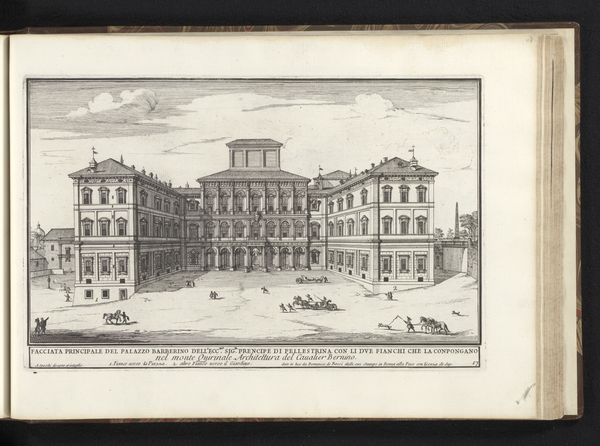
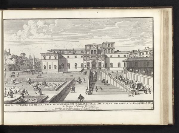
Dimensions: height 210 mm, width 331 mm
Copyright: Rijks Museum: Open Domain
Curator: This intricate engraving, rendered in ink by Alessandro Specchi around 1699, depicts the courtyard of the Palazzo del Quirinale in Rome. It's a fascinating example of Baroque architectural representation. Editor: It does have an imposing feel. All those precisely drawn lines and repeated forms really convey the scale of the palace, and yet it feels curiously devoid of warmth. Curator: The artist has meticulously captured the symmetrical arrangement, employing linear perspective to create a sense of depth and volume. Note the subtle variations in line weight that delineate the architectural elements and articulate spatial recession. Editor: What stands out to me is how the courtyard itself seems like a stage, doesn’t it? A few figures are scattered about like actors waiting for their cue, and the palace becomes this backdrop symbolizing power and order. Even the shadows cast are dramatically sharp, emphasizing the building's imposing presence. Curator: Yes, the interplay of light and shadow creates a dynamic rhythm within the composition. Observe the geometry—the rectangular courtyard defined by the arcaded facades on either side, balanced by the central tower. The very construction embodies Baroque ideals of balance and grandeur. Editor: But even those very principles can signify rigidity. Is it designed to awe rather than invite? The architecture almost suppresses human presence, doesn’t it? I also note the almost obsessive rendering of architectural detail—I suspect to signify papal control. Curator: Your reading certainly highlights the potential interpretations! Indeed, this print acts as a carefully constructed representation of power, but equally, one can find delight in its graphic qualities, the interplay of line and tone across the toned paper. Editor: Well, seeing through the cultural symbolism—power and order—my feelings on its aesthetic rigidity and social intent haven't altered too much, yet it’s undoubtedly a work packed with meaning and precise intention. Curator: Agreed. The combination of rigorous technique and the weight of the imagery creates a truly compelling visual statement from that era, don’t you agree?
Comments
No comments
Be the first to comment and join the conversation on the ultimate creative platform.
More like this