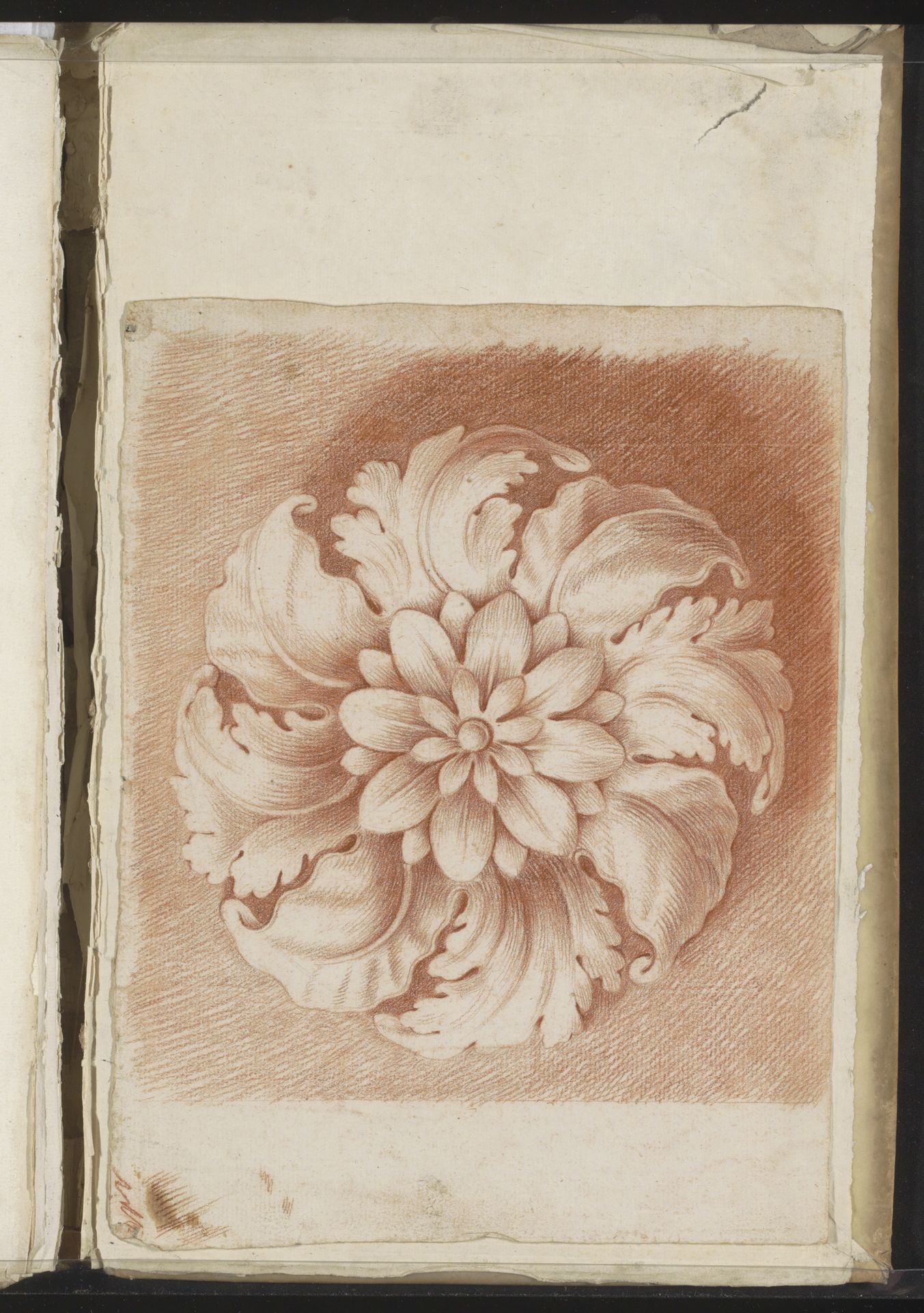
Curatorial notes
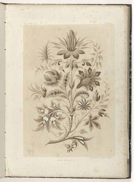
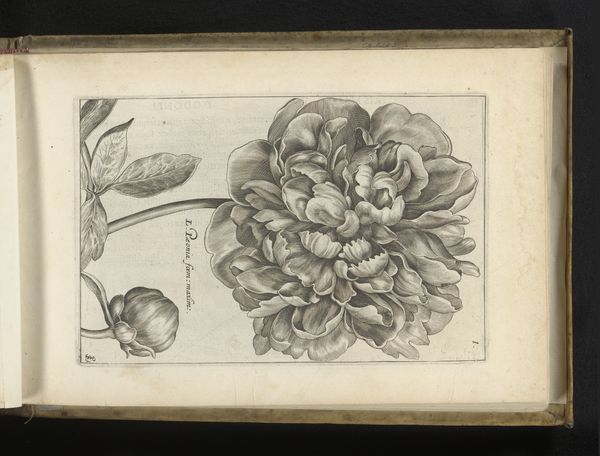
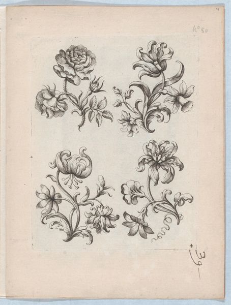
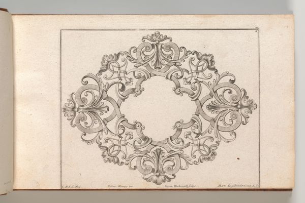
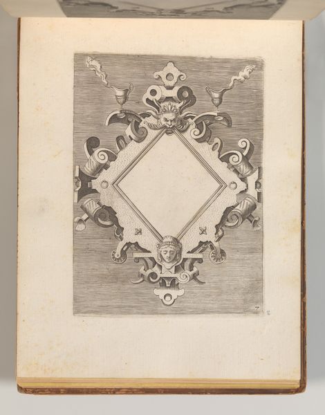
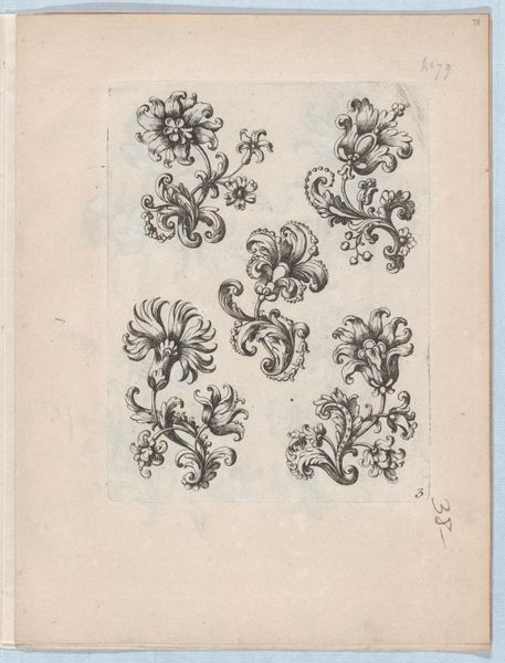
Editor: We're looking at "Floraal ornament," a drawing made around 1701 by Jacob Toorenvliet. The monochrome rendering of this botanical design is remarkable; it looks almost three-dimensional on the page. What strikes you most about the form and structure of this drawing? Curator: The dynamism lies within the structured repetition. Consider the radiating leaves. They aren't simply replicated, but each possesses unique inflections, generating visual interest while adhering to a central, organizing principle. The Baroque thrives on such tension: ornamentation balanced with inherent geometric structure. Editor: So, you're saying the individual variations within the overall symmetrical design are key? Curator: Precisely. Toorenvliet masterfully manipulates light and shadow using the pen, defining form, giving a plastic quality to the floral design, even as we understand it to be line on paper. Do you notice how the cross-hatching reinforces depth without relying on color? Editor: Now that you mention it, yes! It’s subtle but essential to creating the illusion of volume. How important is it that this is an “ornament?” Does its intended purpose affect how we see its composition? Curator: Functionality dictates form to a certain extent. This is clearly not intended as a scientific illustration, but rather as a design element. So, its beauty resides less in botanic accuracy, but in its aesthetic contribution. The line work generates interest and provides a sense of completeness in this example of Baroque design. Editor: That makes sense. Seeing how function and structure interplay offers such a rich interpretation. Curator: Indeed. Through examining visual relationships alone, the work presents layers of insight, wouldn't you agree?