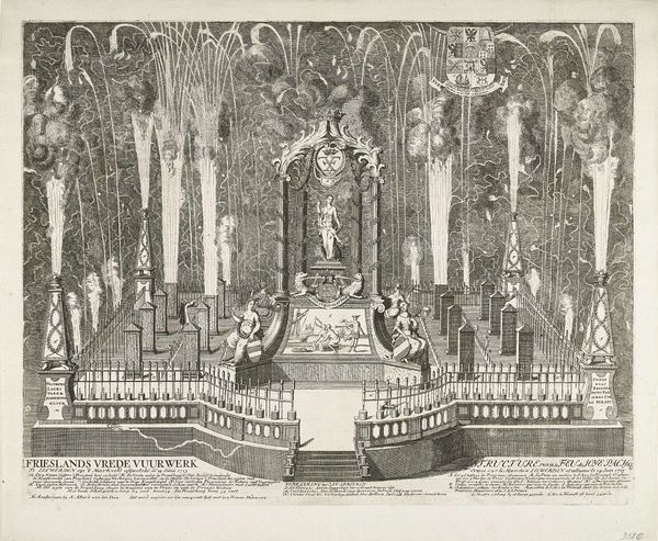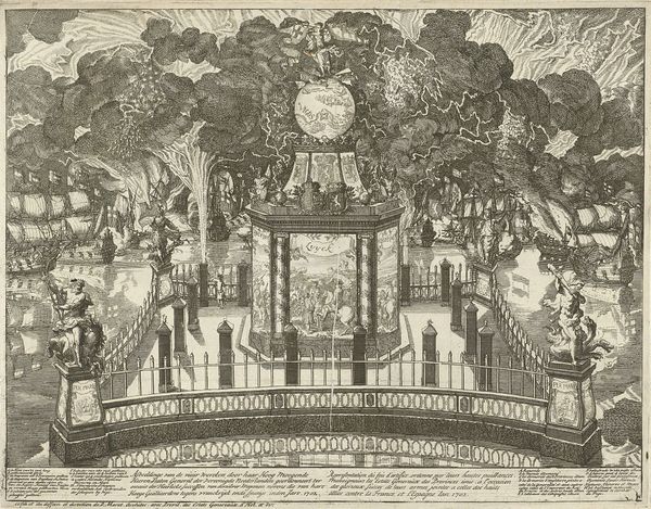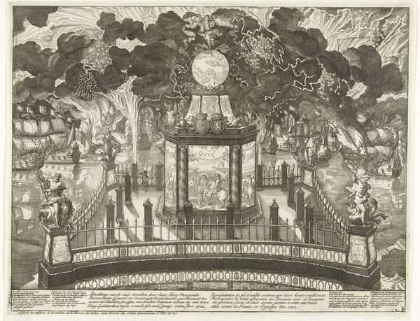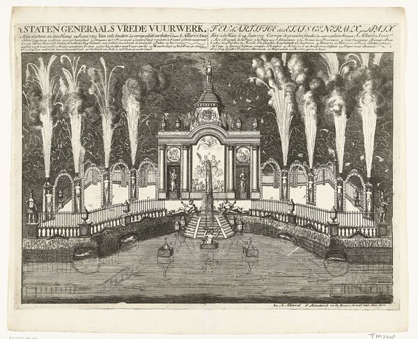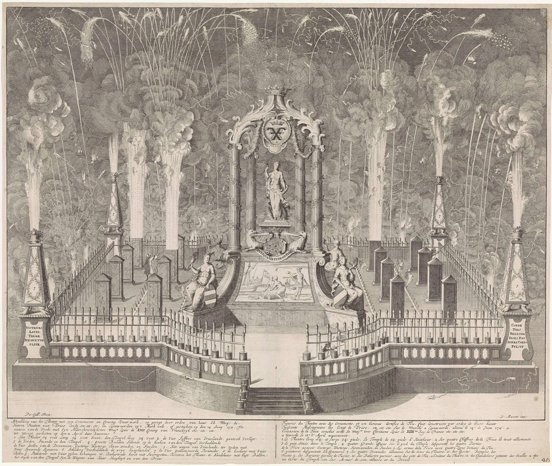
1713
Vuurwerk bij de viering van de Vrede van Utrecht te Leeuwarden, 1713
Pieter van (II) Call
1688 - 1737Location
RijksmuseumListen to curator's interpretation
Curatorial notes
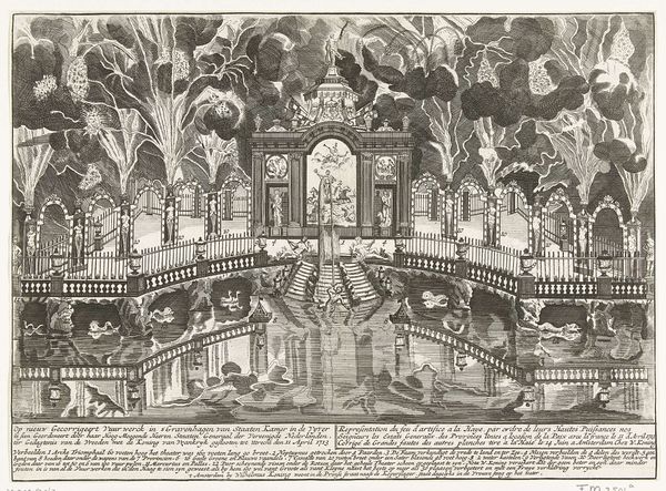
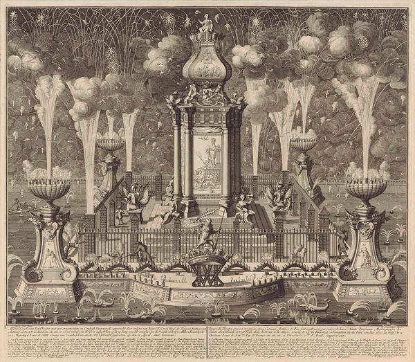
Curator: Pieter van Call's engraving, "Fireworks at the Celebration of the Peace of Utrecht in Leeuwarden, 1713," currently residing at the Rijksmuseum, presents an intriguing scene. Editor: My first impression is that this is an impressive feat of perspective, creating an artificial vista in monochrome! Curator: Indeed! Observe the deliberate compositional structuring; the centralized temple motif and the strong horizontal and vertical lines work together to establish depth, pulling the eye toward the fireworks display at the vanishing point. The density of linework really gives depth to the smoke. Editor: And those fireworks – they seem almost celebratory in their extravagance! Visually, fireworks commemorate significant events but have you considered them to act as symbols of ephemerality, moments of great release quickly disappearing, underlining both the power and fragility of peace itself. Curator: That’s a potent interpretation. I'm struck by the repetition of forms and the structured chaos created by the fireworks within that ordered framework. It's visually stimulating, yet remains anchored by architectural elements. This interplay underscores the work's dynamism. Editor: Moreover, if you consider Baroque sensibilities, everything is symbolic. What appears on first glance to be decorative carries coded cultural meanings accessible to the contemporary viewer, a language expressed visually for posterity. The structure framing a goddess statue for instance acts as an allegory to Peace, Reason or Justice triumphant after long conflict. Curator: The symbolic language of Baroque art indeed aimed at clear articulation; however, the lasting intrigue of the artwork arises precisely from the tension generated through structural and technical oppositions in monochrome. It also appears to represent modernity. Editor: I think that's a valid, alternative opinion. Overall this print seems to be charged with multiple levels of interpretation and provides viewers with layers of understanding relevant in our age of information overload. Curator: Absolutely, thank you! A stimulating analysis and further perspective on Van Call’s vision in celebration, construction, and lasting artistic intention.