Dimensions: height 234 mm, width 149 mm
Copyright: Rijks Museum: Open Domain
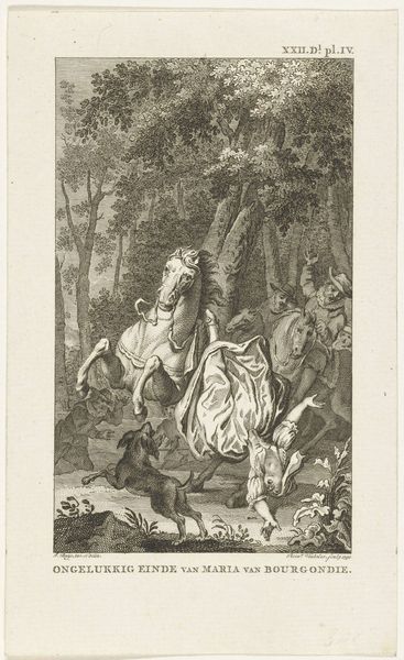
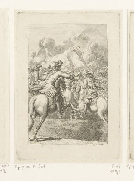
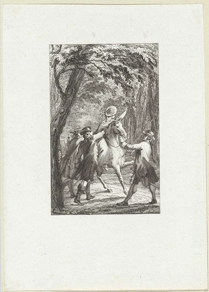
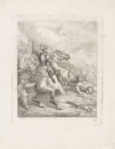
Editor: This engraving from 1785, titled "Death of Hans Willem, Baron van Aylva, 1691" by Reinier Vinkeles, presents a chaotic scene. The central figure is falling from a rearing horse. The stark contrast and intricate line work really bring a sense of drama, wouldn't you agree? What catches your eye in terms of the formal elements? Curator: The immediate tension arises from the acute diagonal formed by the fallen rider and the horse's posture, wouldn't you say? Observe how Vinkeles employs chiaroscuro, manipulating light and shadow, to sculpt the forms and amplify the scene's dramatic impact. Editor: Yes, definitely! The dramatic contrast adds a lot, but is that all it does? It also seems to emphasize certain shapes over others. Curator: Precisely! The stark illumination on the horse and fallen figure compels the viewer's gaze, effectively creating a focal point. Beyond that, examine the deliberate compositional arrangement; the grouping of figures at the edge serves to frame the central action. Does the direction of their gaze, in turn, direct our own? Editor: Absolutely! It really emphasizes that this scene should be important to me. Do you think there are deeper formal things going on? Curator: Certainly. Consider the relationship between line and form. Vinkeles masterfully employs intricate lines to delineate every detail, capturing the textures of fabric, musculature of the horse, and the distressed expressions of onlookers. Are there any points in the composition at which this meticulous quality feels challenged or pushed? Where, and why? Editor: I notice in the background near the trees there is not the same level of detail and care as the immediate foreground action. Curator: Quite right! Now, reflect on the dynamic tension orchestrated between clarity and obscurity. Vinkeles deliberately manipulates the viewer’s perspective by creating zones of precise definition alongside areas intentionally blurred or left in the distance. That contributes further to the reading, I suspect. Editor: I hadn't noticed that before, how that background obscurity contributes to the image! It really emphasizes that I should focus on what is front and center, the chaos. Thanks for pointing that out! Curator: A keen eye reveals so much. The language of forms often holds untold narratives, does it not?
Comments
No comments
Be the first to comment and join the conversation on the ultimate creative platform.
More like this