drawing, pencil
#
drawing
#
landscape
#
pencil drawing
#
pencil
#
cityscape
#
realism
Dimensions: height 311 mm, width 401 mm
Copyright: Rijks Museum: Open Domain
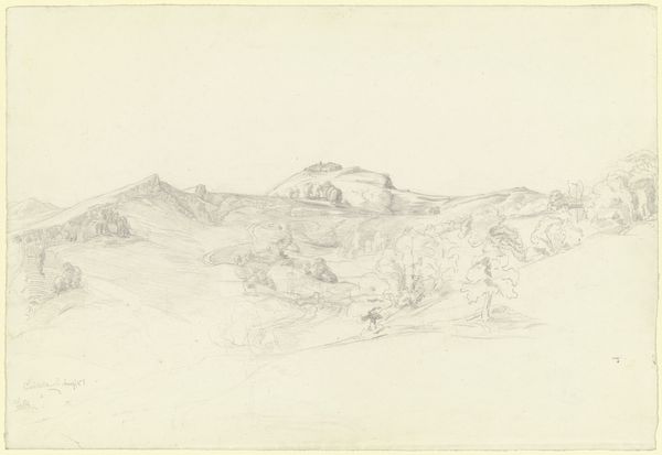
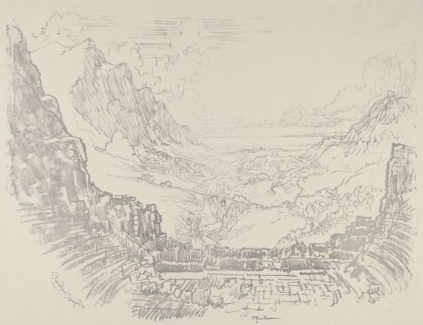
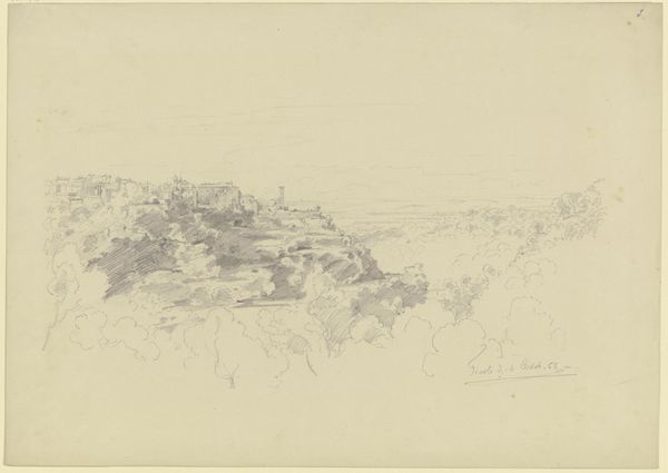
Curator: Right, let’s have a look at "Town with Mill on a Hill", a pencil drawing created by Carel Nicolaas Storm van 's-Gravesande, sometime between 1851 and 1924. Editor: Moody, isn't it? Like a still from an old black-and-white film. The stark contrast really grabs you, almost feels like a memory surfacing from the mist. Curator: The technique is striking. Just look at how he's used simple graphite to create this entire atmosphere. The blending of tones gives it an almost photographic realism, whilst softening those structures we associate with industry, like that windmill. Editor: Exactly! And speaking of graphite… pencil drawings like this showcase accessibility. Think of all the sketches dashed off on readily available materials; preliminary drafts leading to monumental canvases, but drawings like this are also often "finished" works in and of themselves. I see beauty in its utility and also how it elevates craft! Curator: A great point. There's something beautiful and unassuming about a pencil. And it's interesting to imagine Storm van 's-Gravesande working directly from the landscape with that single tool. He captures the almost defiant presence of the town sitting atop this hill—solid architecture battling ephemeral, dramatic cloudscapes. Editor: The drawing feels very of-the-moment too. Mill grinding grains into flour and providing sustenance, structures reflecting shelter and social organizations; a depiction of humans trying to make something useful for themselves—and ultimately, to scratch out their very existence! But also... I feel like the perspective has been manipulated here—is it just me? Almost tilted slightly upwards, as if viewed with nostalgia or reverence… Curator: Perhaps that elevated perspective allows for a better consideration of these structures? After all, it does appear as if this drawing was done after industrial modernity changed how those living in urban environments engaged with agriculture and urban life. There's a quiet pride in these structures but the muted tones could hint at their possible demise. Editor: Interesting, the artist renders humble building materials like shingles with attention, yet also invites us to ponder broader questions of material use and societal development. I do believe that by showing all of these material details the artist provides us a grounded and informed view of its significance for Dutch life! Curator: It really highlights the relationship between industry, labor, and also natural landscapes and architecture, doesn't it? Almost mournful. Editor: It does. Almost beckons us into a quieter observation of our history!
Comments
No comments
Be the first to comment and join the conversation on the ultimate creative platform.
More like this