![Variation [verso] by Benton Spruance](/_next/image?url=https%3A%2F%2Fd2w8kbdekdi1gv.cloudfront.net%2FeyJidWNrZXQiOiAiYXJ0ZXJhLWltYWdlcy1idWNrZXQiLCAia2V5IjogImFydHdvcmtzLzY1OTBmNWRjLTlkYzMtNDVmZS04ZmZiLTg5MjE2NzJlMjBkZi82NTkwZjVkYy05ZGMzLTQ1ZmUtOGZmYi04OTIxNjcyZTIwZGZfZnVsbC5qcGciLCAiZWRpdHMiOiB7InJlc2l6ZSI6IHsid2lkdGgiOiAxOTIwLCAiaGVpZ2h0IjogMTkyMCwgImZpdCI6ICJpbnNpZGUifX19&w=1920&q=75)
mixed-media, print, paper
#
abstract-expressionism
#
mixed-media
# print
#
paper
#
form
#
geometric
#
line
Copyright: National Gallery of Art: CC0 1.0
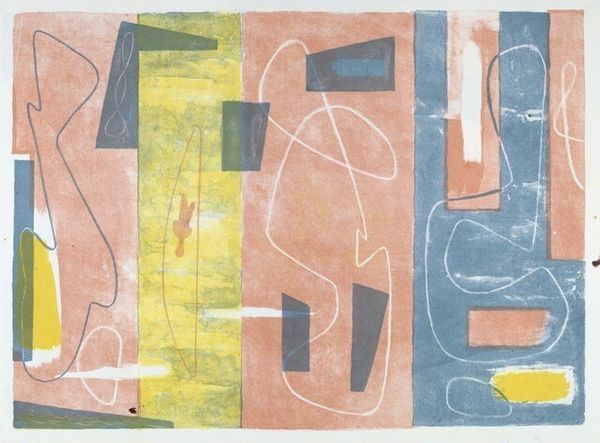
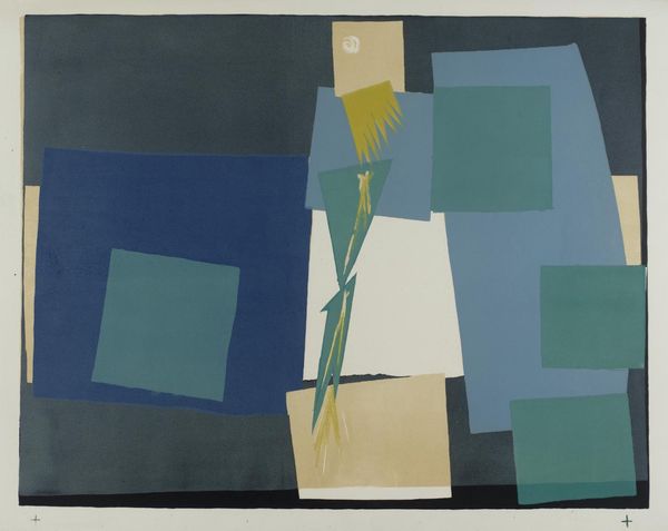
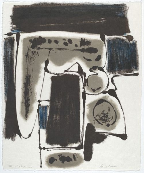
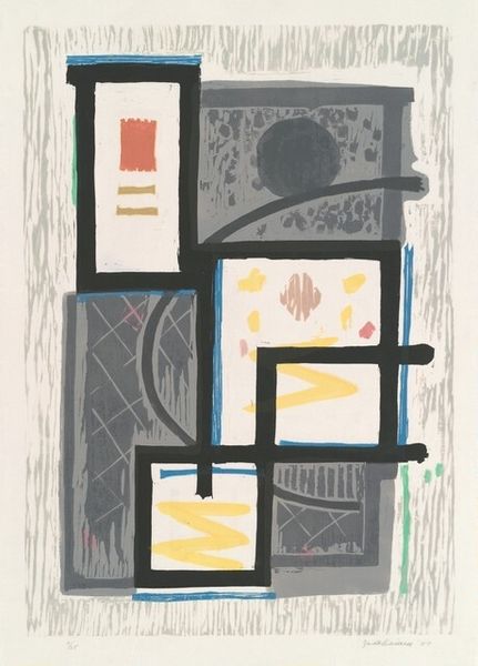
Editor: Here we have Benton Spruance’s “Variation [verso],” created in 1950 using mixed media on paper. I find its combination of hard geometric forms and fluid lines quite striking. What compositional elements stand out to you? Curator: Immediately, the interplay between positive and negative space presents itself as the most compelling element. Consider how the density of forms on either side creates a visual dialogue, almost a call and response structured by contrasting shapes. What relationship exists, in your view, between the organic line and the rectilinear volumes? Editor: It's almost like the free-flowing line is rebelling against the rigidity of the shapes, wanting to escape the composition somehow. What does the juxtaposition suggest to you? Curator: The juxtaposition produces a visual tension – the unyielding geometry is restrained by the unpredictability of the curving line. Notice also the colour choices – the muted blues and yellows which add to the graphic nature. Do these colours enhance, or perhaps challenge, the piece’s structural integrity? Editor: I see what you mean about the colour. The limited palette creates a unified field, but it also allows the shapes to have clearer boundaries, so the interplay feels more intentional. It seems the success lies in the balance between these forces. Curator: Precisely. It is the subtle dissonance between those elements that gives this piece its dynamism, creating something compelling from the sum of its parts. An artwork for our time, would you agree? Editor: Yes! Thank you, I learned so much through our dialogue.
Comments
No comments
Be the first to comment and join the conversation on the ultimate creative platform.
More like this