Dimensions: support: 307 x 220 mm
Copyright: © DACS, 2014 | CC-BY-NC-ND 4.0 DEED, Photo: Tate
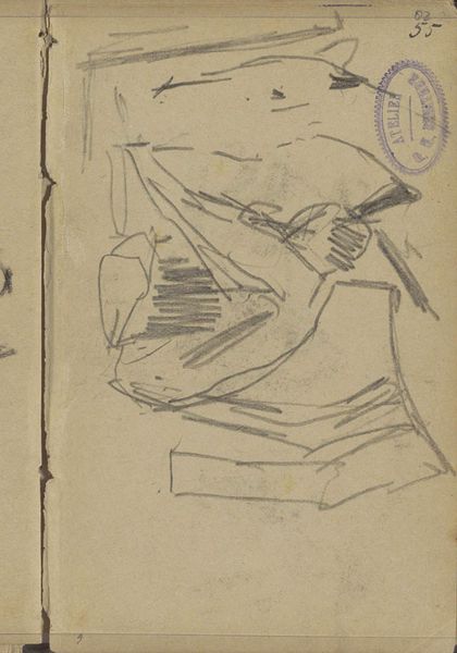
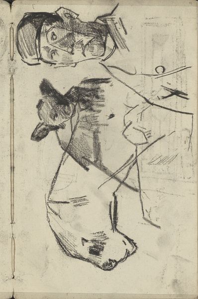
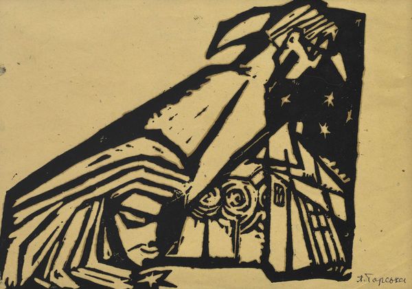
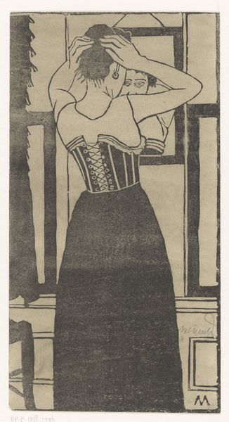
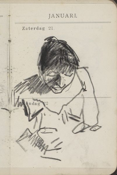
Curator: Looking at Kurt Schwitters' "Measure" feels like uncovering a fragmented dream. It's disorienting, but somehow…right. Editor: Absolutely. It's a collage, a Merzbild as he called them, using found materials. You see a sketch of a woman imposed on what looks like printed ephemera. The visual tension is fascinating. Curator: The woman seems so serene against the chaotic backdrop of text and geometric shapes. It's like a fleeting memory battling against the noise of the modern world. Editor: I see the figure almost as a classical symbol, the timeless feminine, juxtaposed against the jarring modernity of typography. The name "Maas" looms so large, almost mocking the figure's vulnerability. Curator: The juxtaposition is what gets to me, how these disparate elements find an odd harmony. It's a reflection, maybe, on how we piece together our own fractured realities. Editor: Precisely. Schwitters gives us visual clues, almost taunting us to make sense of it. And maybe the point is not to entirely make sense, but to feel. Curator: "Measure" isn't just a title, it's an invitation to measure our response to this strange, beautiful puzzle. Editor: Indeed. It's a journey into the fragmented self, reflected in paper.
Comments
tate about 2 months ago
⋮
http://www.tate.org.uk/art/artworks/schwitters-measure-t12392
Join the conversation
Join millions of artists and users on Artera today and experience the ultimate creative platform.
tate about 2 months ago
⋮
In the early 1920s, Schwitters started to make ''found'' artworks. In Measure (left), the image is taken from a magazine, to which he has added a line drawing Koi (right), was created ten years later. Beyond the choice of the material, Schwitters may not have made any alterations. The printed paper probably comes from the printing works that Schwitters frequented in his capacity as a designer. The blocks of print are arranged into a geometrical structure reminiscent of Constructivist compositions. As all the lettering is reversed the paper must be an offprint from printers' proofs. Gallery label, August 2004
More like this