Baron de Rothschild, from the Racing Colors of the World series (N22a) for Allen & Ginter Cigarettes 1888
0:00
0:00
Dimensions: Sheet: 2 3/4 x 1 1/2 in. (7 x 3.8 cm)
Copyright: Public Domain
Editor: This is "Baron de Rothschild, from the Racing Colors of the World series," made in 1888 by Allen & Ginter, now residing at the Metropolitan Museum of Art. It looks like colored pencils were involved to render this tiny portrait. It seems a rather simple composition, but the subject's clothing provides a striking, rhythmic design. What draws your eye? Curator: Certainly, the alternating bands of yellow and teal command immediate attention, don't they? Consider the effect of this strict horizontal division upon the figure. It truncates and contains the form, shifting the focus to the immediate surface plane. What sense do you make of the subject's hands gripping the riding crop? Editor: They seem unnaturally large and prominent, almost disconnected from the body. The tight grip suggests a controlled energy. Curator: Precisely. The size and placement are key. They mirror the graphic boldness of the striped jersey. Note, also, the way the curves of the crop handles echo the rounded cap. It produces a cyclical visual field that suppresses recession into space. Does the brand lettering at the bottom feel integrated with the composition? Editor: Not entirely. It feels somewhat detached, perhaps serving a purely commercial function. Curator: Agreed. It’s a planar disruption, jolting the viewer back to the present. Despite this disjunction, one could argue it contributes to the image's overall flatness by acting as another visual block. Editor: That's a great perspective. I'd only focused on the lettering as text, and not as another compositional element. Curator: Precisely. The relationship between image and text is something worth always pondering. Editor: Absolutely, I learned a lot! Thanks.
Comments
No comments
Be the first to comment and join the conversation on the ultimate creative platform.
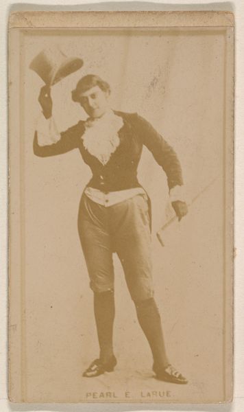
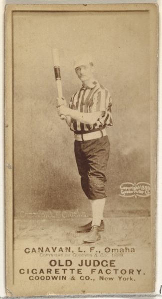
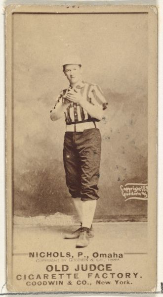
More like this