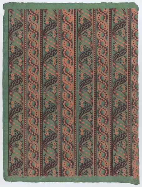
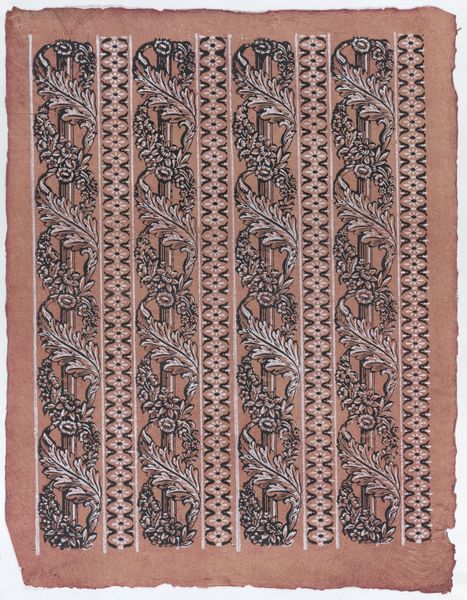
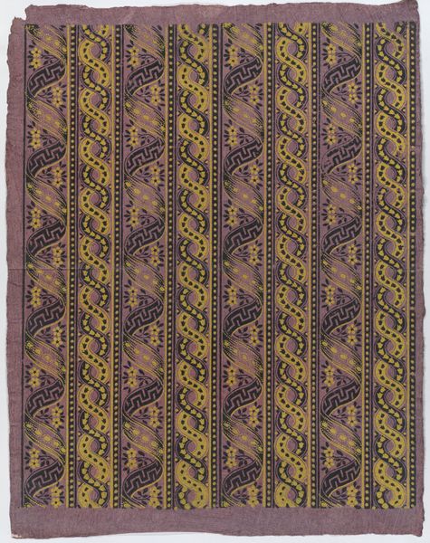
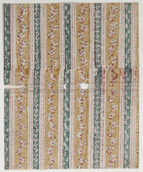
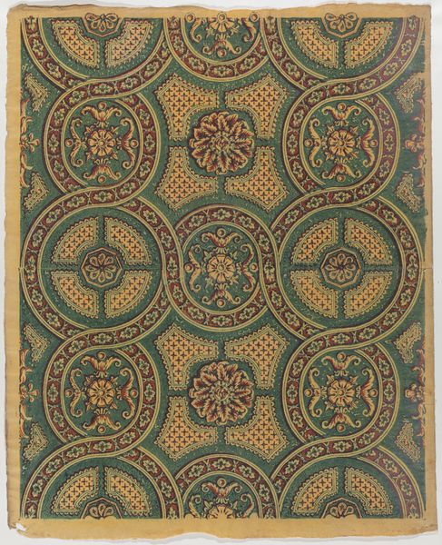
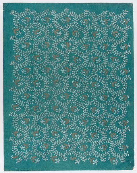
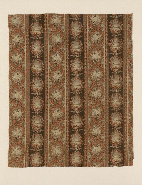
Sheet with four borders with a garland of acanthus leaves and flowers 1775 - 1875
0:00
0:00
drawing, print
#
drawing
# print
#
pattern
#
pattern design
#
decorative-art
Dimensions: Sheet: 13 5/8 × 18 1/4 in. (34.6 × 46.3 cm)
Copyright: Public Domain
Curator: Here we have an intriguing, if somewhat understated, piece. It’s called “Sheet with four borders with a garland of acanthus leaves and flowers,” created sometime between 1775 and 1875 by an anonymous artist. It’s currently held at the Metropolitan Museum of Art. Editor: My first impression is, perhaps unsurprisingly, wallpaper. It has that regimented repetition and faded elegance about it. Curator: Precisely. And while we don’t know the artist's name, its purpose feels evident. These drawings or prints would’ve been meant for practical applications, probably wallpaper or fabric design. I find the ghostly pale greens and pinks rather haunting. Editor: Right, this color palette feels very… specific to a certain kind of aristocratic interior, evoking those powdered-wig, pre-revolution sensibilities. Were these patterns also implicitly statements of class or belonging? Curator: Absolutely. The acanthus leaves, a motif borrowed from classical architecture, signals taste and refinement. Remember, access to design and decorative arts has always been unevenly distributed, mirroring societal inequalities. Editor: The regimented symmetry, that enforced harmony, it contrasts rather harshly with the real, often messy lives of people living with such ornamentations around them. I find myself wondering who labored to create these patterns and how this artistry was perceived in that era. Curator: Indeed, whose stories are suppressed within these decorative frills? This makes you consider not only the artistry and design itself, but what it represented socially, doesn't it? The artist and engraver, who probably belonged to a printing business workshop, remained uncredited, their personal artistic freedom surrendered to their task. Editor: Exactly. What begins as an appreciation for pattern-making quickly unfolds into deeper questions of labor, class, and access to creative expression. I keep circling back to the contrast, too. The almost clinical exactness of design beside this quite imperfect handmade texture. Curator: And now I can’t help but see it that way too! Thanks to the uneven colors, it becomes a poignant memento. So what starts off appearing so serene actually hides these little disruptive elements, once you stop to look. Editor: Right. In art and design, what’s not shown or explicitly stated can sometimes carry the most profound meaning. This really feels relevant when discussing questions about privilege and oppression, right?
Comments
No comments
Be the first to comment and join the conversation on the ultimate creative platform.
More like this