drawing, graphite
#
drawing
#
pen sketch
#
hand drawn type
#
personal sketchbook
#
idea generation sketch
#
ink drawing experimentation
#
pen-ink sketch
#
pen work
#
graphite
#
sketchbook drawing
#
cityscape
#
sketchbook art
#
modernism
#
initial sketch
Copyright: Rijks Museum: Open Domain
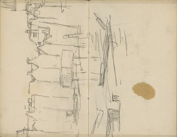
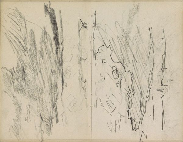
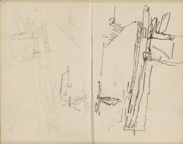
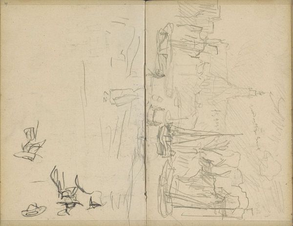
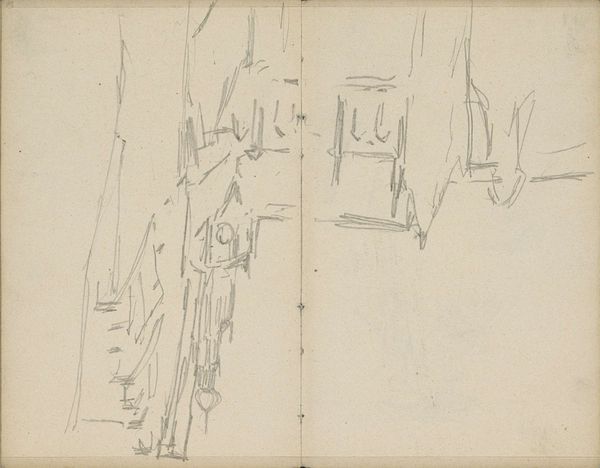
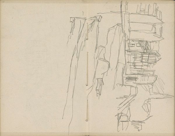
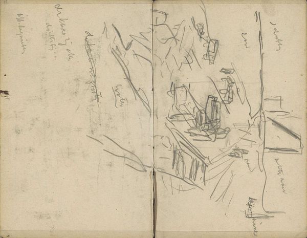
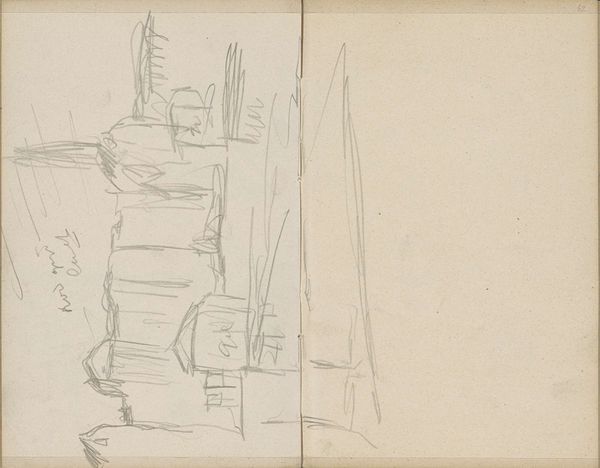
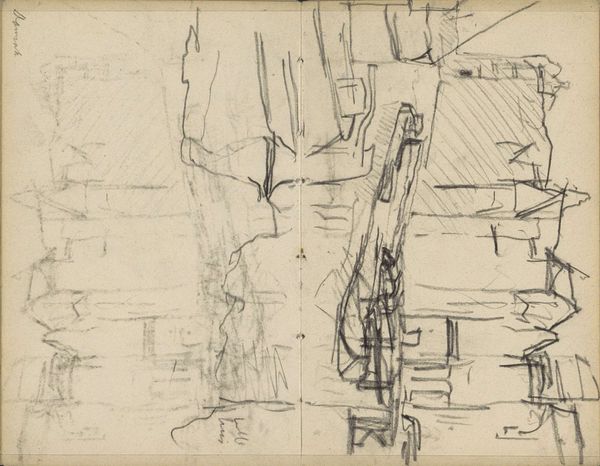
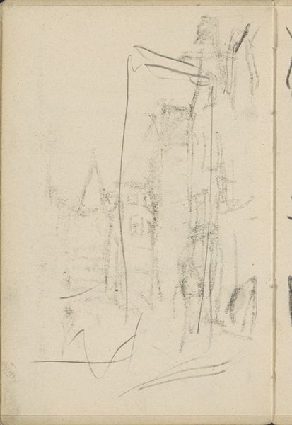
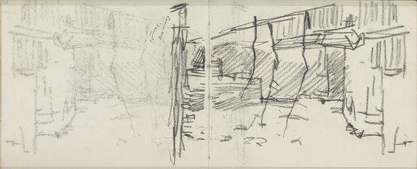
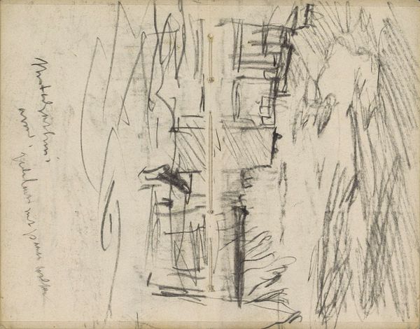
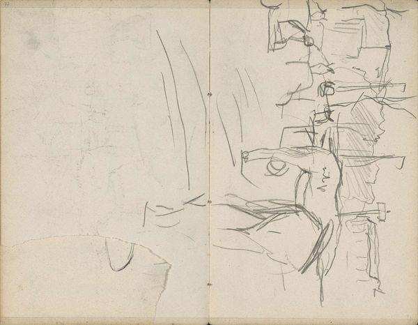
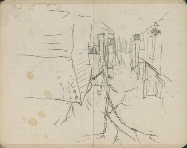
Editor: We're looking at "Gezicht in Amsterdam, mogelijk het Rokin," or "View in Amsterdam, possibly the Rokin" by George Hendrik Breitner, dating from 1912 to 1919. It's a drawing in graphite and pen. I find the quick, sparse lines so evocative of a bustling city scene. What stands out to you in this piece? Curator: The immediate impression is one of dynamic instability, wouldn't you agree? Notice how the artist uses line – its varying weight and abrupt changes in direction. There's little concern for representational accuracy; rather, the lines themselves create the essence of form and space. Editor: I see that. It feels more about the *idea* of a cityscape than a literal depiction. Why do you think Breitner chose such a fragmented approach? Curator: Consider the function of a sketchbook. It’s a space for preliminary investigation, idea generation. This isn't about rendering a polished, finished scene, but exploring the visual relationships. Look at the contrast between the dense cluster of marks on the left page and the more architectural structure on the right. What meaning do you infer from the positioning of the elements on opposing pages? Editor: Maybe the left is just scribbles, while the right represents his conscious effort to structure a view, finding solid form in the chaos? It's like thought evolving on paper. Curator: Precisely. And within that structure, do you observe any dominant geometric forms, and how those forms contribute to the composition's overall feeling? Editor: The right side is mainly composed of horizontals and verticals, creating a somewhat unstable grid. The left is amorphous. I notice how the lines vary so much – the thickness, darkness. Curator: An excellent observation! Notice the textures thus created; we discern a visual push and pull across the page, all of it contributing to a dynamic visual tension. I believe Breitner sought to capture a momentary glimpse. What is your final reading of his work? Editor: I find that it speaks to the transient nature of urban experience, an evolving visual symphony rendered through stark, beautiful marks.
Comments
No comments
Be the first to comment and join the conversation on the ultimate creative platform.
More like this