drawing, paper, ink, pen
#
drawing
#
script typography
#
hand-lettering
#
hand drawn type
#
hand lettering
#
paper
#
personal sketchbook
#
ink
#
hand-drawn typeface
#
pen-ink sketch
#
pen work
#
sketchbook drawing
#
pen
#
sketchbook art
#
miniature
#
calligraphy
Copyright: Rijks Museum: Open Domain
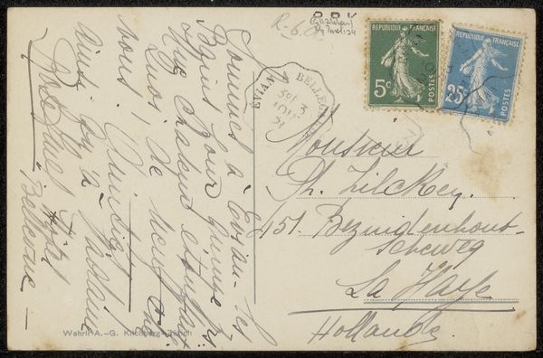
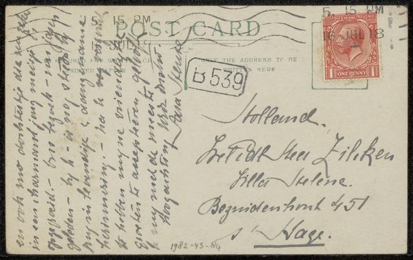
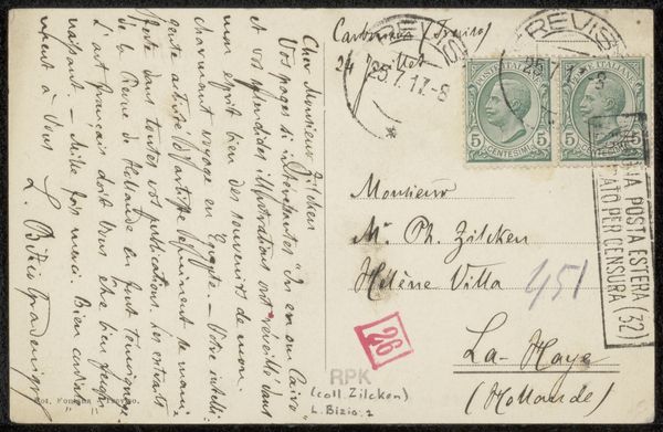
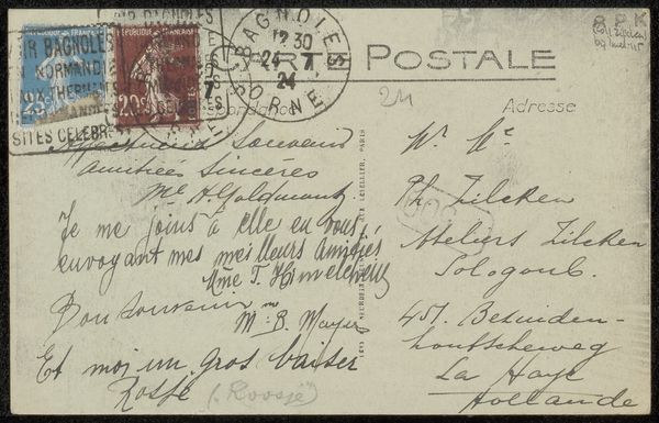
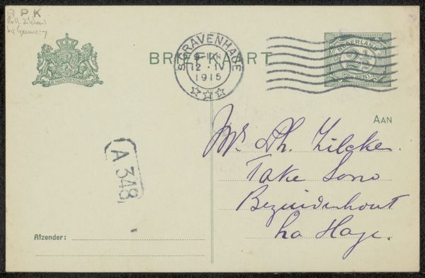
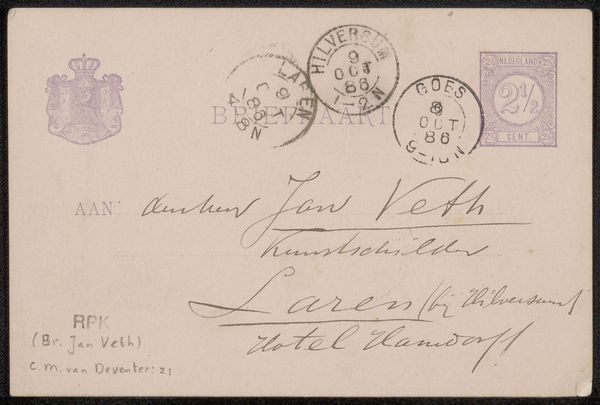
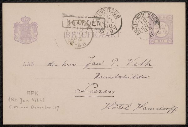
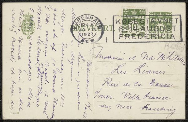
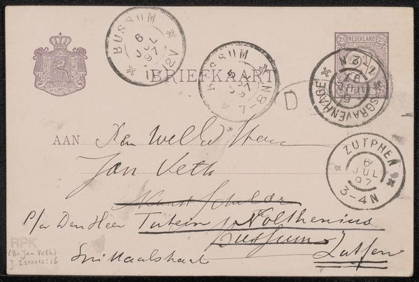
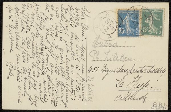
Editor: This is a drawing titled "Prentbriefkaart aan Philip Zilcken" by Charles Paul Gruppé, likely created before 1928. It's a postcard with ink on paper. I'm immediately struck by the script—it feels very personal and intimate. What do you see in this piece beyond a simple greeting card? Curator: The script is fascinating, isn’t it? Look at the flourishes, the almost performative quality of the penmanship. This isn't just conveying information; it's imbuing the message with personality. Each stroke carries emotional weight. The miniature format amplifies that intimacy, doesn’t it? A small, precious object. Editor: Absolutely! It's like holding a tiny piece of history in your hand. But the text itself is rather straightforward. Is there a cultural memory evoked by the style? Curator: Consider the tradition of letter writing during this era. The act itself was a ritual, and handwriting, especially practiced penmanship, signified social grace and connection. Think of it as a visual language of its own. Also, notice how the stamps depicting George Washington have a symbolic presence and confirm ties to nation and identity. Editor: So the handwriting isn’t just functional, but symbolic? It’s reflecting a bygone era of social conventions. The style really amplifies a different mood. Curator: Precisely! It reminds us how cultural memory is encoded in visual symbols. Editor: It’s easy to overlook the impact of the presentation! The handwriting suddenly feels very telling. Curator: Visual symbols evolve and morph through history. Editor: It’s really fascinating to learn about everything held in this small work!
Comments
No comments
Be the first to comment and join the conversation on the ultimate creative platform.
More like this