#
3d model
#
3d rendering
#
3d image
#
plastic material rendering
#
virtual 3d design
#
front view render
#
3d shape
#
3d digital graphic
#
metallic object render
#
architecture render
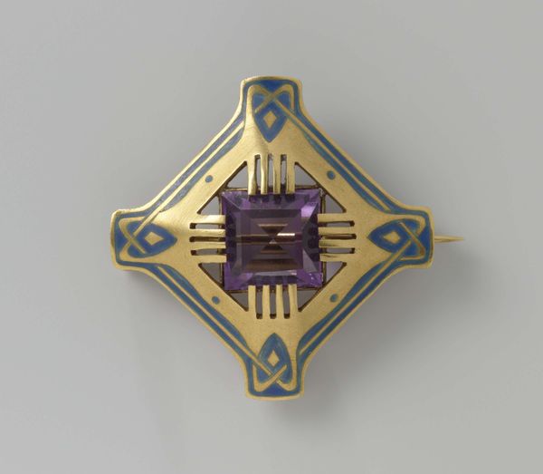
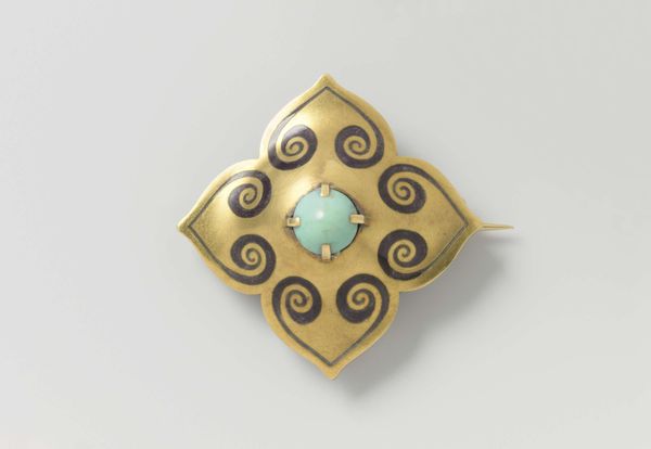
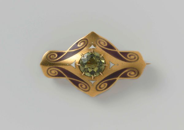
Dimensions: height 2.2 cm, width 3.1 cm
Copyright: Rijks Museum: Open Domain
Curator: We’re looking at a brooch designed by Lodewijk Willem van Kooten, dating from around 1908 to 1911. It presents a very precise geometric construction, and its golden framework encases a striking green gem at its center. Editor: The rigidity of those lines and angles… there’s an immediate formality to it. Almost architectural, really. The interplay of that sharp-cut jewel and hard-edged setting is quite arresting. Curator: Indeed. Kooten was part of the Dutch Nieuwe Kunst movement. They were striving to integrate art into everyday life. This piece exemplifies that aspiration, moving away from overly ornate styles in favor of streamlined aesthetics. Think about the political implications of accessibility that it speaks to. Editor: Absolutely. That central stone... the specific shade of green, coupled with those almost stern lines... It evokes a feeling of guarded prosperity, wouldn’t you agree? The geometric arrangement around it creates a halo effect, elevating the central stone almost to a point of veneration. It speaks of earthly power and privilege. Curator: Note those small squares of what appears to be blue enamel at the periphery, which function both to punctuate and soften the sharp angles. What kind of association could the wearers have been trying to convey with a square? Blue also usually implies that a message has been written, especially regarding power. Editor: It could also have implied safety. Blue, through its associations with the Virgin Mary and the color’s status as a ward from the evil eye, suggests protection and blessing. It may represent a wish for well-being to come over the gem and by extension, the wearer of this jewel. And it provides a small dose of humanizing softness to what would otherwise be an expression of pure modernist dogma. Curator: Yes, the integration of those blue accents adds a needed dimension. This work presents more than simple geometry; it is about constructing a revised notion of art's societal purpose. Kooten really wanted to create objects that spoke to changing social mores and desires for simplicity. Editor: Ultimately, I read this jewel as a piece that is striving for timelessness through those crisp geometric patterns and that enduringly fascinating, centrally positioned gemstone. There is something powerful at play here in terms of aspiration and visual symbolism. Curator: This brooch offers such a compelling encapsulation of art’s dialogue with modern society during a formative era, the tensions it held, and the aesthetics it embraced. Editor: Yes. Seeing how simple shapes can signify so much makes you appreciate its ability to hold the weight of a period, a worldview and even wishes of safeguarding all at once.
Comments
No comments
Be the first to comment and join the conversation on the ultimate creative platform.
More like this