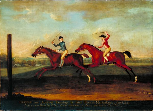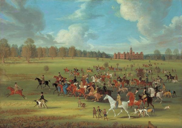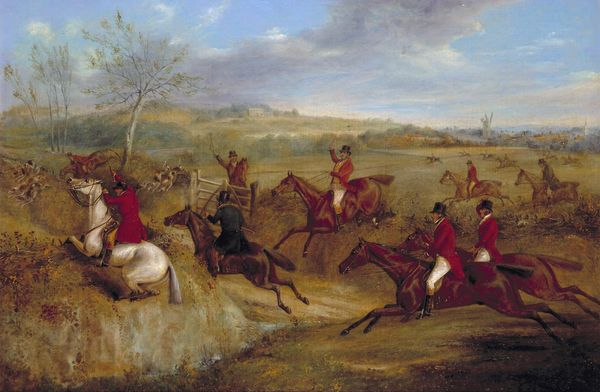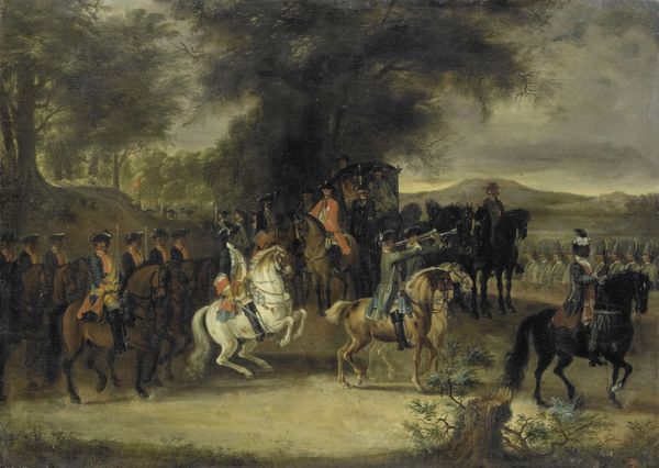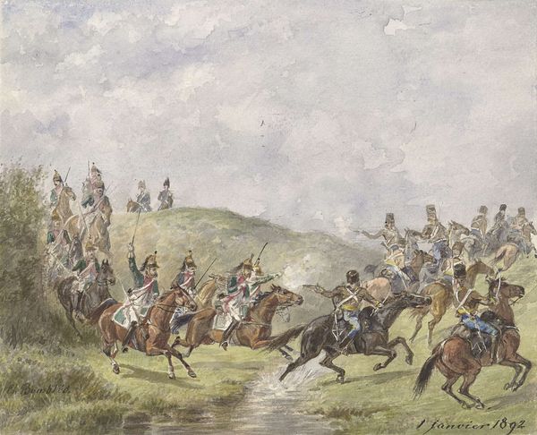
Curatorial notes
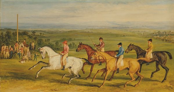
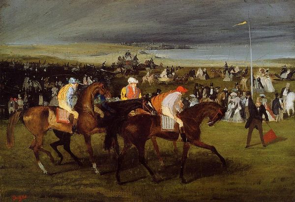
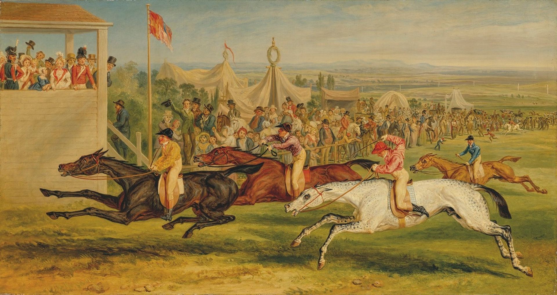
Curator: Ah, "Disappointment" by James Ward, created in 1841 using oil paints and watercolors. It depicts a vibrant horse race, doesn't it? Editor: Yes, it’s dynamic, but… something about the flatness of the figures contrasts with the illusion of depth that makes the crowd feel unsettling, almost claustrophobic. And is it just me, or do the horses appear almost monstrous with the extreme positions and foreshortening? Curator: It's interesting you say monstrous. Perhaps it captures the… unsettling experience of high-stakes competition and its spectatorship. Think about the class divides—the folks in the stands versus the jockeys pushing themselves and their animals to the brink for fleeting glory. Horse racing, you know, always mirrored societal aspirations and cruelties. Editor: Right, this feels inherently classist; note how those in the stands appear separate from the track action—literally elevated—displaying visible indifference as their wealth or poverty is gambled for entertainment. But that aside, don't you also feel the term "disappointment" has an ironic sentimentality considering the subject's roots in animal exploitation? The racing horse's labor isn’t exactly romantic! Curator: Oh, absolutely, there is irony. But consider also the disappointment of those who wagered and lost—their personal stakes in this social spectacle! And yet, look how alive and pulsing the colors are, particularly in the foreground. Ward captured that frantic energy, that hopeful-yet-doomed atmosphere perfectly. It’s strangely thrilling and utterly tragic simultaneously, wouldn't you say? Editor: That thrilling aspect touches upon the excitement of competition, while obscuring the laboring bodies whose “disappointment” or ruin isn’t recognized. Those dynamic colours may represent an individual’s fleeting high, perhaps distracting from their societal position in 1841, while the flag planted near the viewer marks and stakes a territory over bodies in a manner echoing colonial occupation! Curator: A strong interpretation. Maybe “Disappointment” asks us who truly suffers when fortunes shift. I appreciate the layering Ward creates—surface enjoyment and structural oppression, you could call it a Victorian precursor to sports commentary. Editor: Indeed, a lot to digest beneath that ostensibly vibrant, racing surface. It certainly provides food for thought about power, labour, and who carries the real weight of defeat.