print, engraving
# print
#
landscape
#
river
#
romanticism
#
cityscape
#
genre-painting
#
engraving
#
realism
Dimensions: height 334 mm, width 453 mm
Copyright: Rijks Museum: Open Domain
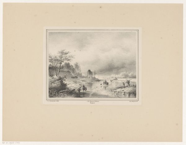
Curator: Brrr, even looking at this engraving by Jacobus Sörensen, titled "Koek-en-zopiekraam op bevroren rivier met poort", from the mid-19th century, sends a chill down my spine! The scene is just so evocative of a cold winter's day. Editor: It certainly is. There's a lovely sense of depth, isn't there? The artist’s skillful control of light and shadow really pulls the eye across the frozen river to that imposing gate. The monochrome palette emphasizes the cold mood. Curator: Yes, the gate anchors the scene, doesn't it? In terms of context, winter scenes like these were popular during the Dutch Romantic era. There was this looking back toward simpler, older times that really made genre-painting explode in popularity. This romanticization served as a means of solidifying a distinct Dutch identity. Editor: Notice, too, how Sörensen contrasts the geometrical precision of the architecture, rendered in exquisite detail, against the more freely drawn, naturalistic elements: the clouds, the figures... There’s a wonderful visual tension. Curator: Indeed, it's a carefully constructed tableau of daily life. You have people skating on the ice, gathering around the "Koek-en-zopiekraam"—that food stall, which essentially means 'cookie and sip'—which was a common sight during the winter months. Moments like this capture a fleeting glimpse of the culture in play, especially where vendors are so connected to specific social rituals. Editor: The eye is not only drawn to the details, but also to how the light catches on the ice and reflects against the clouds— it nearly vibrates! I wonder about the techniques Sörensen used to create this remarkable textural contrast. Curator: These prints really shaped how the Netherlands saw itself, promoting particular virtues and ways of living. It is always interesting how art influences the cultural zeitgeist. Editor: Absolutely, this reminds me of the way an image’s formal arrangement can itself convey ideology. It seems like we see and feel so much of 19th-century Netherlands by examining its shapes and patterns. Curator: A cultural mirror, held up through the hands of the artist. Editor: Precisely! This work truly illustrates how so many perspectives meet within art.
Comments
No comments
Be the first to comment and join the conversation on the ultimate creative platform.
More like this