Copyright: John Hoyland,Fair Use
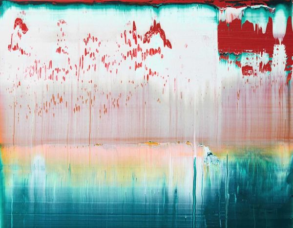
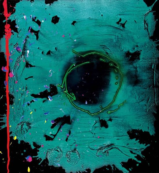
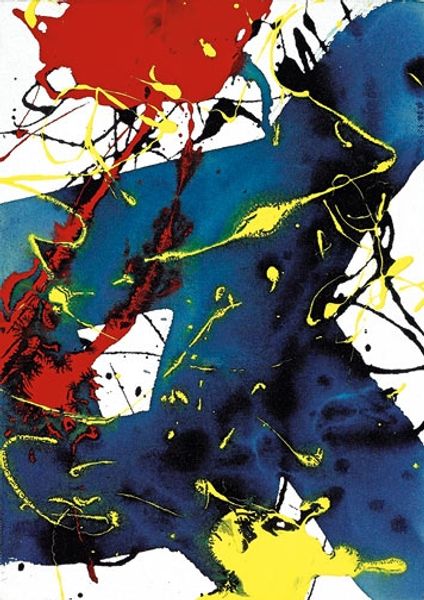
John Hoyland made "Letter to Chaim - 10.7.06" sometime in 2006, and the way he handles the paint is a real process, layers over layers. The colors are kind of wild, almost like a controlled explosion. There’s this big splat of red and white on the right. It’s drippy, like it was poured or flung. Look at the way the paint is both thick and runny, like the surface is built up. Then there's that field of teal, which feels deep and moody, with all those subtle variations. The texture is super physical; you can almost feel the push and pull of the brush. That splat of red is like a burst of energy, but it's balanced by the calm of the teal, which to me shows how abstraction can embody raw emotion. Hoyland’s work reminds me a little of Helen Frankenthaler, especially in the way he lets the paint soak into the canvas. It’s all about the conversation between the artist, the paint, and the surface.
Comments
No comments
Be the first to comment and join the conversation on the ultimate creative platform.