print, etching, graphite
#
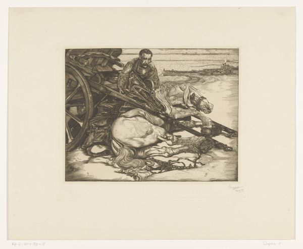
dutch-golden-age
# print
#
etching
#
graphite
#
realism
Dimensions: height 311 mm, width 345 mm, height 471 mm, width 491 mm
Copyright: Rijks Museum: Open Domain
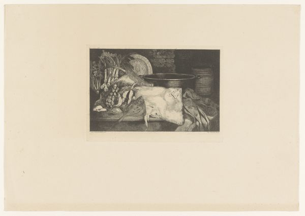
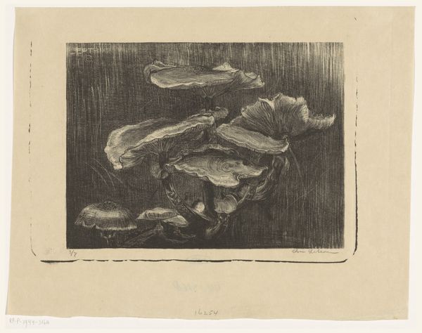
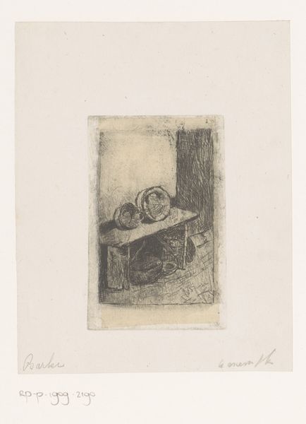
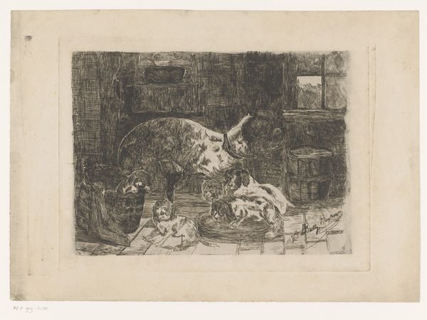
Curator: Aat Verhoog's "Koffervis," from 1958, employs etching and graphite on paper, resulting in this stark black-and-white print, currently held at the Rijksmuseum. Editor: Intriguing! The composition feels unbalanced. The dense, dark form on the right contrasts so strongly with the prickly sphere perched on a pedestal to the left. Curator: The interplay of form and line is definitely key. Note how the etching technique, with its meticulous lines, defines the spiky texture of the "koffervis" – what we would call a porcupine fish. Editor: Yes, and that starkness, amplified by the medium. I’m thinking about the artist’s hand laboriously creating these detailed lines to depict something so inherently... textural. It makes me consider the market—the means of distributing printed images like this. What was the context for displaying this work in its time? Curator: Verhoog, as an artist rooted in realism, captures the essential qualities of his subjects. Consider how the artist uses shadow. The shadows define form but also flatten the composition, creating an almost unsettling spatial ambiguity. Note the cylinder behind it... it makes you pause and ask what purpose the added elements might serve. Editor: The title, too. “Koffervis” or “Coffinfish,” if translated literally. It raises some uncomfortable associations! This, coupled with the stark contrast, suggests an awareness, a consideration, and maybe even a meditation of life, death, and how humans encounter animals within certain markets and production constraints. Curator: A perceptive reading! It allows for a multi-layered interpretive experience where visual design converges with subject and historical context. Editor: I appreciate how exploring its production techniques opens questions about Verhoog's intention—is this about objective rendering, an engagement with the macabre, or an investigation into market dynamics that framed the production of prints like these? Curator: Indeed, contemplating how meaning arises through careful attention to form and structure gives an expansive perspective. Editor: It’s truly fascinating to see such diverse elements merging through Verhoog’s unique lens and choices of material.
Comments
No comments
Be the first to comment and join the conversation on the ultimate creative platform.
More like this