drawing, print, paper, ink
#
drawing
# print
#
bird
#
fantasy-art
#
paper
#
text
#
ink
#
symbolism
#
watercolour illustration
Copyright: Public domain
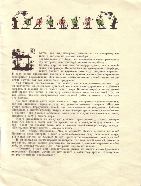
Heorhiy Narbut made this illustration to Hans Christian Andersen’s 'Nightingale' sometime before 1920. Look at the black ink of the bird and tree – it’s almost like a woodcut, so decisive, but softened with these beautiful golden leaves. Artmaking is a process of layering decisions like this. What I love about this piece is how Narbut uses such a limited palette to create a rich world. The texture of the paper, slightly yellowed, peeks through, giving it an aged quality. The black ink is opaque, grounding the image, while the gold feels like an echo of the nightingale's song – bright, precious, but ultimately ephemeral. Note how the leaves have been simplified to radial shapes – this gives them a decorative flatness that contrasts with the naturalism of the bird. It is this tension that gives the image its life. Narbut, like Aubrey Beardsley, was part of the early 20th-century move towards graphic design; and like Beardsley, his art suggests that the beauty of art is that it remains unresolved, open to our ongoing interpretation.
Comments
No comments
Be the first to comment and join the conversation on the ultimate creative platform.
More like this