drawing, watercolor
#
drawing
#
art-nouveau
#
water colours
#
watercolor
#
line
#
decorative-art
#
watercolor
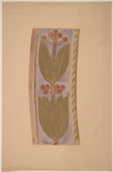
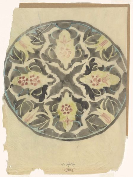
Dimensions: sheet (irregular): 4.3 × 18.1 cm (1 11/16 × 7 1/8 in.) mount: 30.2 × 46.3 cm (11 7/8 × 18 1/4 in.)
Copyright: National Gallery of Art: CC0 1.0
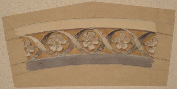
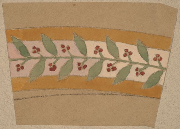
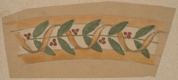
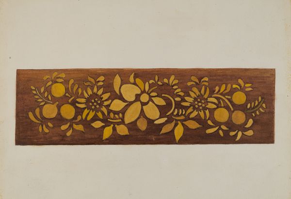
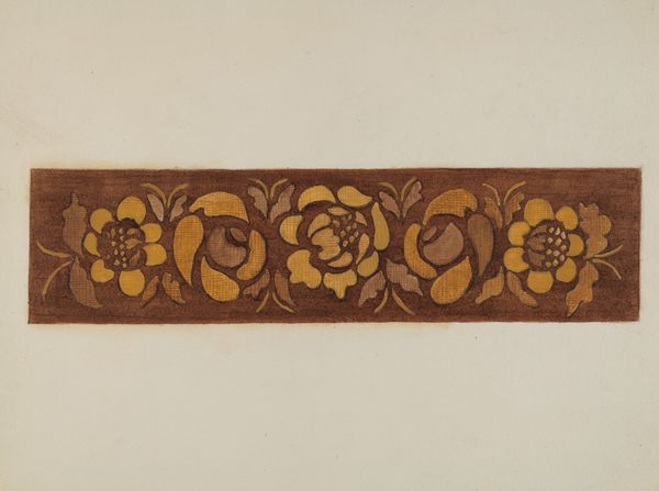
Curator: This watercolor drawing, "Study for a Border Design" by Charles Sprague Pearce, dating from between 1890 and 1897, strikes me as intentionally understated in its presentation, especially for the Art Nouveau period. Editor: Yes, it’s a very delicate design. What strikes me is how muted the colors are; it almost feels like a faded memory. What do you see in this piece that makes you say it’s Art Nouveau? Curator: It's not merely decorative; the design hints at the means of production – the paper support itself, the visible pencil lines, the subtle layering of watercolors. This suggests a deliberate engagement with the 'how' of making art, almost exposing the artist’s labor. The aesthetic elevates a design for what likely was a mass-produced border into the realm of fine art. What do you think of the way that shifts the perception of art and craft? Editor: That’s a great point. I hadn’t considered how the materials themselves were almost part of the design. I suppose I typically separate “fine art” from “decorative art," but seeing the labor and material so bare really challenges that. How does the social context affect how it might have been received? Curator: Given the timeframe, Pearce likely conceived this for interior decoration in a rapidly industrializing world. The handmade quality visible in the watercolor and preliminary sketch underscores a rejection of mass-produced goods, offering instead a return to handcrafted, individualized design – perhaps accessible only to the upper classes. This also highlights a critique, implicit or explicit, of industrial capitalism by focusing on artisanal processes and natural forms as a response to dehumanization of factory jobs. The choice to incorporate flaws and manual touch points becomes part of the work’s commentary. Editor: So the design isn't just pretty, it's actually saying something about work and consumption at the time? That gives me a totally different way to appreciate it. Curator: Precisely. By focusing on the 'nuts and bolts' of its creation and historical placement, we reveal layers beyond its superficial prettiness, enabling it to connect meaningfully with debates around craft, labor and class. Editor: Thank you! It makes me consider art through a totally different, much more grounded, lens.
Comments
No comments
Be the first to comment and join the conversation on the ultimate creative platform.
More like this