Copyright: CC0 1.0
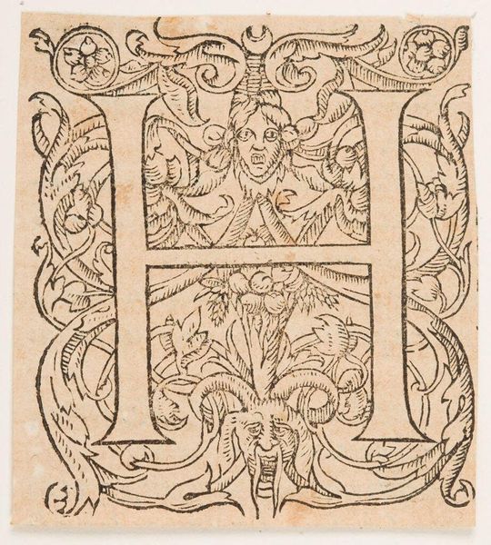
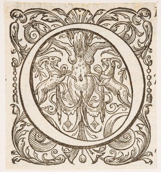
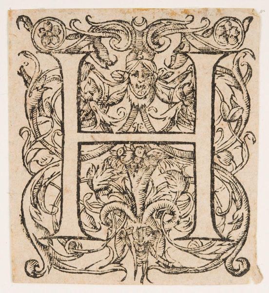
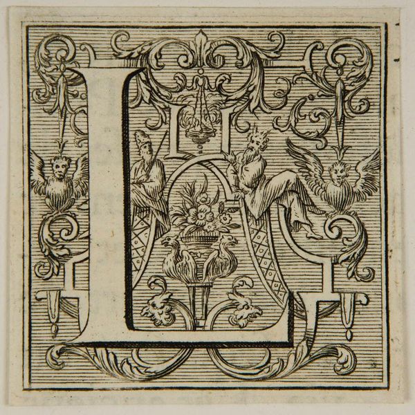
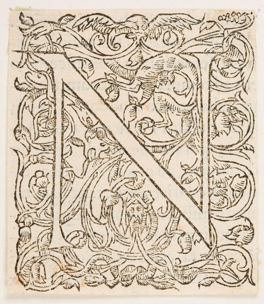
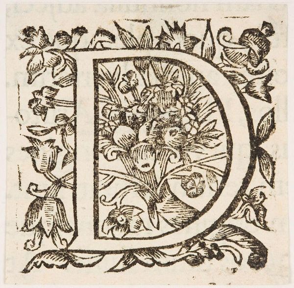
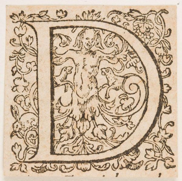
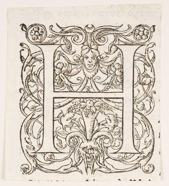
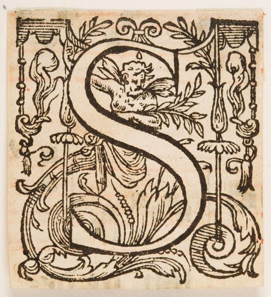
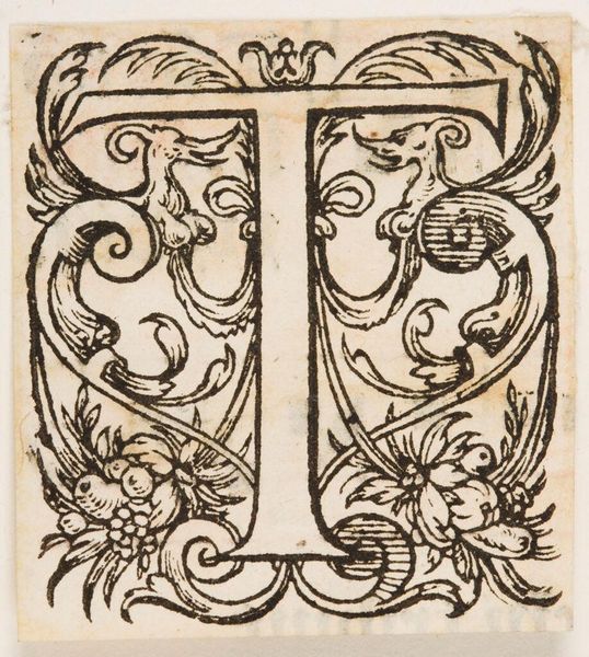
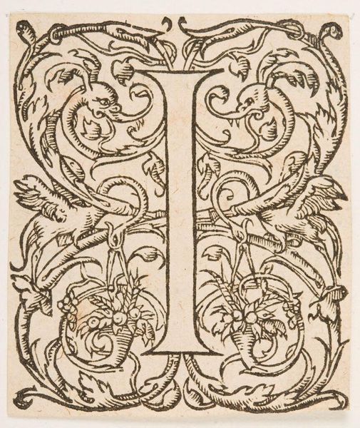
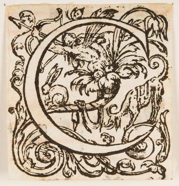
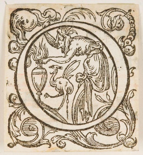
Editor: This woodcut, "Initial Q" by an anonymous artist, is an intriguing piece from the Harvard Art Museums. The letterform itself incorporates a grotesque face. What can you tell me about the formal qualities and structure of this print? Curator: Note the sharp contrast between the black ink and the untouched paper. The anonymous artist uses line weight and density to create depth and texture, particularly in the foliate designs surrounding the initial. Observe how the face emerges organically from the Q. Editor: So, it's the interplay of these formal elements that gives it its character? Curator: Precisely. The composition guides our eye through a sophisticated interplay of positive and negative space, revealing a mastery of form typical of its era. Editor: I see, a new way of thinking about typography! Curator: Indeed, a close look at form yields much.
Comments
No comments
Be the first to comment and join the conversation on the ultimate creative platform.
