print, textile, typography
# print
#
textile
#
typography
Dimensions: height 219 mm, width 311 mm
Copyright: Rijks Museum: Open Domain
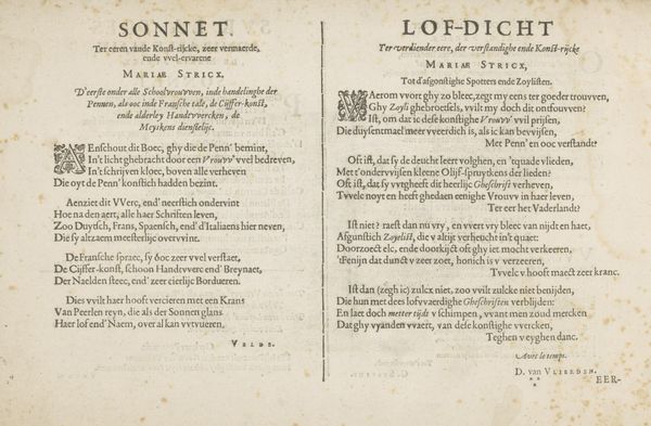
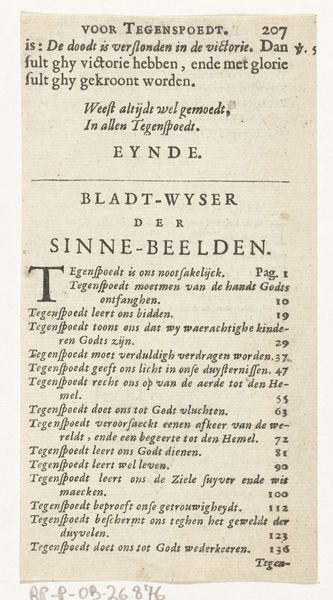
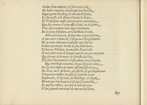
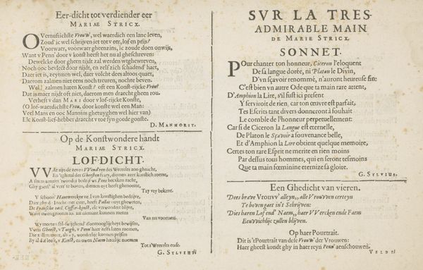
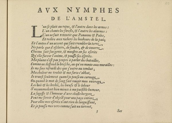
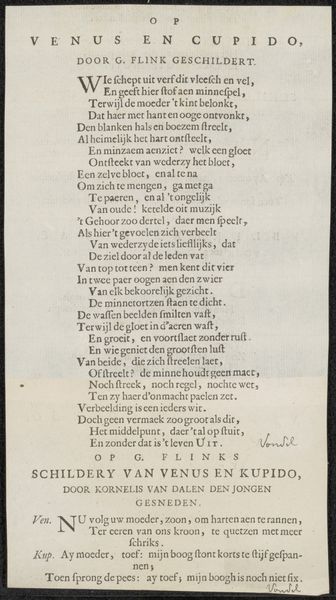
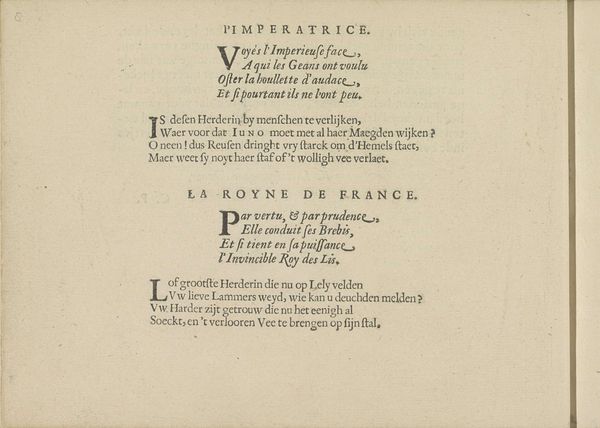
Curator: Here we have “Opdracht en gedicht,” or “Commission and Poem,” a printed work likely dating from the late 17th century, circa 1693-1698. Editor: It feels incredibly academic. The stark, regimented text creates a very formal, almost intimidating atmosphere. The layout emphasizes structure. Curator: It’s intriguing to me how typography itself becomes a textile here. Look at the density and the way the page is visually organized; each poem becomes a woven story, a deliberate construction of power and praise. Who are these figures, Kaarsgieter and Perrault, and what relationship does this text construct between them? The poems are clearly written to elevate them, which places them in relation to societal expectations and the social impact of art. Editor: Indeed. Notice the rigid symmetry—two columns, two distinct voices. The formal arrangement underscores the poem’s function, like the deliberate lines and careful strokes composing a drawing. This symmetry and its stark composition creates the kind of balance and order admired during the Baroque era. It also seems to call out two distinct artistic and political forces—almost like two sides to the same debate. Curator: Exactly! And think about the broader context: 17th-century Europe, where patronage and courtly life shaped artistic expression. This print embodies the politics of artistic recognition, the negotiation of influence, and the delicate dance between creativity and power. What did it mean for an artist like P. Marin or A. Welzing to write poems "commissioned" in honor of Kaarsgieter and Perrault? Were they seeking favor or contributing to a broader cultural conversation? Editor: Well, dissecting this typography reveals a conscious understanding of how font, line, and structure work together to deliver not just meaning, but a distinct aesthetic experience. I think this approach emphasizes both the aesthetic considerations of artistic presentation and how this creates an artistic statement in itself. It highlights what matters, from letterform to white space. Curator: The contrast of light and dark on this simple piece allows us to see, even across centuries, the push and pull of art world dynamics—both of men as well as the powerful structure of politics and expectations which determined who rose to success during their time. Editor: This exploration underlines how the artwork's intrinsic components work together in dialogue—between artist, patron, and us. It reminds us to look beyond words alone and see form as essential content here.
Comments
No comments
Be the first to comment and join the conversation on the ultimate creative platform.
More like this