Dimensions: image: 410 x 295 mm
Copyright: © Geoffrey Clarke | CC-BY-NC-ND 4.0 DEED, Photo: Tate
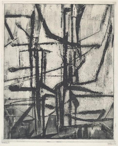
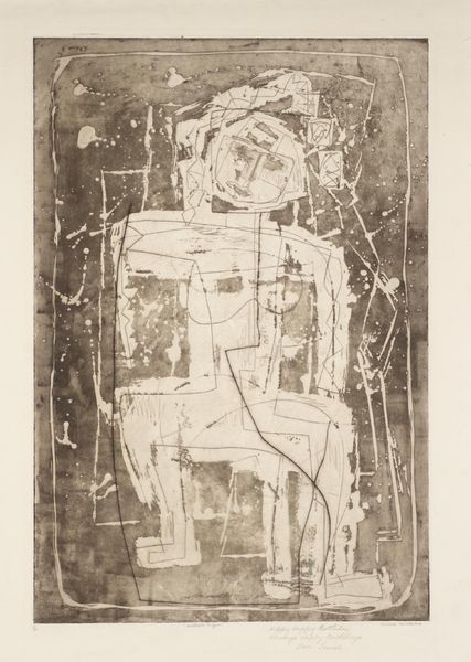
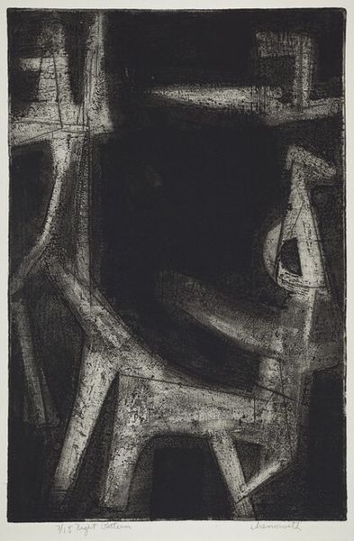
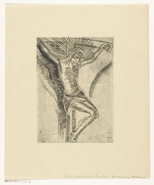
Editor: Here we have Geoffrey Clarke's "Crucifixion," an etching dating to 1954. The coarse texture and dark palette evoke a sense of suffering. What can you tell me about this work? Curator: Let’s focus on the materiality. The rough texture isn't just aesthetic; it speaks to the physicality of labor, the pressure of the printing process itself mirroring the suffering depicted. Consider also the availability and cost of materials in post-war Britain – how might those constraints have shaped Clarke's artistic choices? Editor: That's fascinating! So, the limitations of the materials actually become part of the message? Curator: Precisely! The means of production are never neutral. Understanding them is key to understanding the art. It goes beyond just admiring the image, it asks us to confront the social and economic conditions that made it possible.
Comments
Join the conversation
Join millions of artists and users on Artera today and experience the ultimate creative platform.
tate 11 months ago
⋮
According to the artist, this image was 'the nearest I ever came to representational distortion of the human figure.' Clarke rarely depicted the Crucifixion. He was more interested in the idea of the Cross as a symbol, than in depicting the physical fact of the Crucifixion. The inspiration for this image was a black and white reproduction of the Isenheim Crucifixion at Colmar in Alsace, painted by Matthias Grünewald and completed in 1515. Clarke noted the use by Grünewald of a twisted, very distorted image to convey the full horror of the subject. Gallery label, August 2004
More like this