drawing, pencil
#
drawing
#
pen sketch
#
geometric
#
pencil
#
abstraction
#
line
Copyright: Rijks Museum: Open Domain
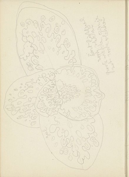
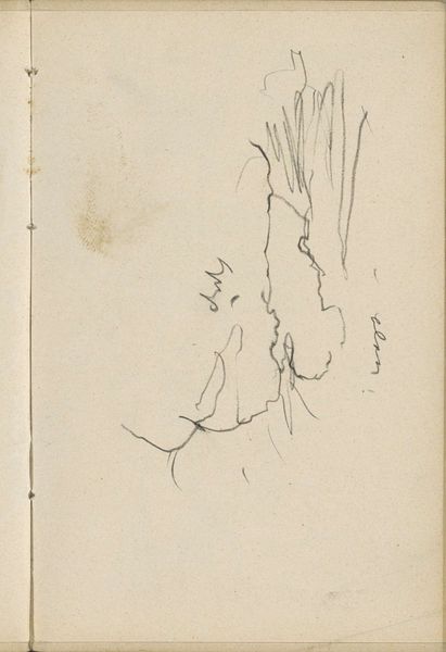
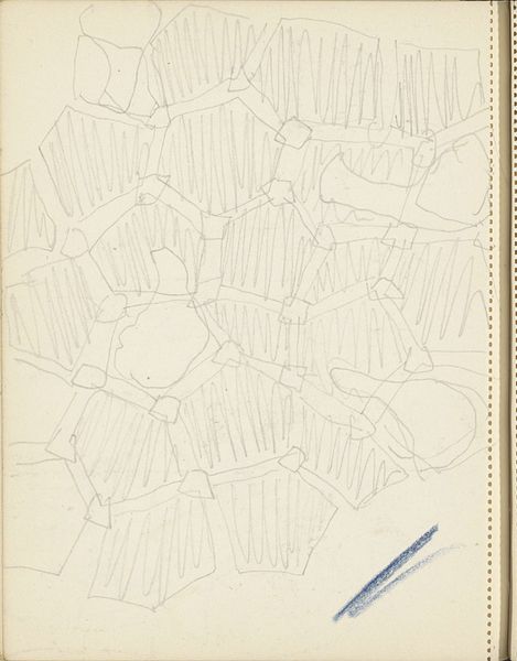
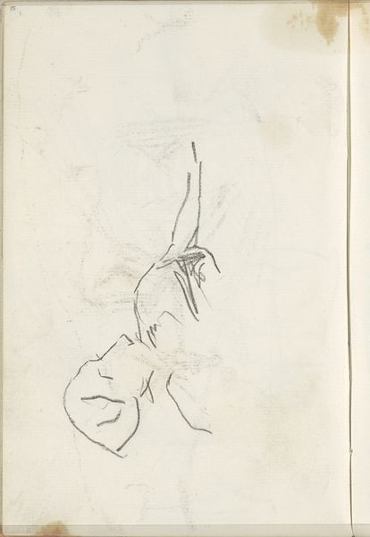
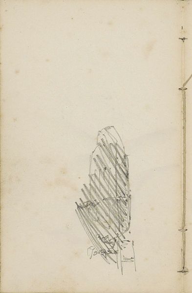
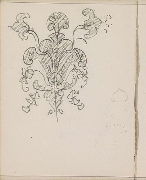
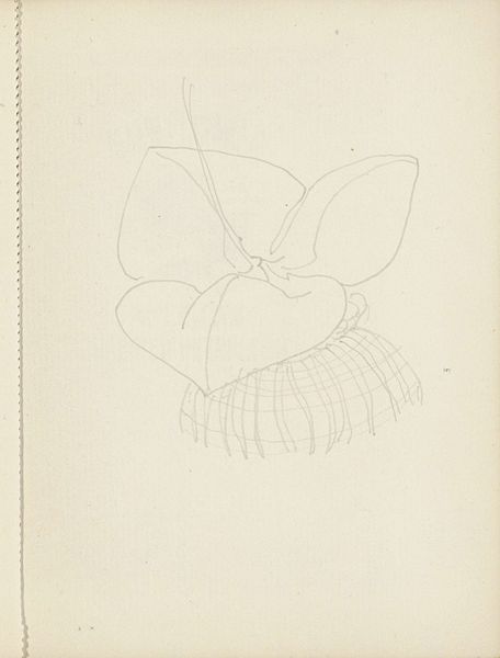
Curator: Reijer Stolk’s “Kleureffect,” made somewhere between 1916 and 1945. It’s a pen and pencil sketch held here at the Rijksmuseum. The title translates to ‘Color Effect’, which is intriguing considering the stark, grayscale nature of the work. What catches your eye first about this drawing? Editor: I’m struck by the hesitant energy of the lines – like watching someone trace an idea just as it emerges. It almost gives the impression of movement, though static and monochromatic, as if I can glimpse what this might become if fleshed out with colors. Curator: Absolutely. I think that searching, that open-ended quality is really central to it. Stolk plays with abstraction, evoking form but stopping short of definite representation. Editor: So, looking closer, I see what appears to be three leaf-like shapes fanning out from a central point. I am particularly interested by this almost floral motif, since threefold symmetry often signifies completion or perfection. Is there some intention or spiritual resonance with this image, however subtle? Curator: That's a sharp observation! It is a suggestion rather than a bold declaration of that symbolic order, more akin to a whispered echo from nature’s vocabulary than a straightforward pronouncement. Editor: Perhaps. Given its dating within such a tumultuous period, I wonder if it's intended as a safe, even unconscious, space to express ideas beyond the restrictive conventions of the time? It almost becomes like an enigmatic key – suggestive but deliberately withholding… Curator: Fascinating! Yes, this drawing opens up into an intricate dialogue of intent and reception; what we bring to it as observers undeniably tints how we interpret those very shapes… those symbolic echoes. Stolk gives us this foundation; yet empowers us, paradoxically, through restraint. Editor: It's less a statement, then, more of an invitation into quiet contemplation on form, intention and the stories latent in every symbol. An unpretentious visual riddle and testament to hidden complexity within supposed simplicity! Curator: Exactly, the 'Kleureffect’ isn't necessarily about pigment at all but about this invitation into potential, like a chord left hanging beautifully unfinished, still echoing and evolving within ourselves long after we've moved on.
Comments
No comments
Be the first to comment and join the conversation on the ultimate creative platform.
More like this