drawing, paper, pen
#
portrait
#
drawing
#
toned paper
#
light pencil work
#
childish illustration
#
cartoon like
#
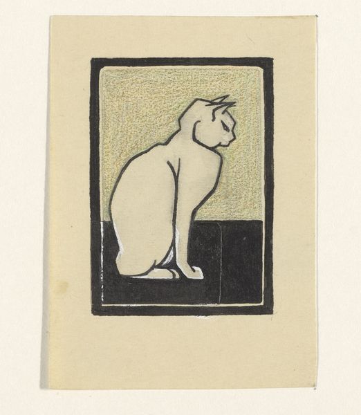
animal
#
cartoon sketch
#
figuration
#
paper
#
personal sketchbook
#
line
#
symbolism
#
sketchbook drawing
#
pen
#
cartoon style
#
cartoon carciture
#
sketchbook art
#
modernism
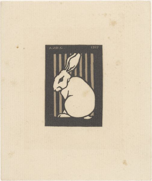
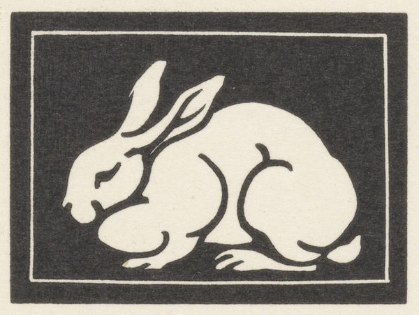
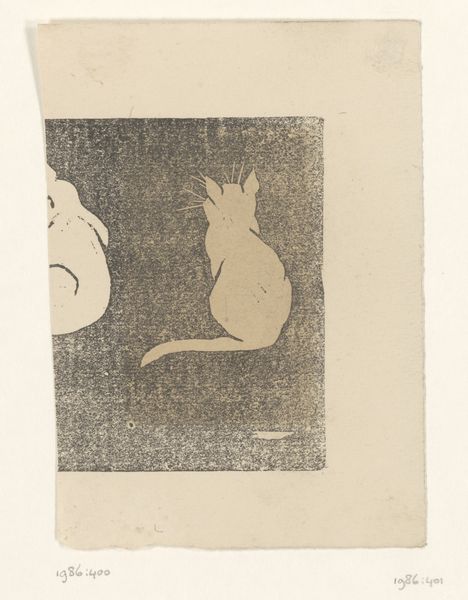
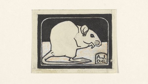
Dimensions: height 67 mm, width 49 mm
Copyright: Rijks Museum: Open Domain
This little artwork, Konijn, was made by Julie de Graag sometime before 1924, and I think it’s just wonderful. It’s hard not to see how the stark contrast between the black ink and the paper creates a sort of graphic punch; the image feels both delicate and bold. Looking closer, there’s a real tenderness in how de Graag renders the rabbit. The slightly smudged quality of the ink gives a soft texture to its fur. See how the white of the rabbit almost glows against the dark bars of the background? It’s a simple palette, but she achieves such depth. I think what’s so compelling is the way the lines aren’t perfect; they waver, giving the piece a handmade, intimate feel. De Graag's work makes me think of other printmakers like, say, Félix Vallotton, but with a gentler touch, perhaps. It’s this beautiful blend of precision and vulnerability, and it really captures the quiet essence of the animal.
Comments
No comments
Be the first to comment and join the conversation on the ultimate creative platform.
More like this