About this artwork
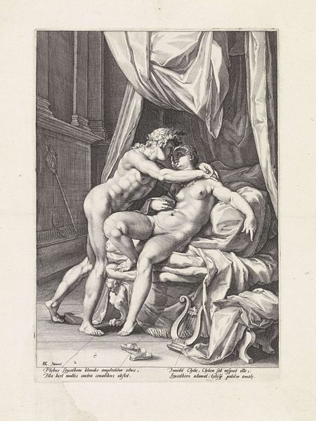
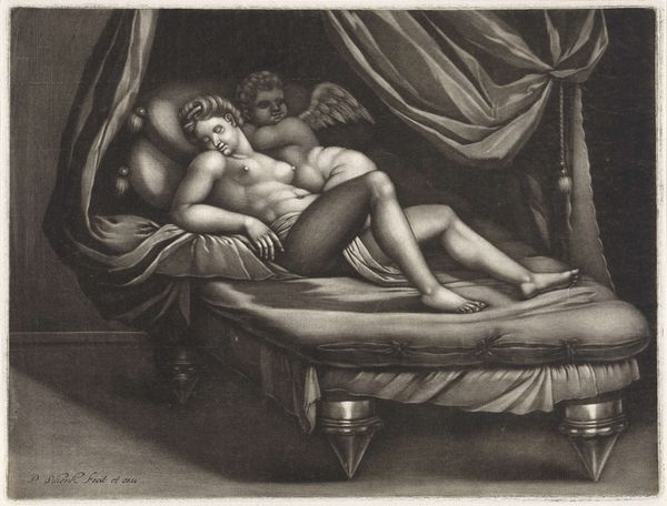
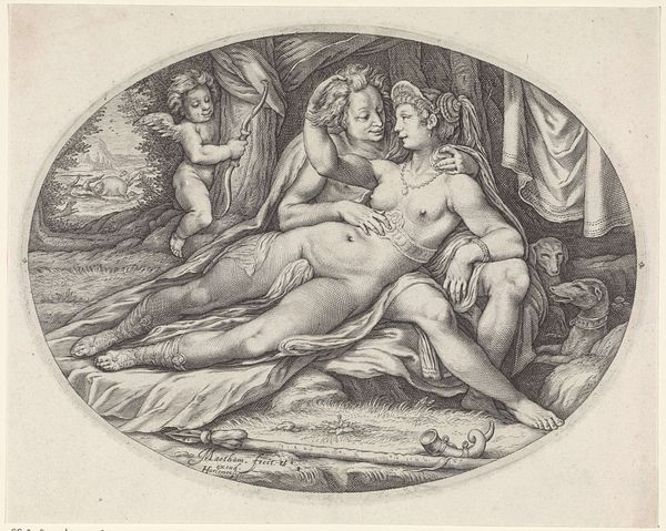
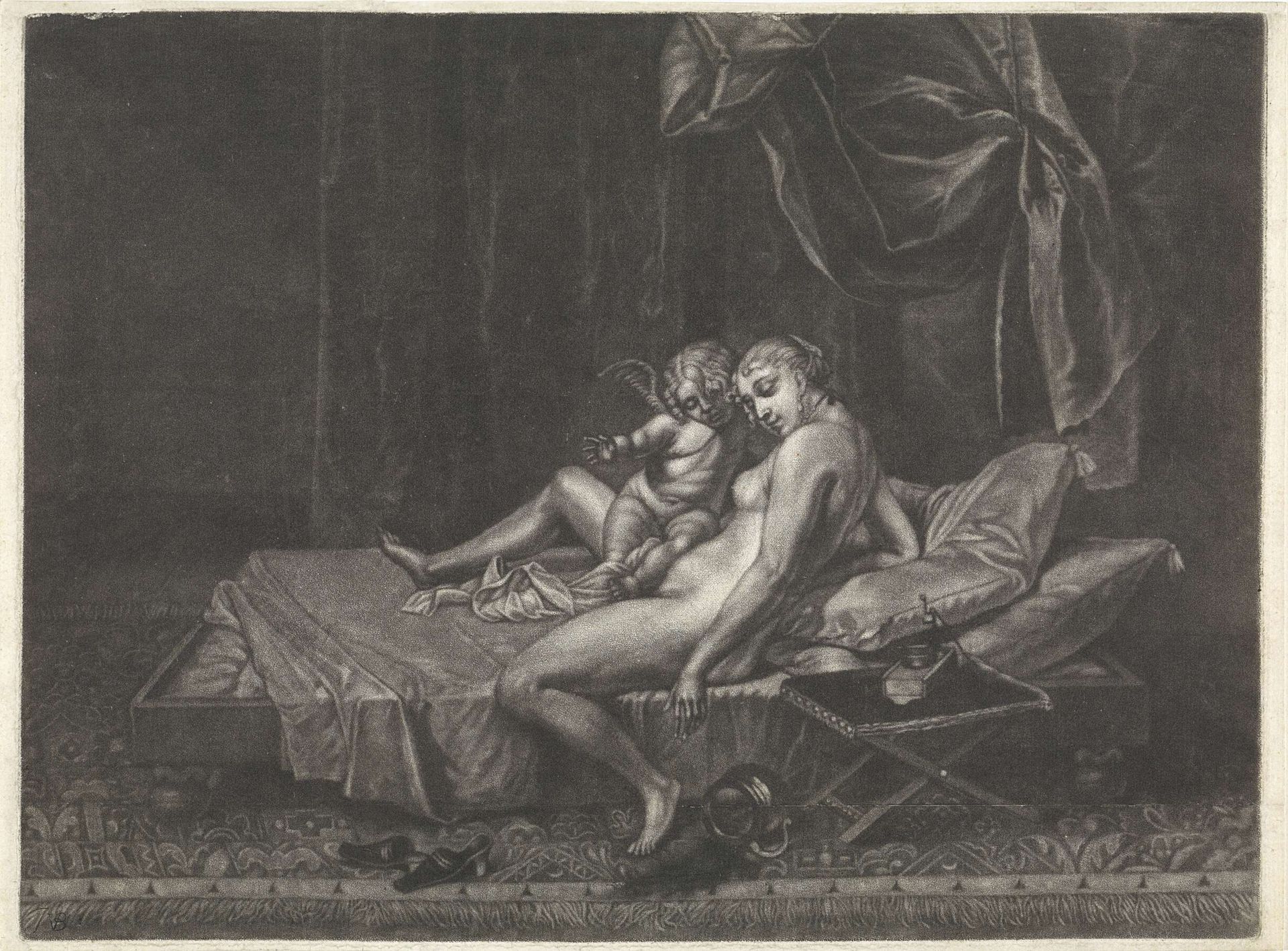
Editor: We're looking at "Venus en Amor," an engraving dating between 1659 and 1740 by Jan van der Bruggen. It's got a real Baroque feel with all that dramatic shading. I am mostly struck by how intimate it seems... a goddess at rest with her son. What do you see in this piece? Curator: Intimacy is key, I think. Consider the texture of the engraving itself, the lines pressed into paper – that tactility speaks to the closeness. I am struck by this balance between the eroticism inherent to such depictions and the more tender mother-son vibe that is at play, but is that truly what we are looking at? The artist forces us to consider our expectations... Look closer: isn't the figure of Venus rendered with a deliberateness which flirts with—how to put it?—a certain theatricality, like they are a part of the performative element inherent to this genre? Editor: A performance? Like they are aware of being watched? Curator: Perhaps... and does that recognition take away from your initial read of an "intimate moment?" Consider, too, the very conscious decision of van der Bruggen in using line, of all things! I find line work can carry an almost aggressive power. He is playing with fire! Editor: That’s an interesting point. The lines do seem very deliberate, almost… bold. They contrast so strongly with the soft subject matter. I didn't think of it that way initially, but now I see what you mean. The bold engraving undercuts any assumed or expected quietude or softness that the "mother and child" depiction may initially project. It is so subversive, really. Curator: It's precisely this tension—between tenderness and the assertive line—that, for me, elevates this above simple Baroque figuration. You have your answer, my friend!
Artwork details
- Medium
- engraving
- Dimensions
- height 215 mm, width 287 mm
- Copyright
- Rijks Museum: Open Domain
Tags
Comments
Share your thoughts
About this artwork
Editor: We're looking at "Venus en Amor," an engraving dating between 1659 and 1740 by Jan van der Bruggen. It's got a real Baroque feel with all that dramatic shading. I am mostly struck by how intimate it seems... a goddess at rest with her son. What do you see in this piece? Curator: Intimacy is key, I think. Consider the texture of the engraving itself, the lines pressed into paper – that tactility speaks to the closeness. I am struck by this balance between the eroticism inherent to such depictions and the more tender mother-son vibe that is at play, but is that truly what we are looking at? The artist forces us to consider our expectations... Look closer: isn't the figure of Venus rendered with a deliberateness which flirts with—how to put it?—a certain theatricality, like they are a part of the performative element inherent to this genre? Editor: A performance? Like they are aware of being watched? Curator: Perhaps... and does that recognition take away from your initial read of an "intimate moment?" Consider, too, the very conscious decision of van der Bruggen in using line, of all things! I find line work can carry an almost aggressive power. He is playing with fire! Editor: That’s an interesting point. The lines do seem very deliberate, almost… bold. They contrast so strongly with the soft subject matter. I didn't think of it that way initially, but now I see what you mean. The bold engraving undercuts any assumed or expected quietude or softness that the "mother and child" depiction may initially project. It is so subversive, really. Curator: It's precisely this tension—between tenderness and the assertive line—that, for me, elevates this above simple Baroque figuration. You have your answer, my friend!
Comments
Share your thoughts