drawing
#
drawing
#
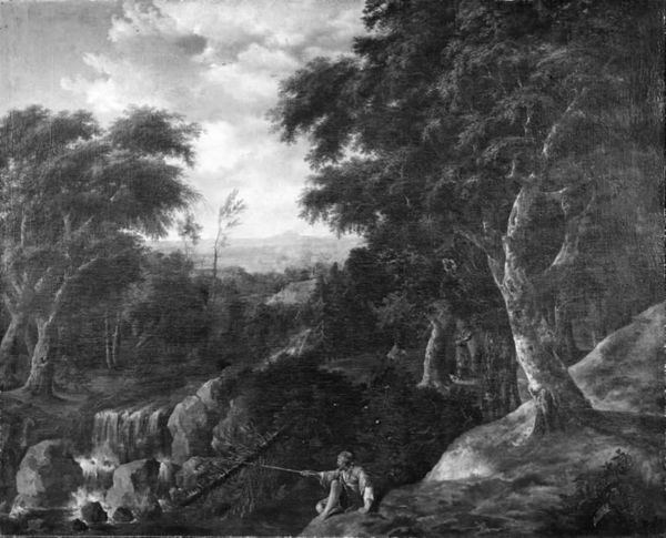
landscape
#
mountain
#
water
#
monochrome
#
realism
#
monochrome
Copyright: Public domain
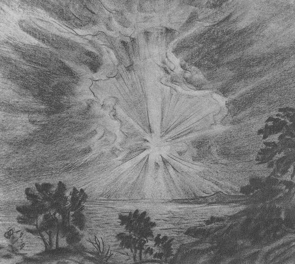
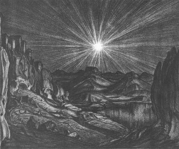
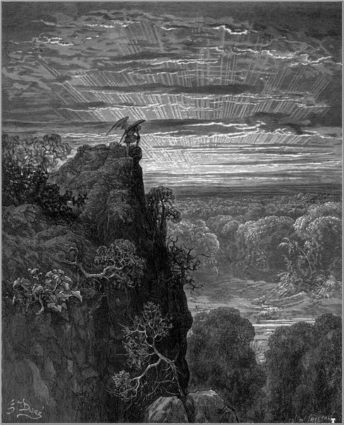
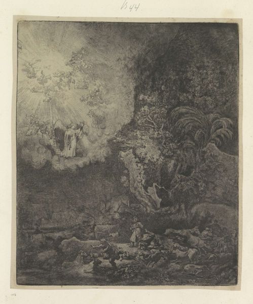
Editor: So, here we have Konstantin Bogaevsky’s "Evening Sun," a drawing from 1922. It's a stark, almost dreamlike landscape, a monochrome rendering of what appears to be a lake nestled amongst mountains and trees with an intense burst of light in the center. What strikes me most is how the darkness and light interact. What do you see in this piece, focusing purely on its formal qualities? Curator: This work presents an intriguing study in contrasts. Note how the artist masterfully employs the medium to create depth and texture. The light emanates, structuring the composition into clear segments that reflect the landscape: from a shadowed foreground up through a radiating center. The dark, almost foreboding tones of the trees and rock formations provide a sharp counterpoint to that effervescent central form. Consider how that tension animates the picture plane, setting up a compositional dialectic for the eye to follow, would you agree? Editor: I do, I'm intrigued by how the textures contribute to the overall affect of depth. Curator: Precisely. Let’s observe how variations in hatching and cross-hatching across different regions create the illusion of volume and distance, this use of these basic materials draws the viewers into the depicted space through a semiotic system using contrast, line quality and composition alone. Notice particularly how those elements draw you to consider depth-perception relationships as their basis for representing objects such as, mountains, light or water? Editor: It’s remarkable how he achieves such luminosity with just monochrome lines, how it directs where your eyes travel within the landscape. The light source pushes into darkness through sheer graphic contrast, it feels charged somehow. I wouldn't have considered this perspective on how basic materials are applied without you directing my attention towards those features. Curator: Indeed. The brilliance arises not from any inherent quality of color but strictly out of structural manipulation of form itself. Seeing how such a graphic and material structure relates, you see, can provide one way of evaluating visuality and thus its potential affective relations.
Comments
No comments
Be the first to comment and join the conversation on the ultimate creative platform.
More like this