drawing, paper, ink
#
drawing
#
dutch-golden-age
#
paper
#
ink
#
calligraphy
Dimensions: height 243 mm, width 360 mm
Copyright: Rijks Museum: Open Domain
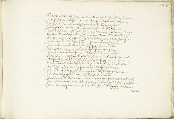
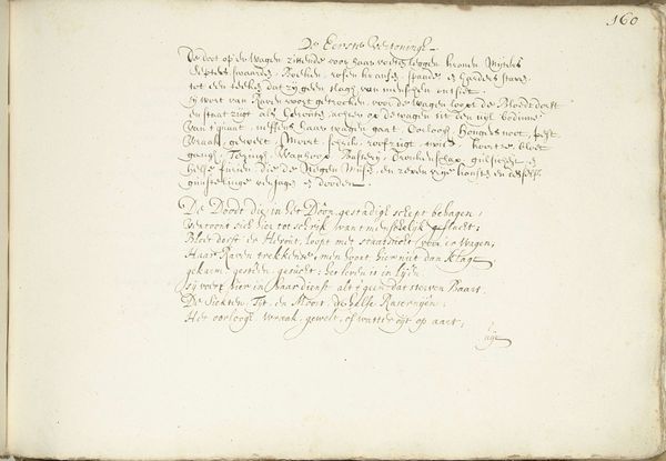
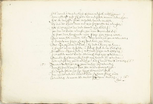
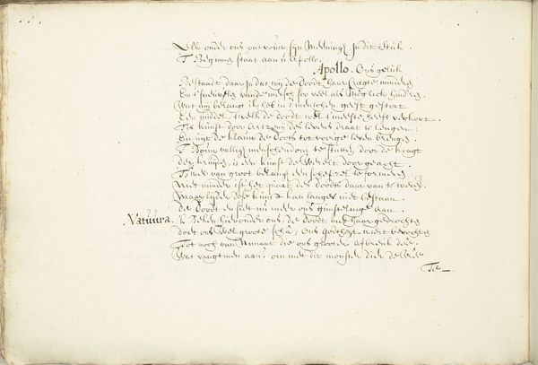
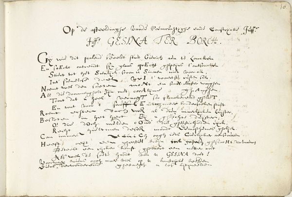
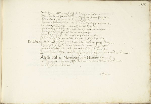
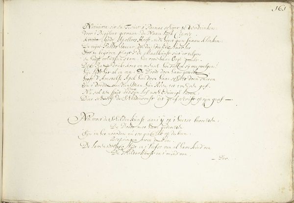
Curator: I am drawn in immediately by the quiet, aged feel of this drawing. It's more script than drawing really... what do you think? Editor: Indeed. "Eerste vertoning (deel twee) en Tweede vertoning (deel een)" it's called, by Henrik Jordis from around 1660. This piece utilizes ink on paper to weave lines of calligraphy across the surface. For me, the appeal rests primarily in understanding the societal function of calligraphy and penmanship within the social context. Curator: Right, so much labor in creating neat, legible scripts... something so rare these days, since we tap on glass! I see a social commentary there... in the gesture. I'm more interested in how Jordis filled the space. Did the page dictate the shape, or did the poem suggest it? The words seem cramped and yearning to stretch beyond the border of the paper. Editor: The Golden Age valued careful craft. The evenness of the strokes speaks to training, access to materials, time... The script's controlled appearance could be deceptive. Remember sumptuary laws! Consider how Jordis negotiated his socio-economic position through this labor. Curator: Hmmm. Well, the poem has themes of blindness and royal crowns. Are these critiques encoded? If so, is Jordis using his artistic license to mock social mobility, given that mastery of calligraphy also helped elevate one's social standing at the time? Editor: It is tempting to read it that way, however, interpreting intent requires contextual grounding. And, the nature of Dutch Golden Age markets allowed for a variety of voices. What do you suppose someone encountering it for the first time might take away, lacking any background knowledge? Curator: Likely they would experience what I do: awe at how history is communicated so gracefully. In short, despite its social grounding and calligraphic nature, the page still hints at deeper expressions, which can move us still! Editor: It really showcases the intersection of craft, social history, and individual agency! It certainly prompts considerations for what is visible or hidden when reading historical works.
Comments
No comments
Be the first to comment and join the conversation on the ultimate creative platform.
